SoulCycle — Website & Mobile Commerce
Category
Branding, Digital, UX, WebAbout This Project
The Setup
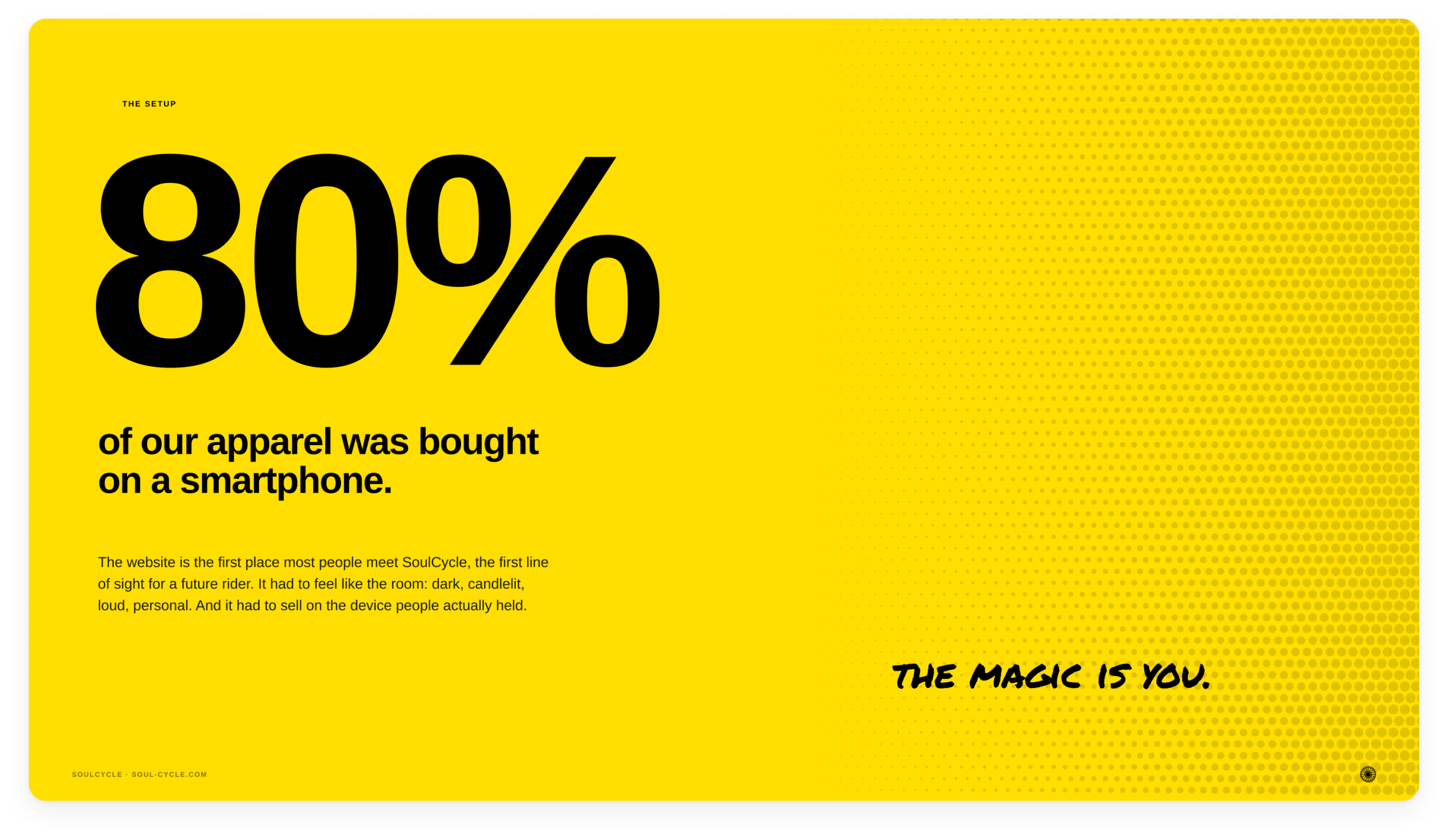
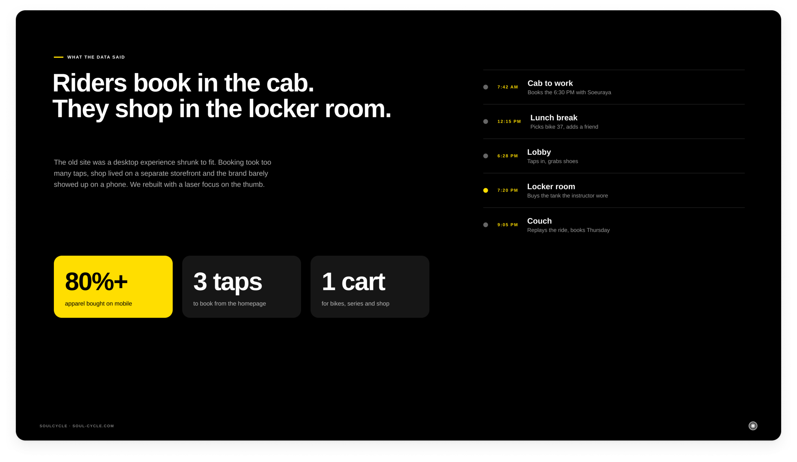
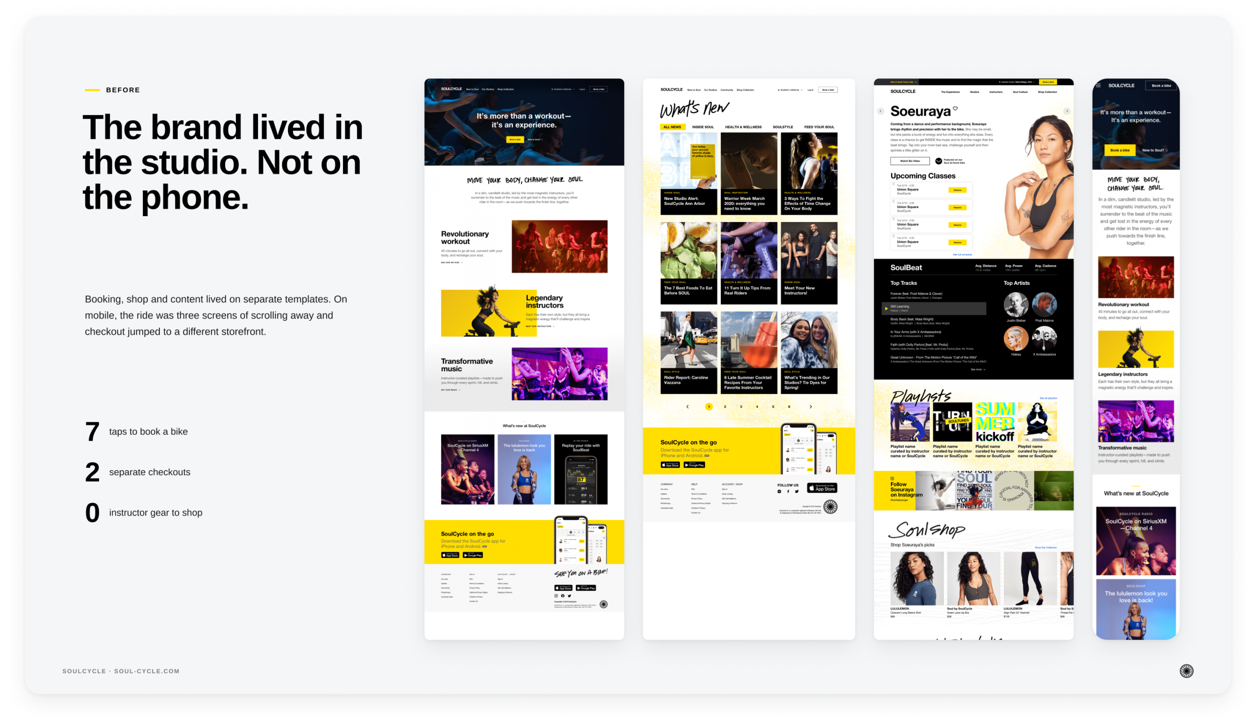
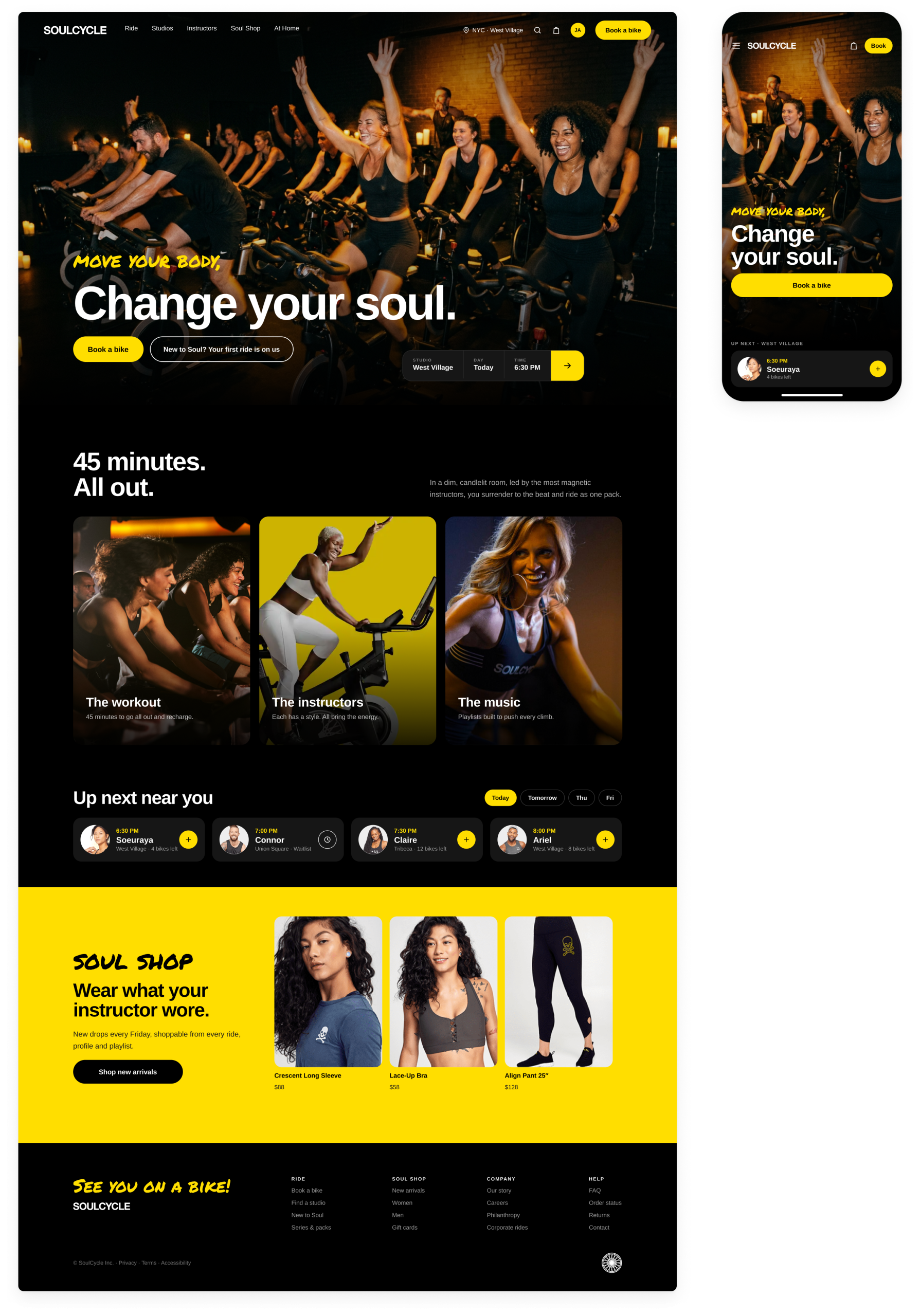
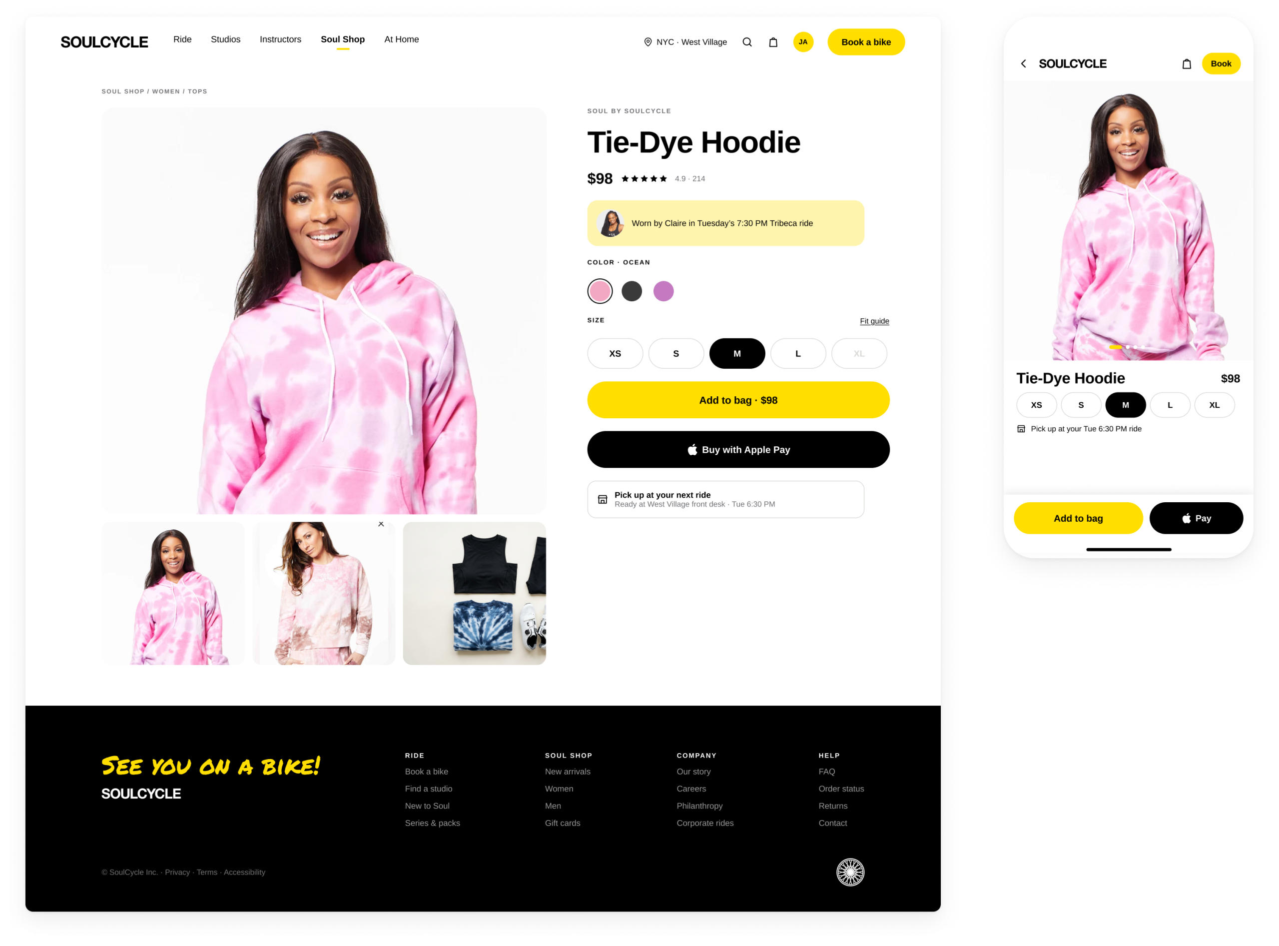
The SoulCycle website is the first line of sight for future riders, the first place most people meet the brand. It needed to be a best-in-class experience that reflected the core values and identity riders found in the studio: a dark, candlelit room, magnetic instructors and music that carries you. The data made the priority unmistakable: over 80% of our apparel was purchased on a smartphone. The existing site was a desktop experience squeezed onto a phone. Booking took too many taps, the brand barely came through on mobile, and the journey from discovering a class to walking into the studio felt disconnected.
What I Led
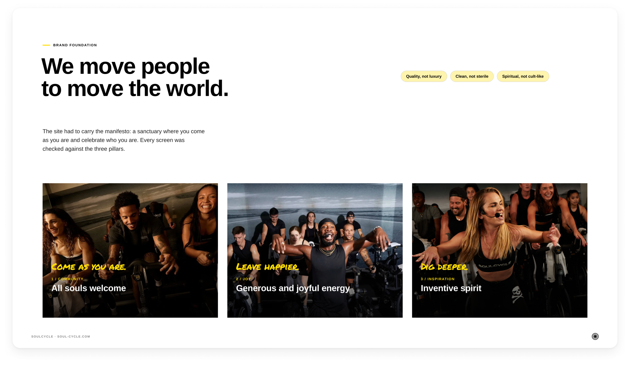
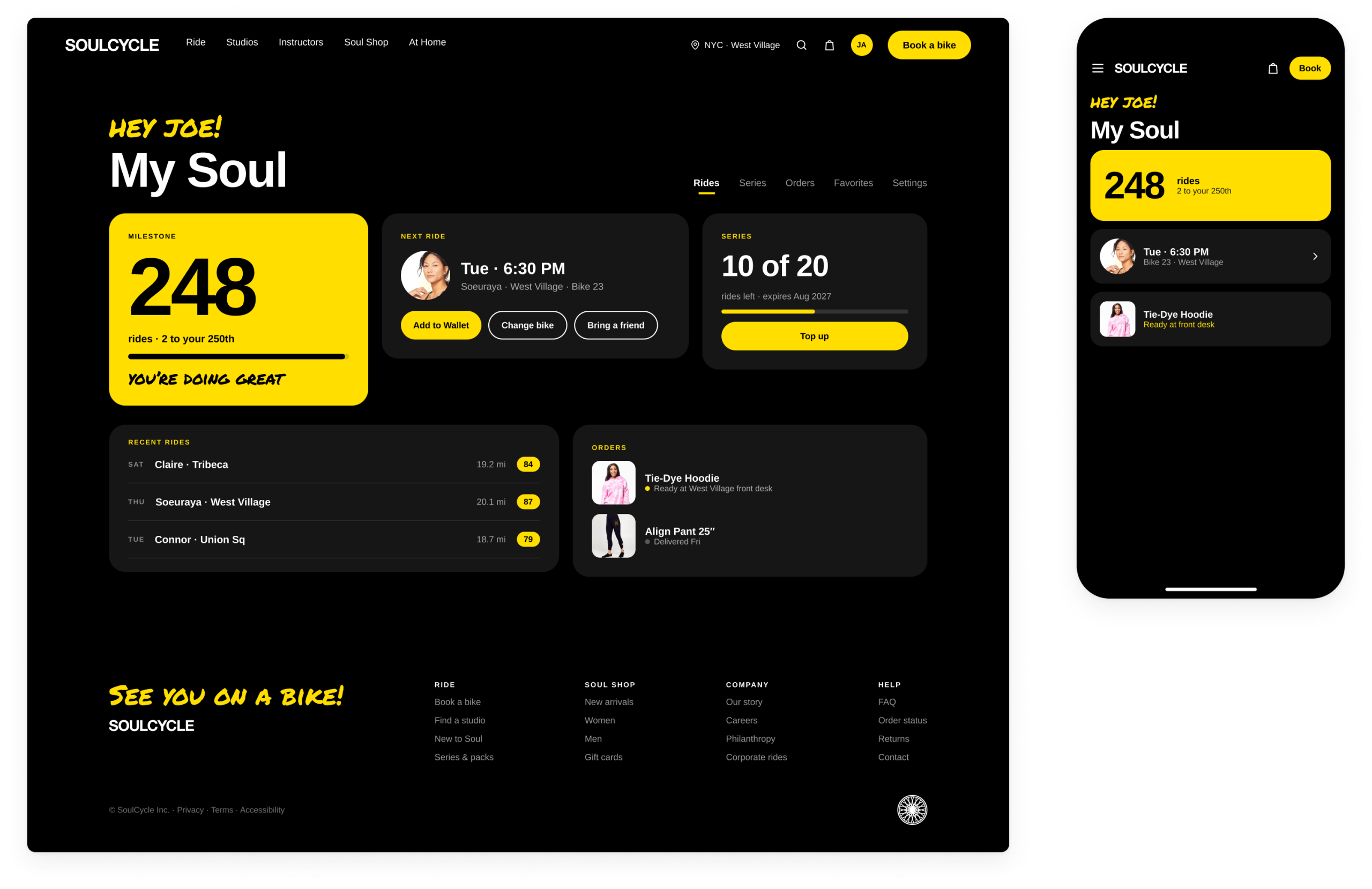
As Head of Product Design, I led the ground-up rebuild of soul-cycle.com, with a laser focus on mobile users and bringing the web experience up to the standard of the brand. We designed for the real moments in a rider’s day: booking in the cab, picking a bike at lunch, finding a studio in a new city, checking in at the front desk. Every page was checked against the three brand pillars: all souls welcome, generous and joyful energy, and an inventive spirit.
What We Delivered
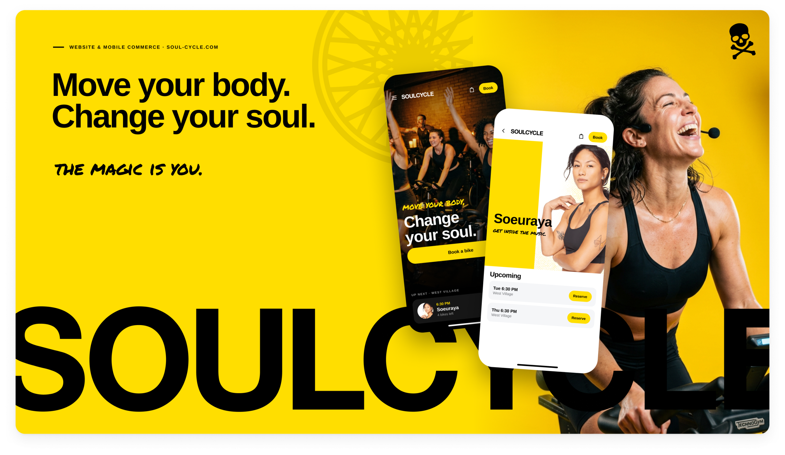
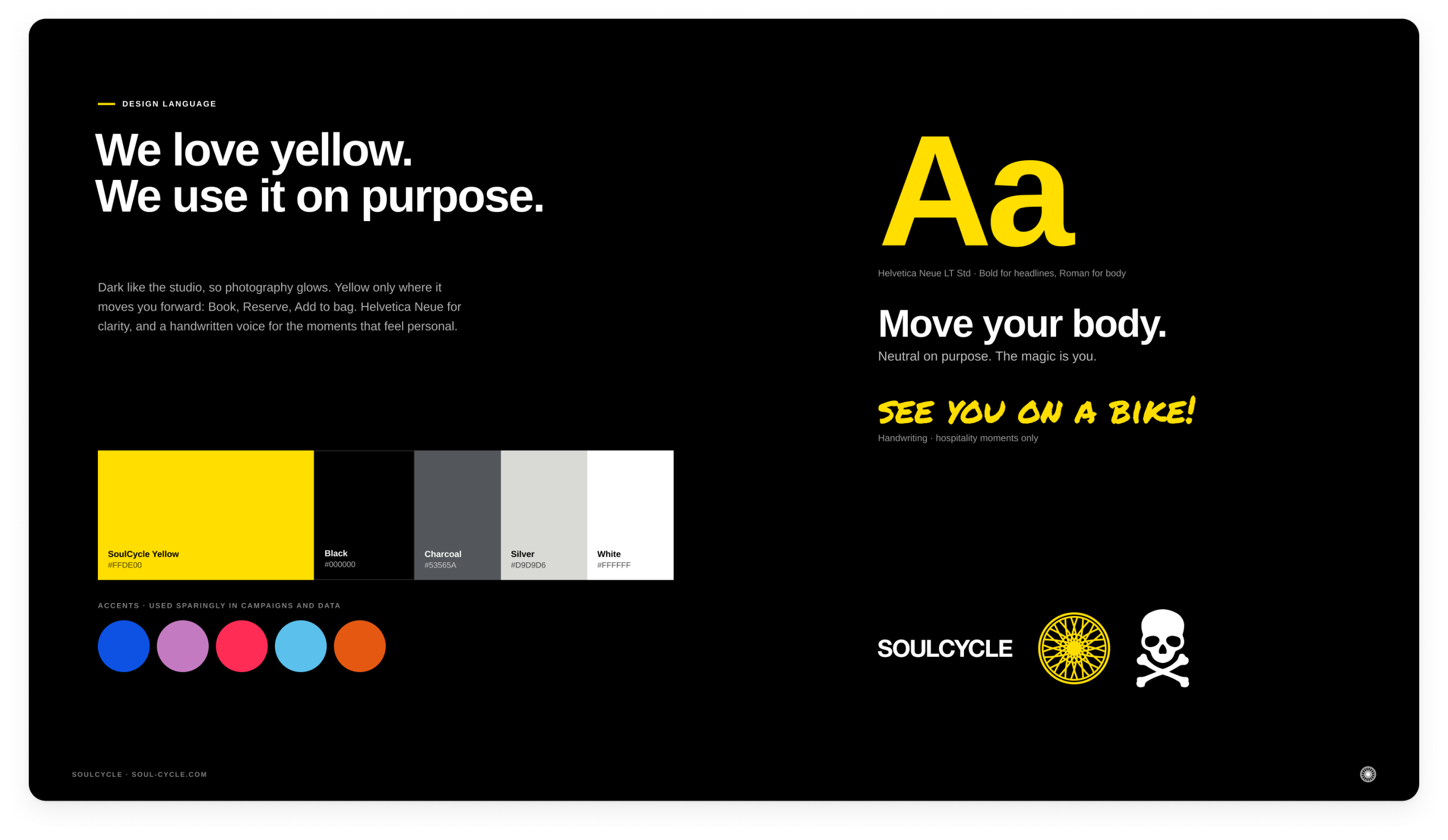
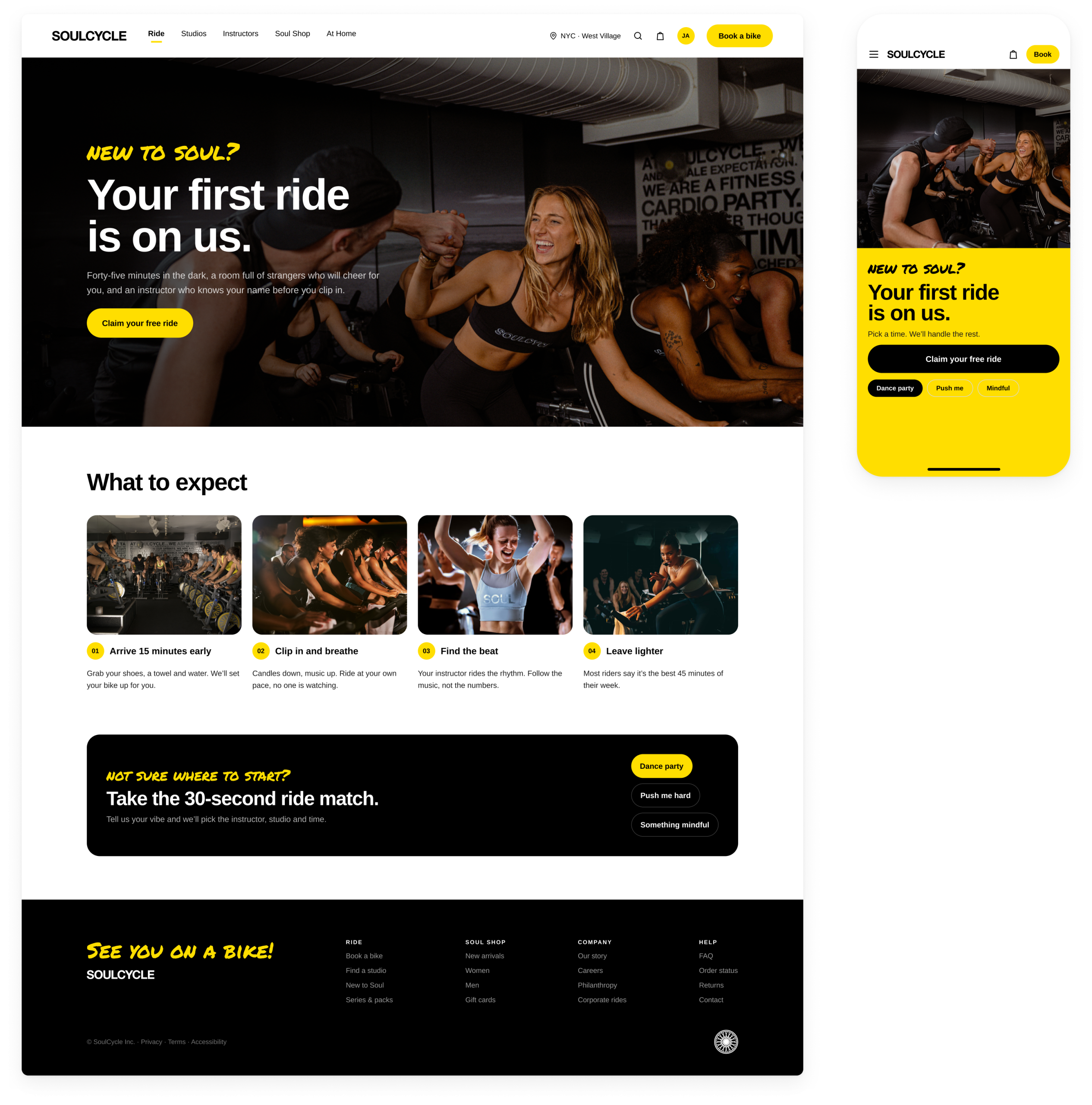
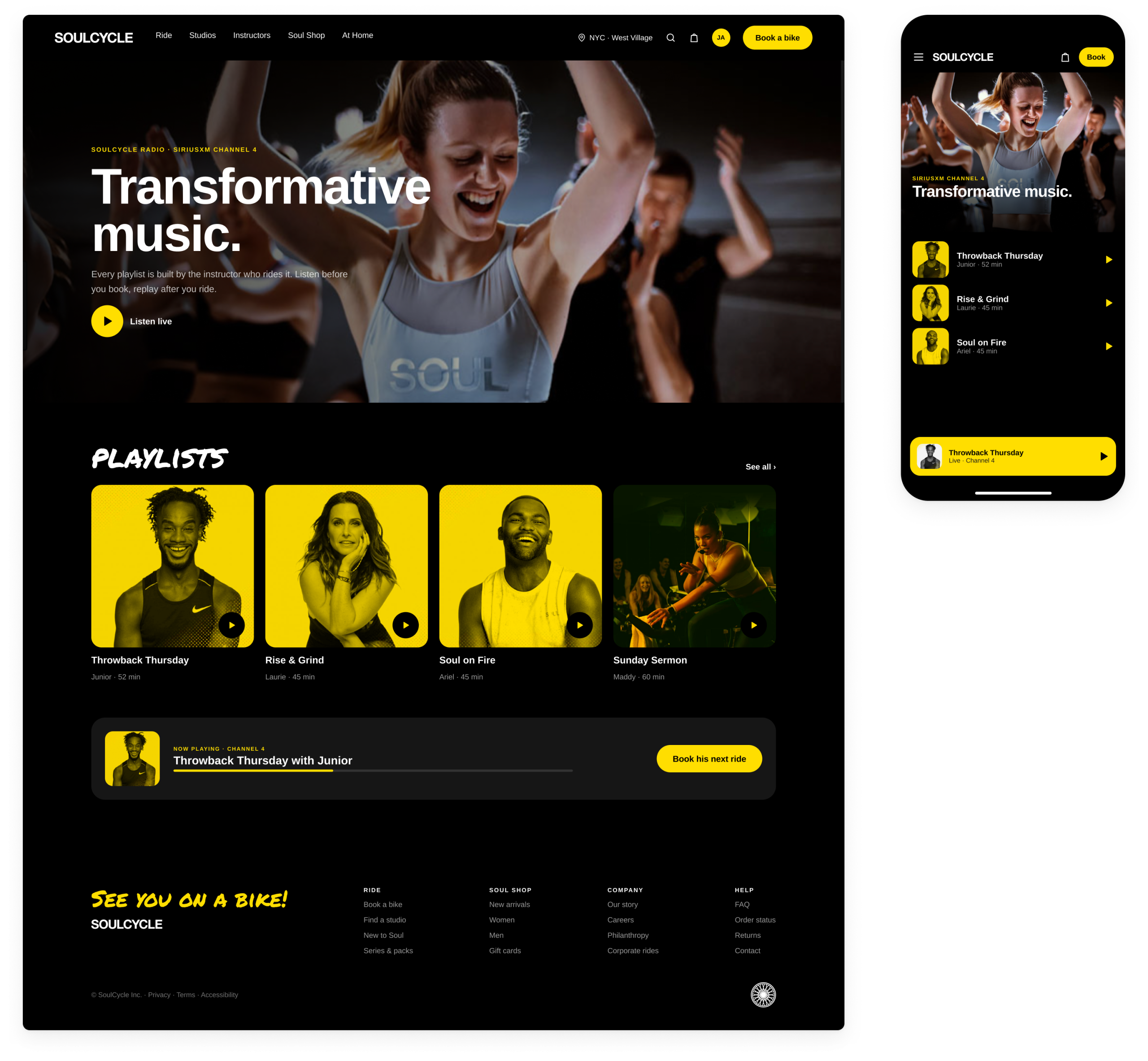
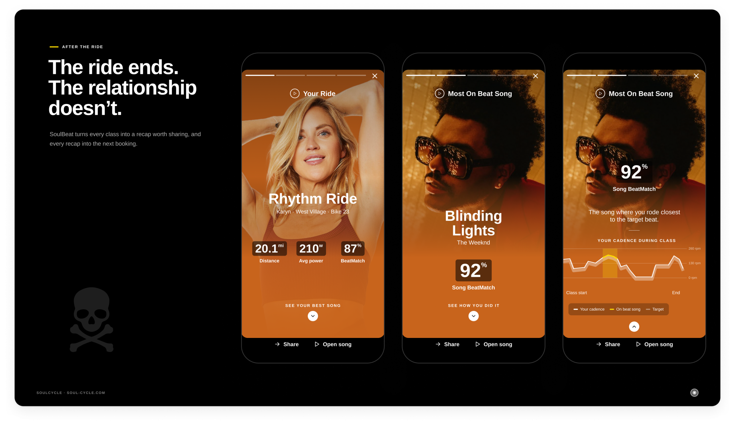
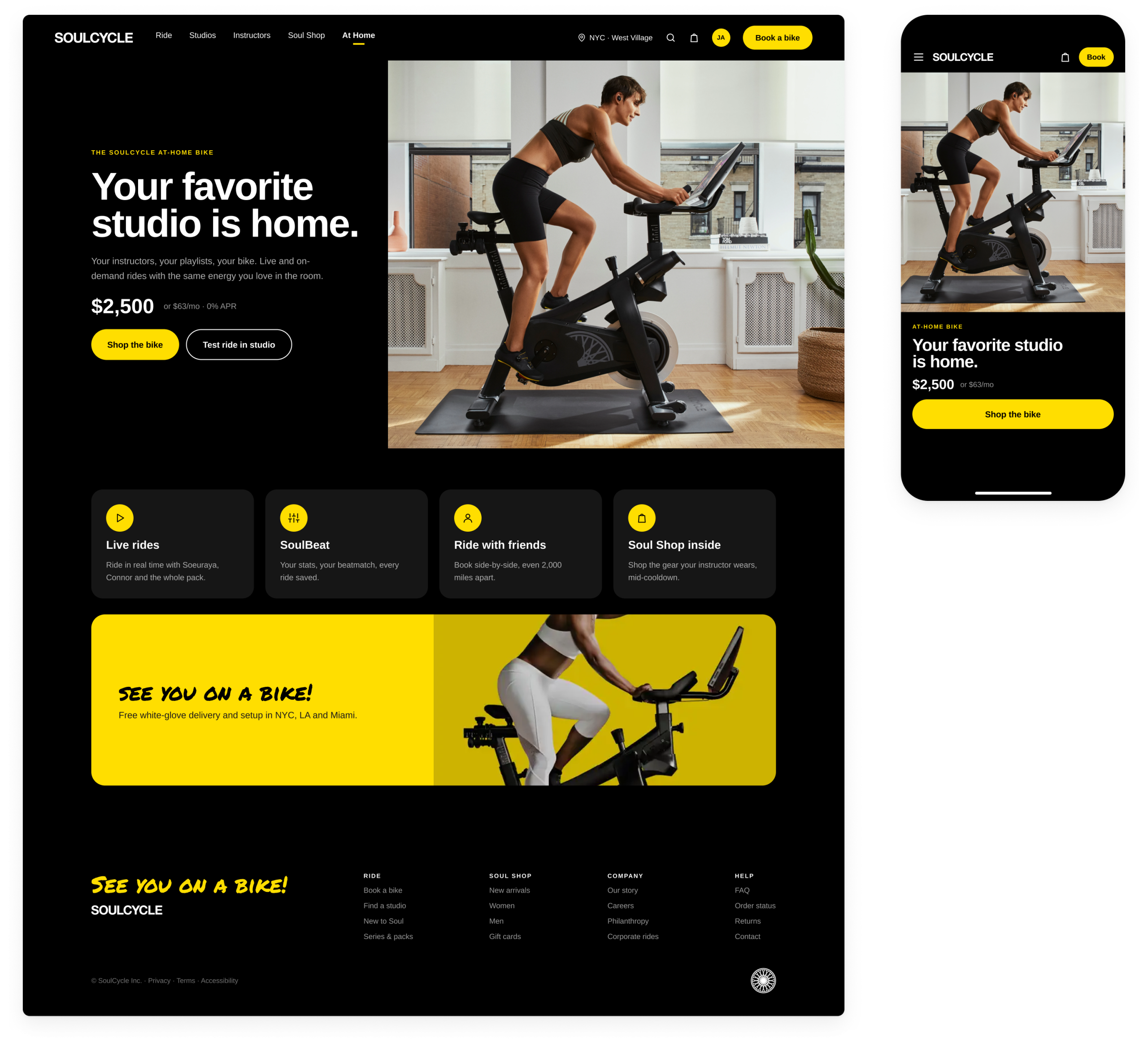
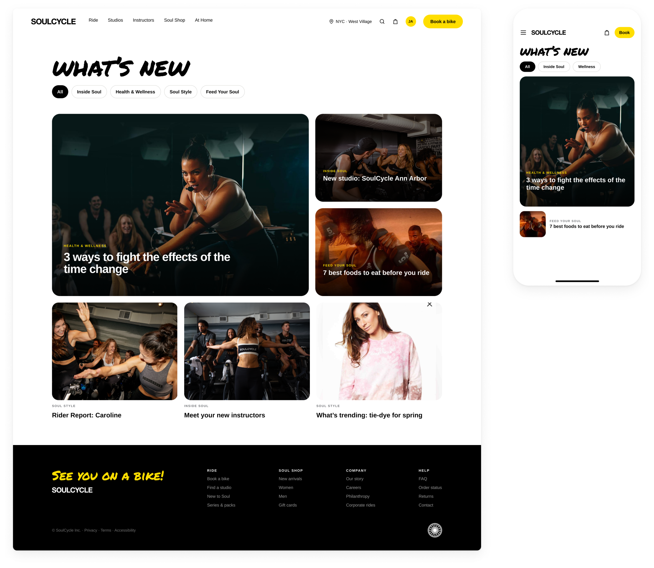
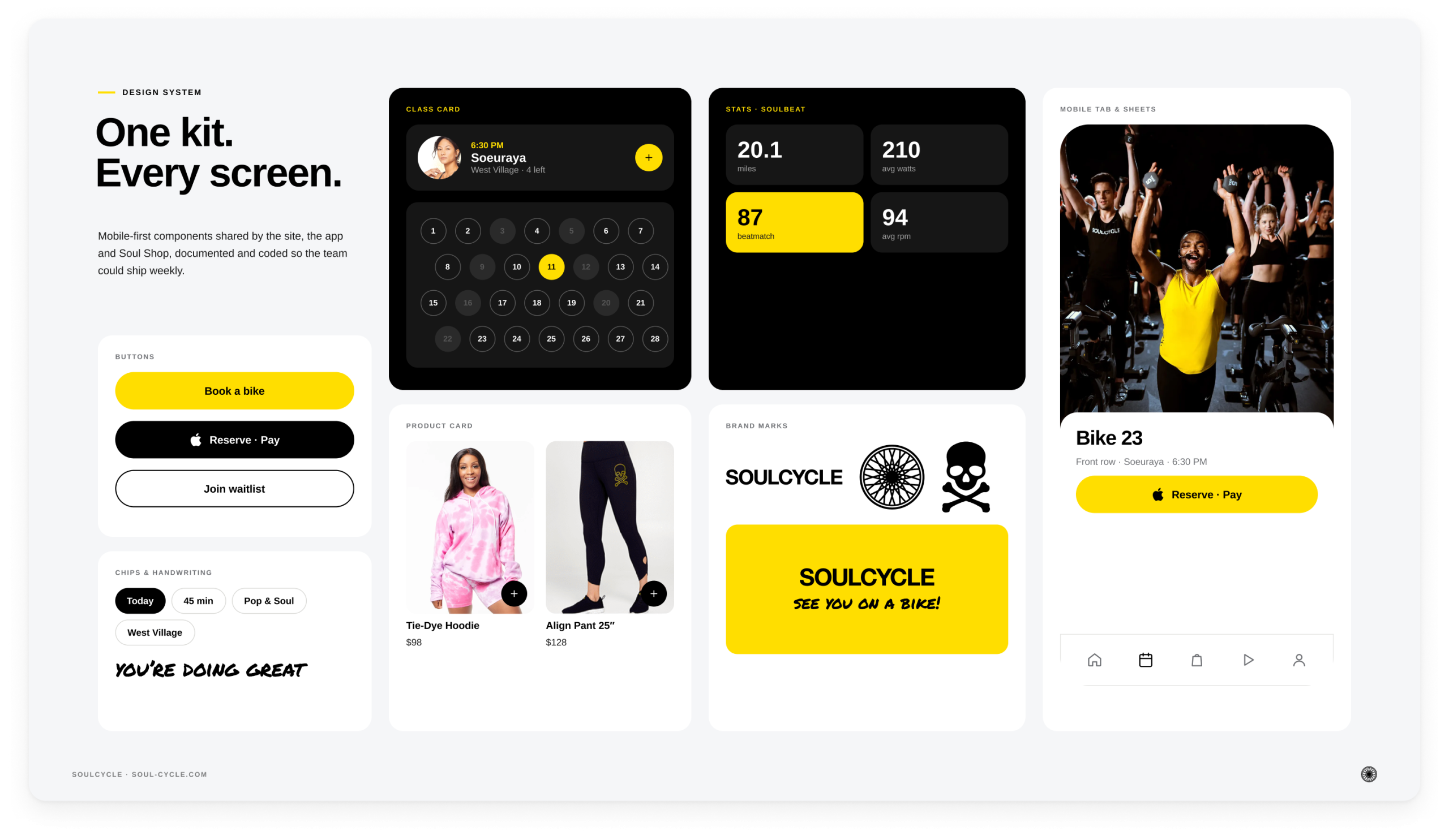
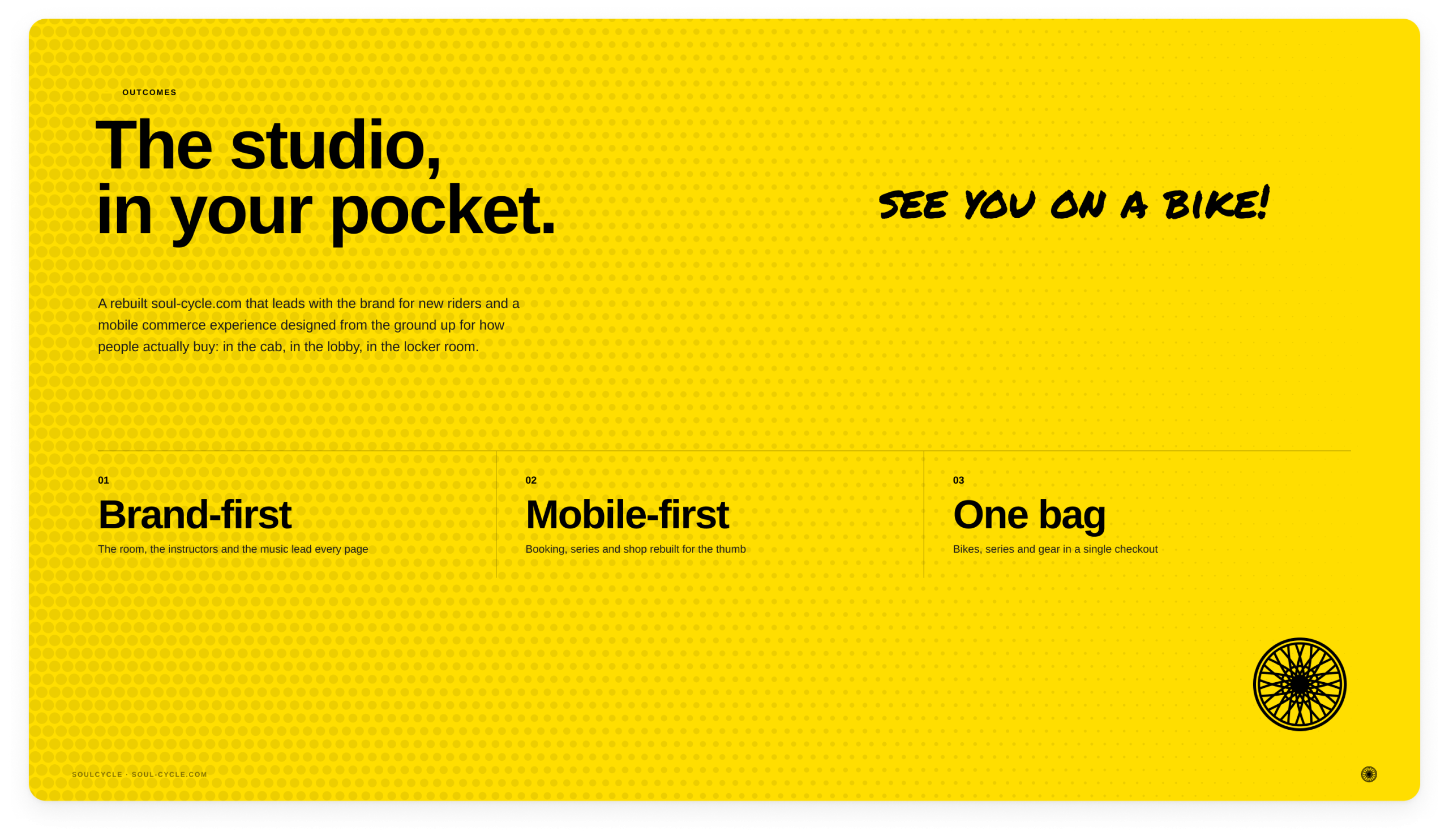
A rebuilt website that leads with the brand for new riders: the room, the instructors and the music are front and center on every page. Underneath it sits a mobile experience designed from the ground up for how riders actually use it:
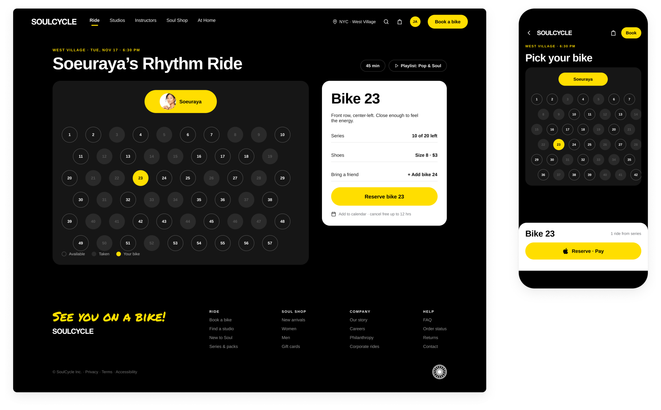
- fast booking from the homepage, with a live view of the room for picking your bike
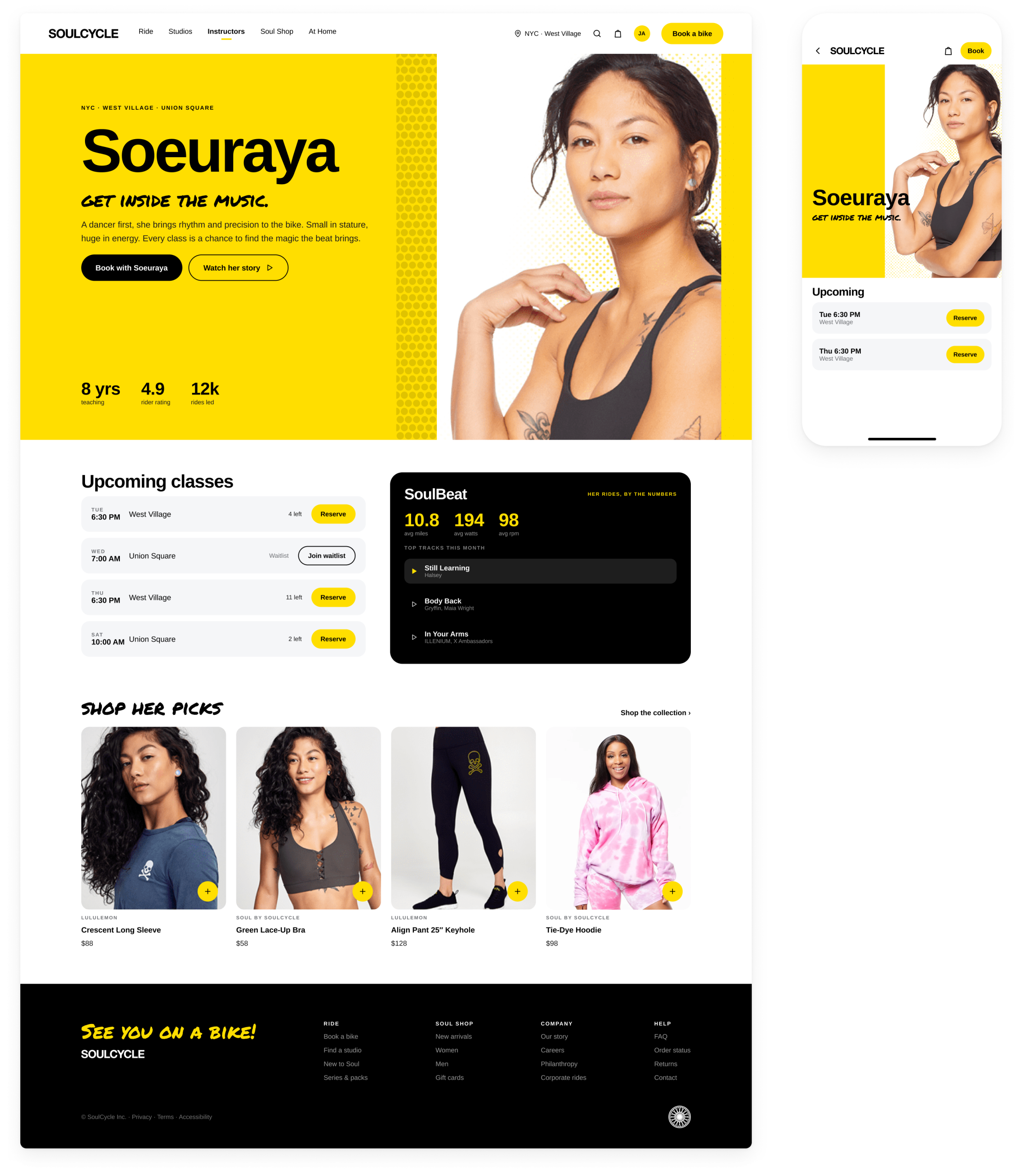
- instructor pages with each instructor’s schedule and music
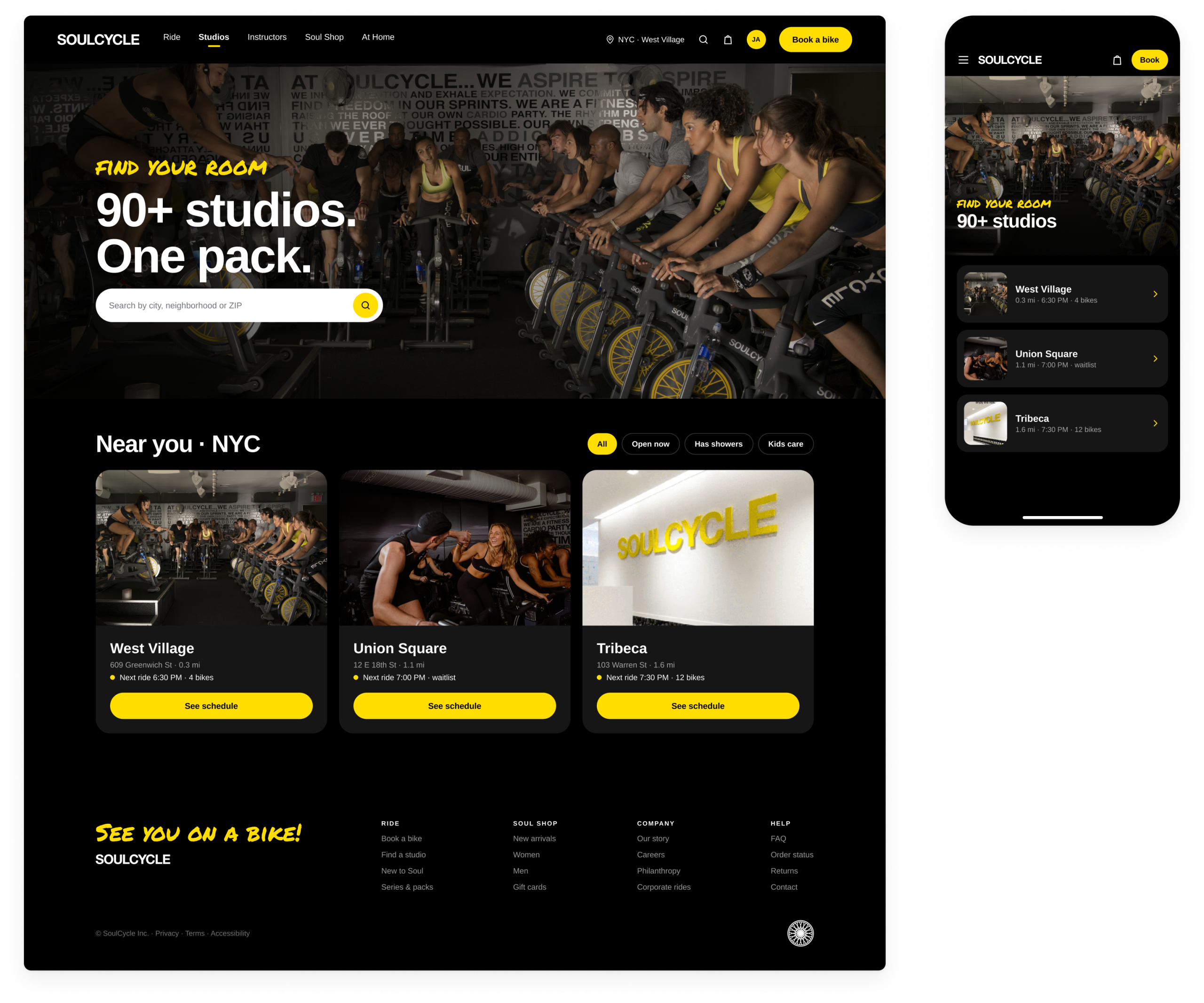
- a studio finder
- a guided first ride for people new to Soul
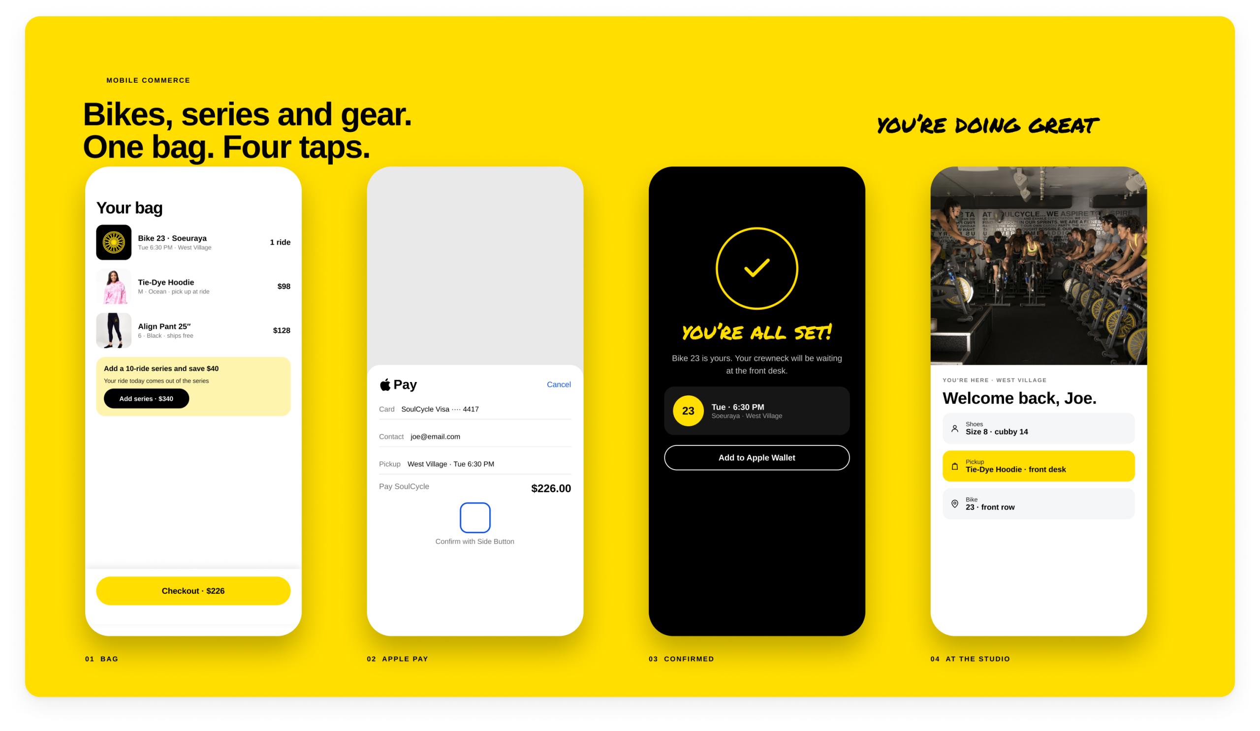
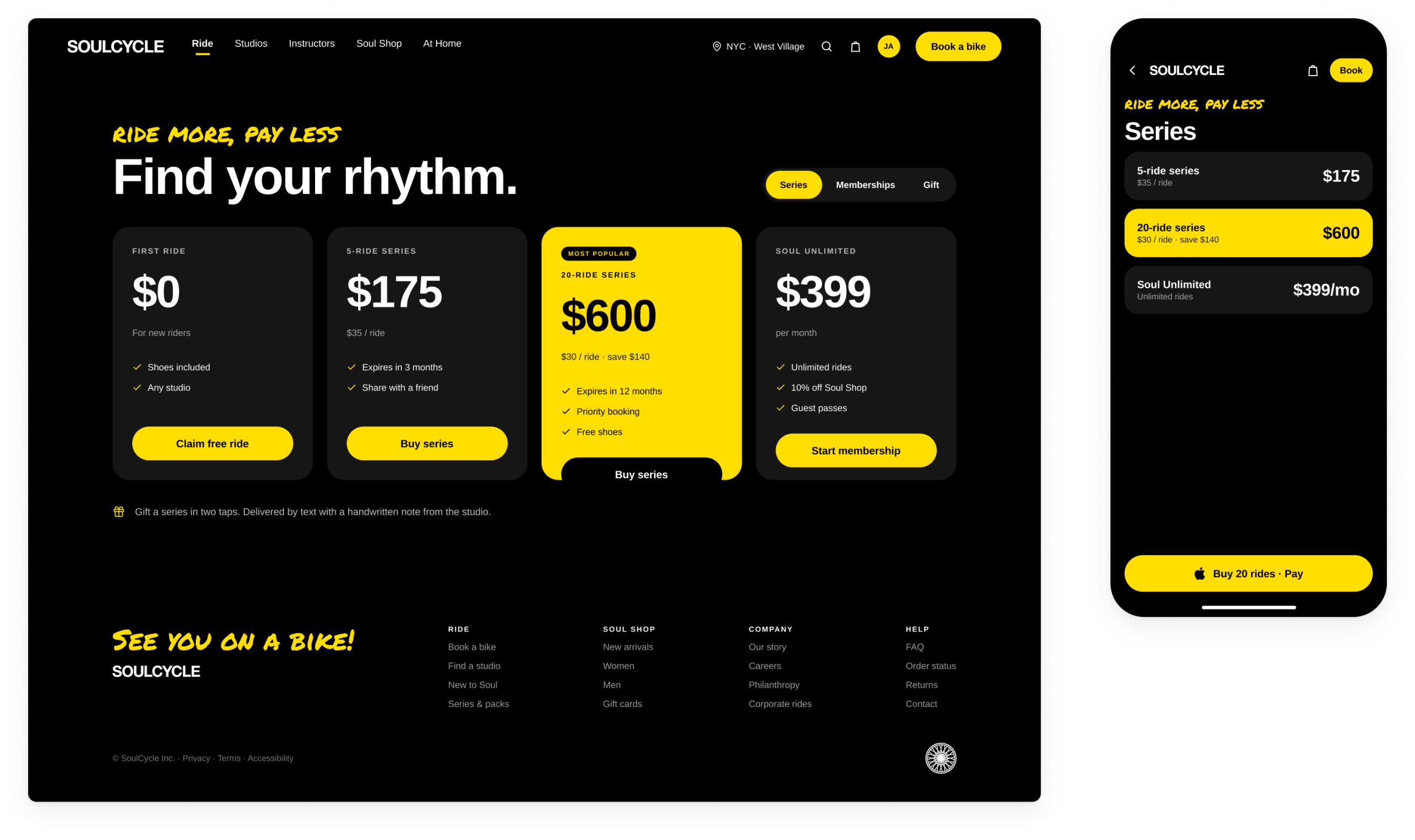
- series and membership options in a single checkout with Apple Pay
Commerce lives inside that journey rather than beside it, so a rider can pick up gear at their next ride without leaving the flow.