Frontier Communications Web & App
Category
Digital, eCommerce, Product, Strategy, UX, WebAbout This Project
The Setup
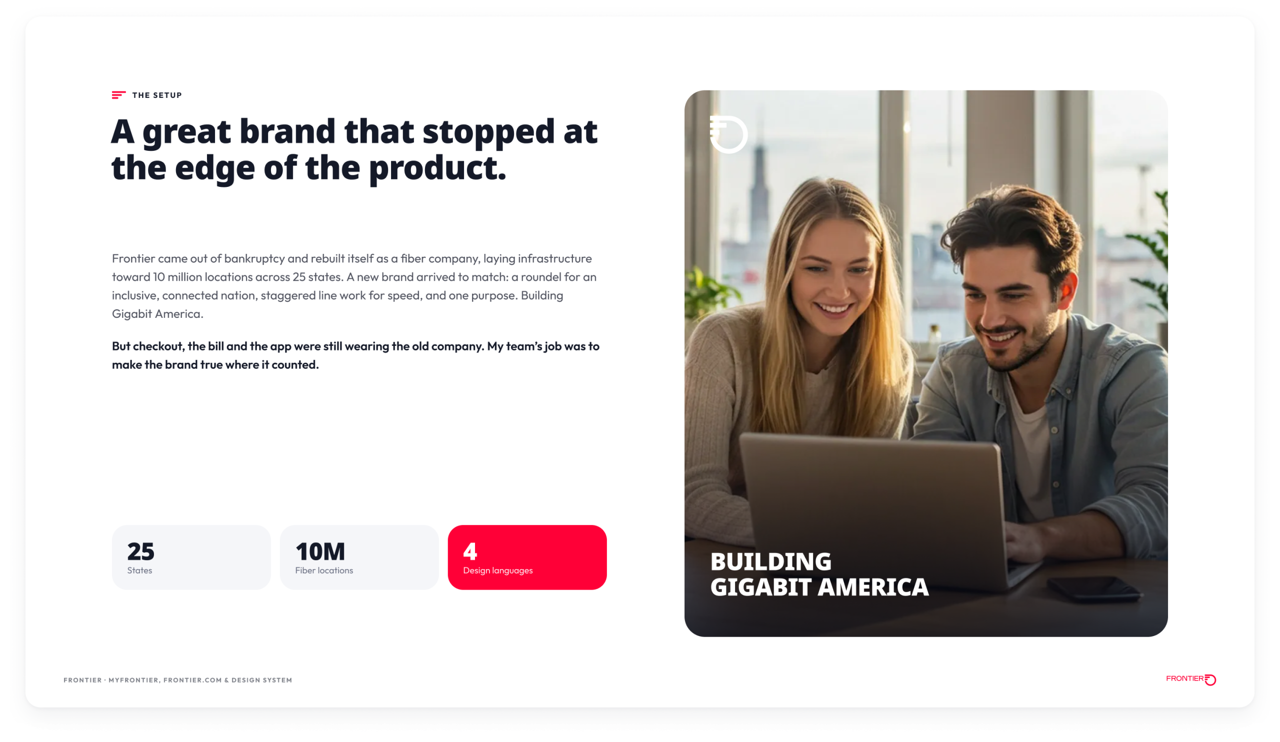
In April 2022, Frontier unveiled a new brand: a roundel logo for an inclusive, connected nation, staggered line work built to suggest speed, a new typeface and a deliberately punchy palette, all rallied behind one purpose, Building Gigabit America. It had a real strategic argument underneath it. The company was a year out of bankruptcy and rebuilding itself as a fiber business across 25 states. But the brand stopped at the edge of the product. The checkout flow, the bill and the app were still wearing the old company, the one the rebrand was trying to leave behind. The product was where the promise would be tested, every day, by customers who had heard promises from telecom companies before.
What I Led
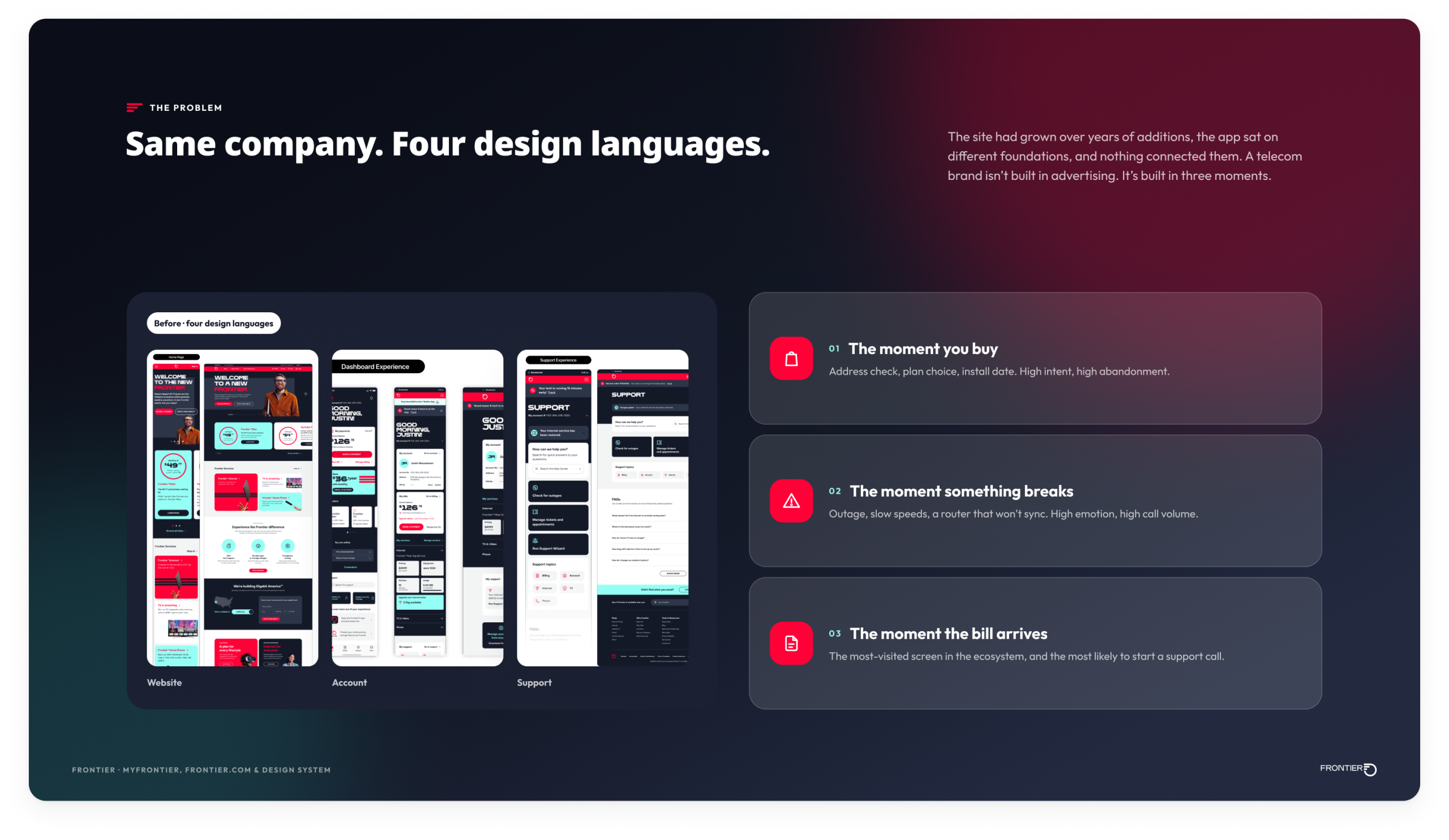
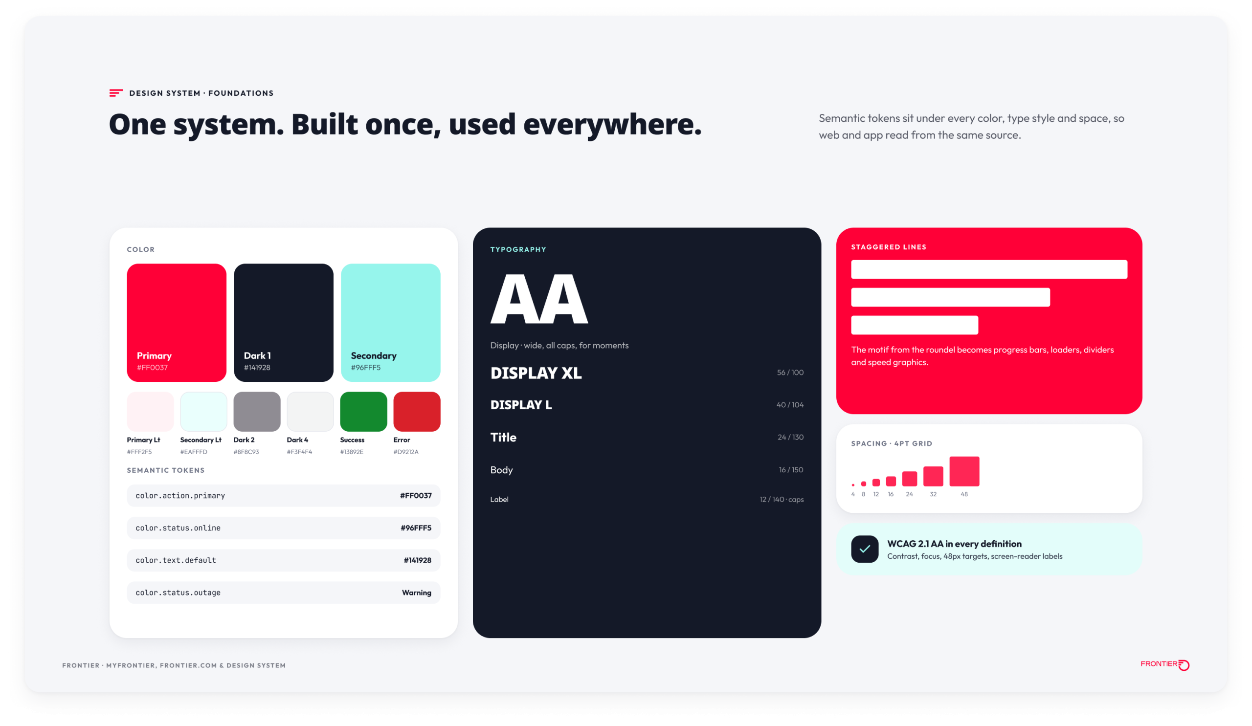
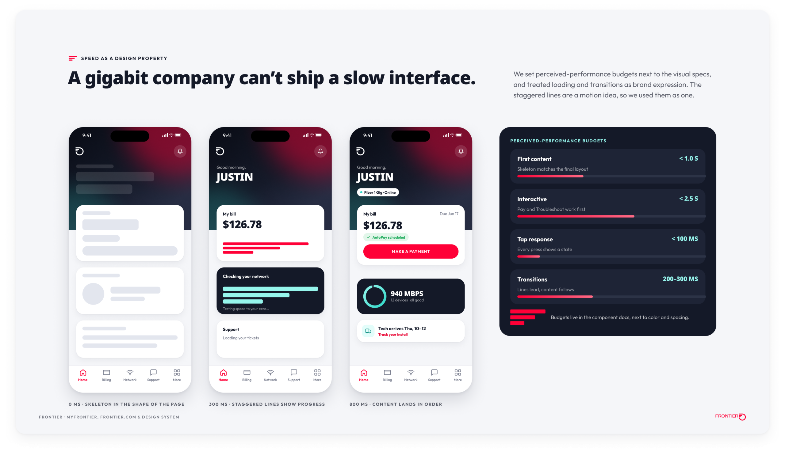
I led the product design team that carried the rebrand into the product ecosystem: the website, the app and the design system underneath both. A telecom brand isn’t built in advertising. It’s built in three moments: when you buy, when something breaks, and when the bill arrives. We had four design languages depending on where you landed and no shared system connecting them. So we built one from the ground up, then rebuilt Frontier.com and the MyFrontier app around those three moments instead of around the org chart. We also treated speed as a design property, with performance budgets set next to the visual specs.
What We Delivered
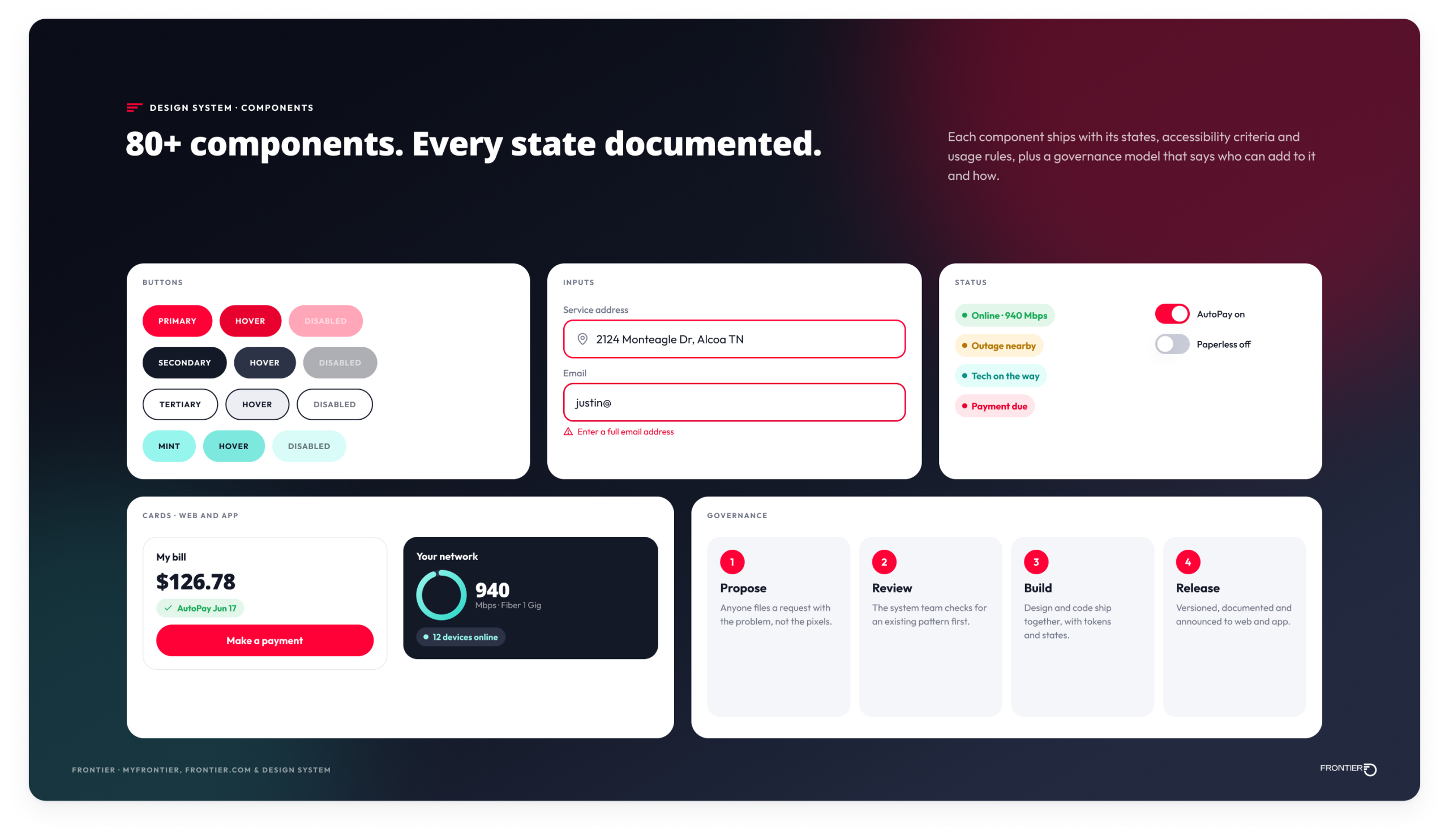
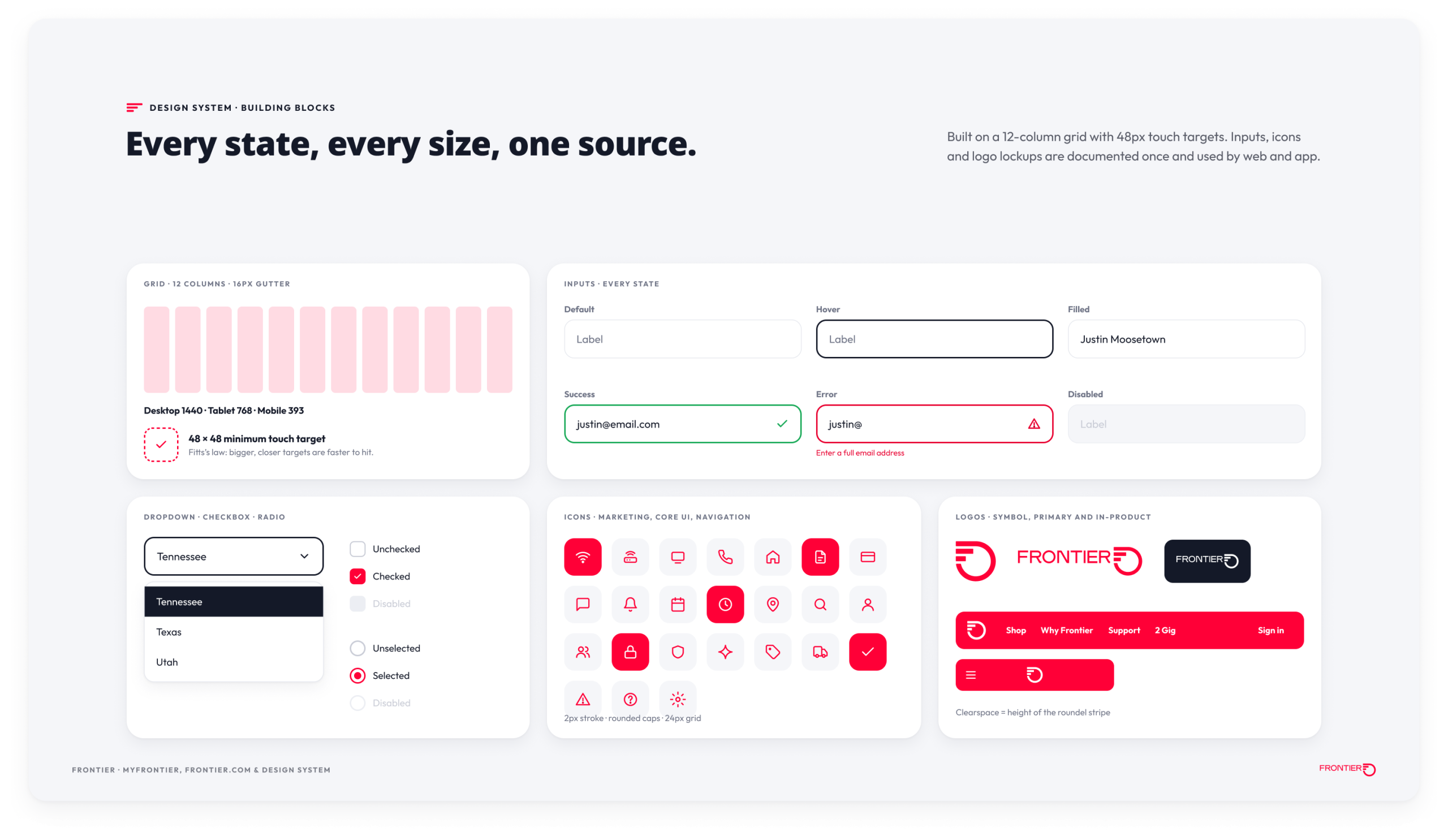
- The design system: 80+ components with semantic tokens, documented states, accessibility criteria in every definition, and a governance model that keeps one-off screens from creeping back.
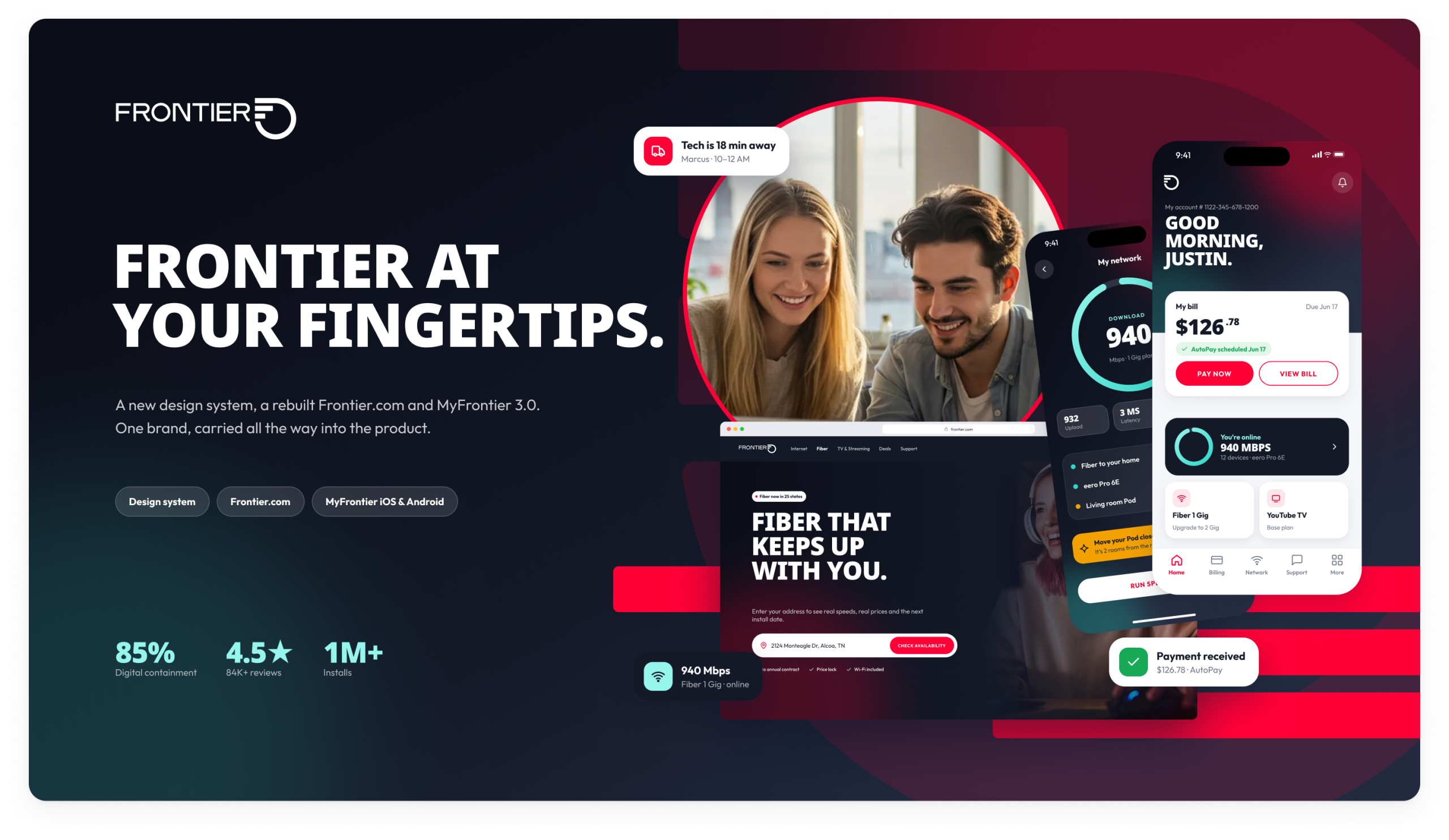
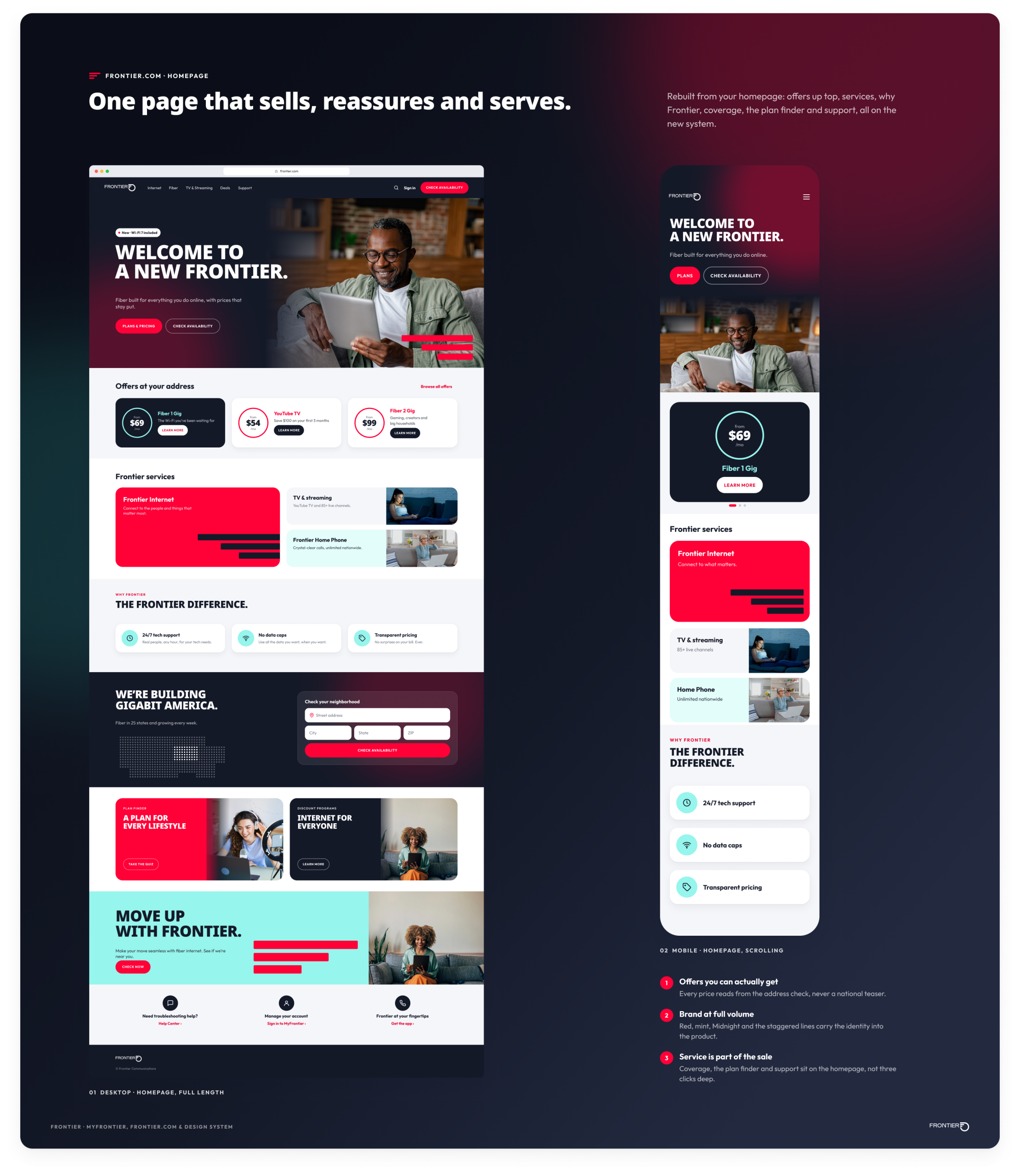
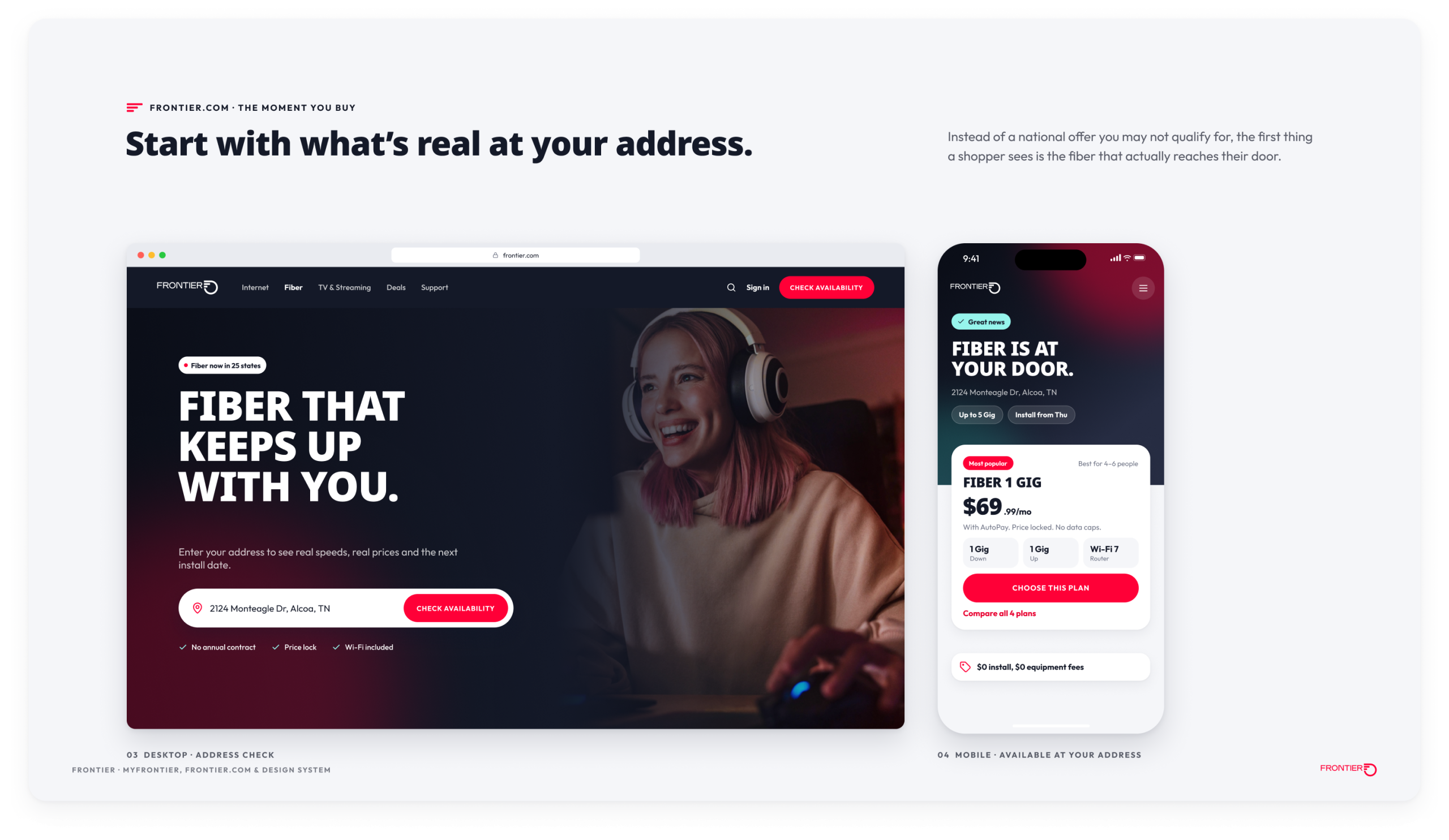
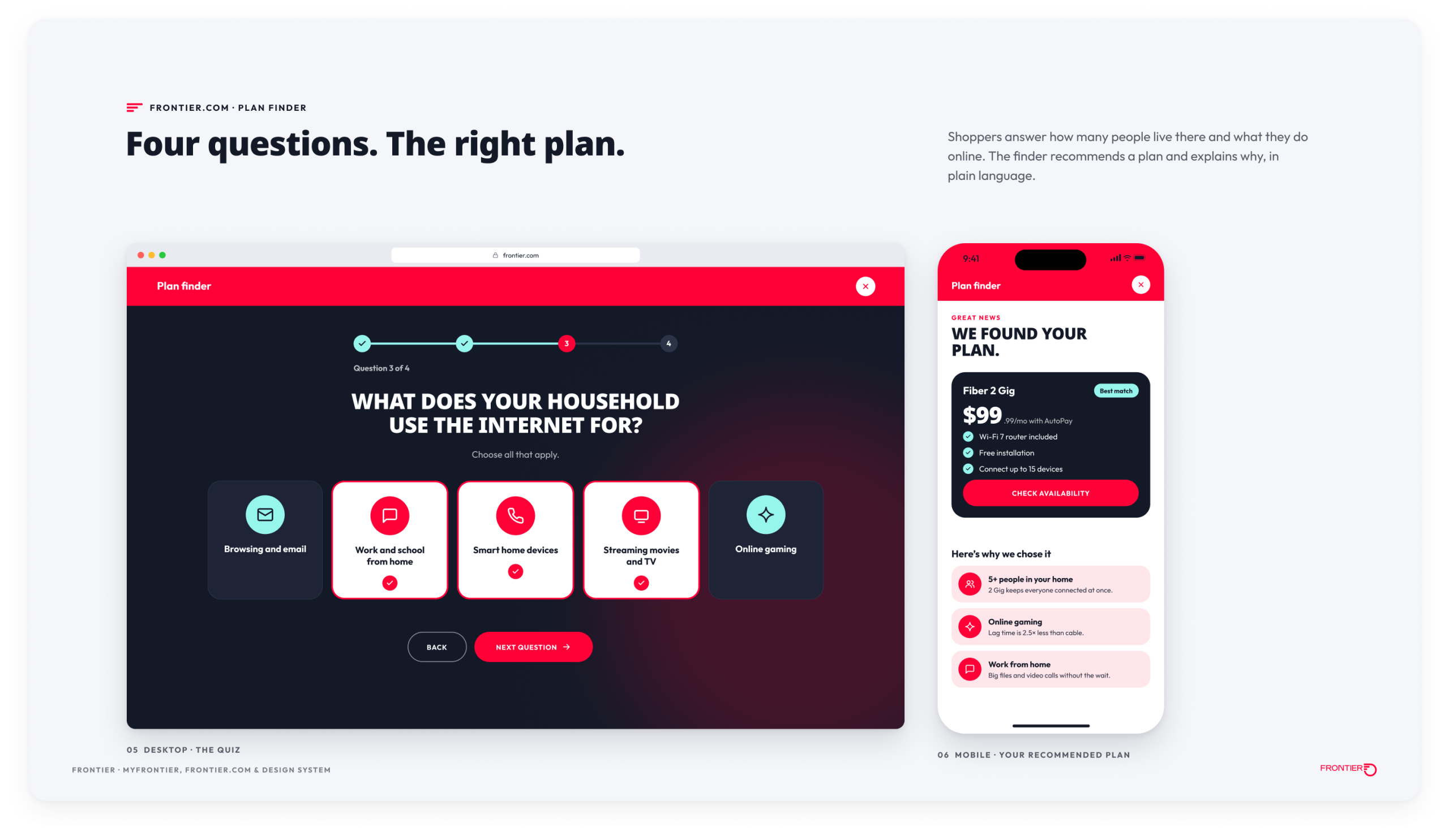
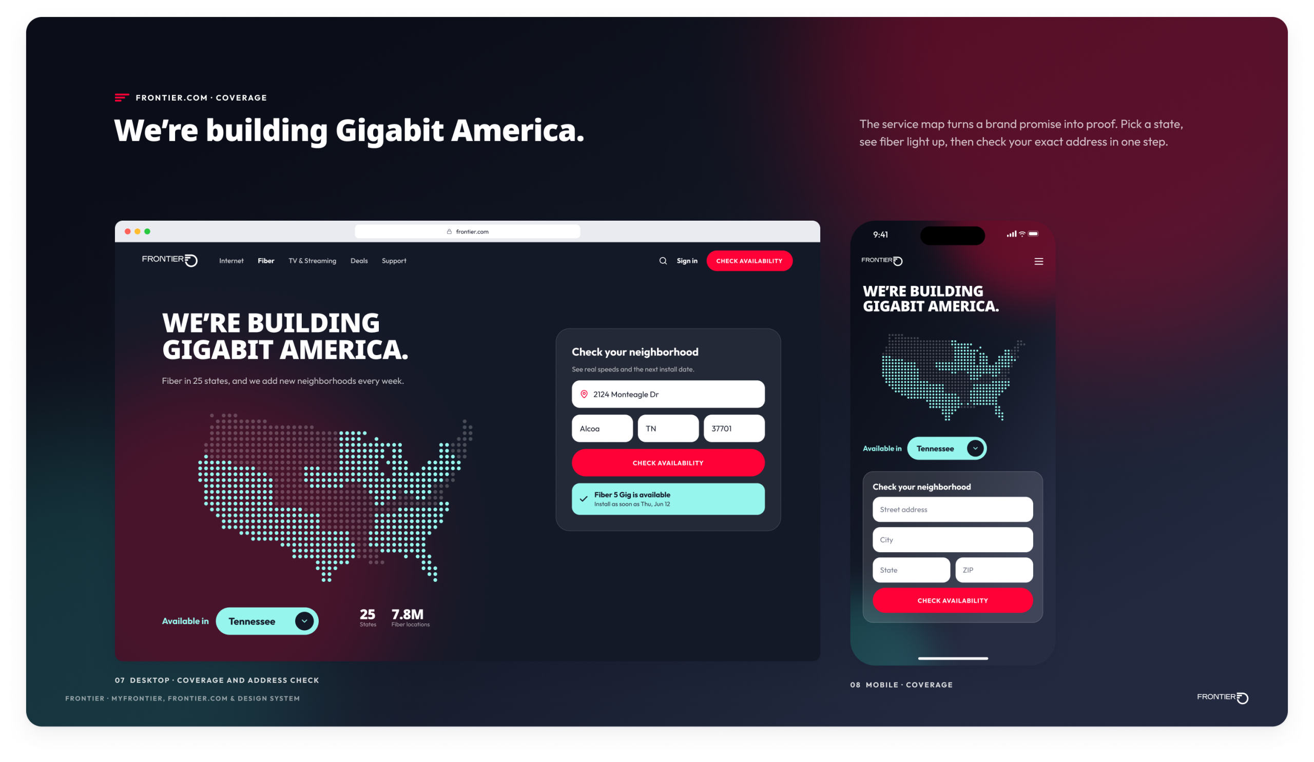
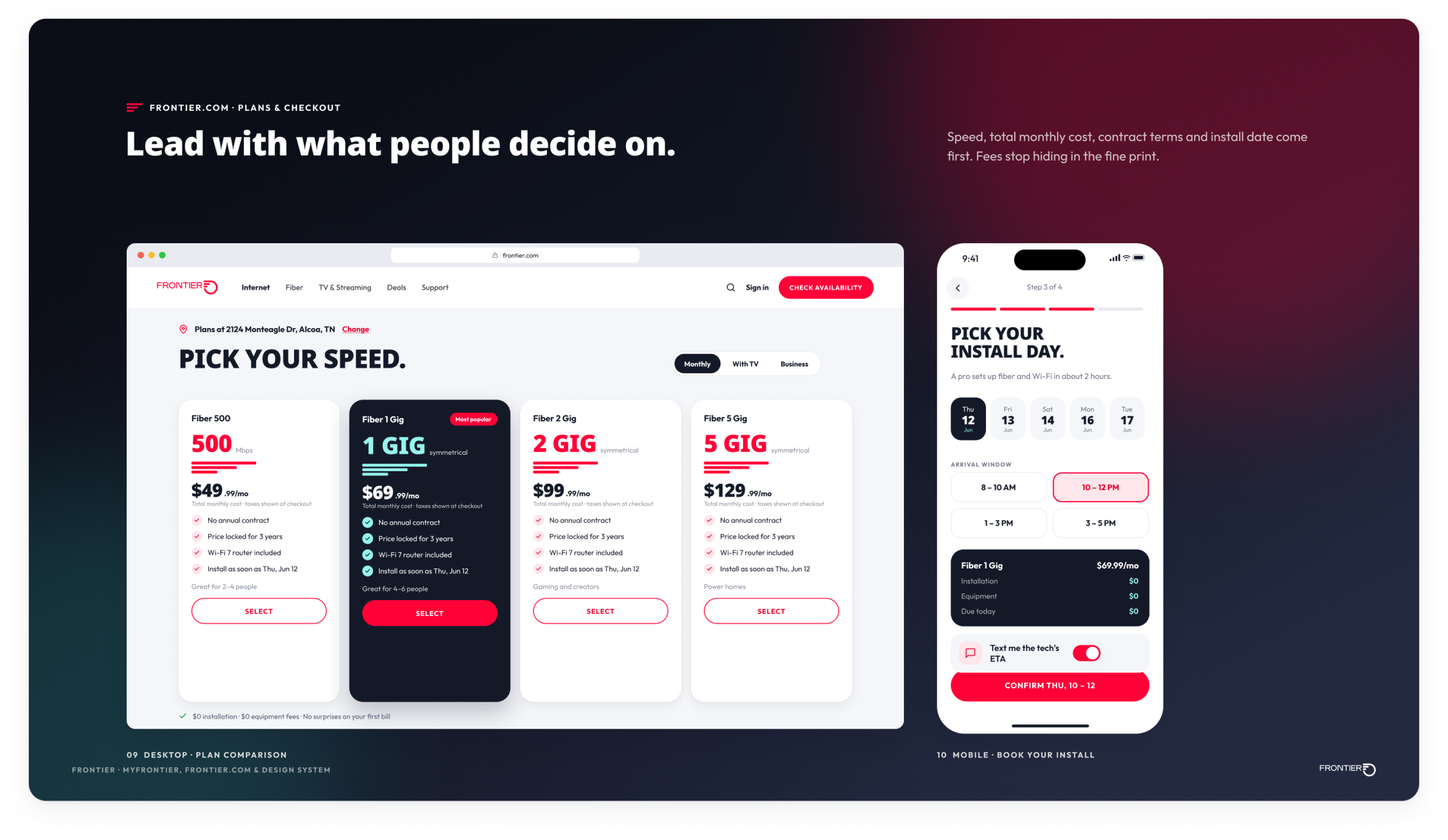
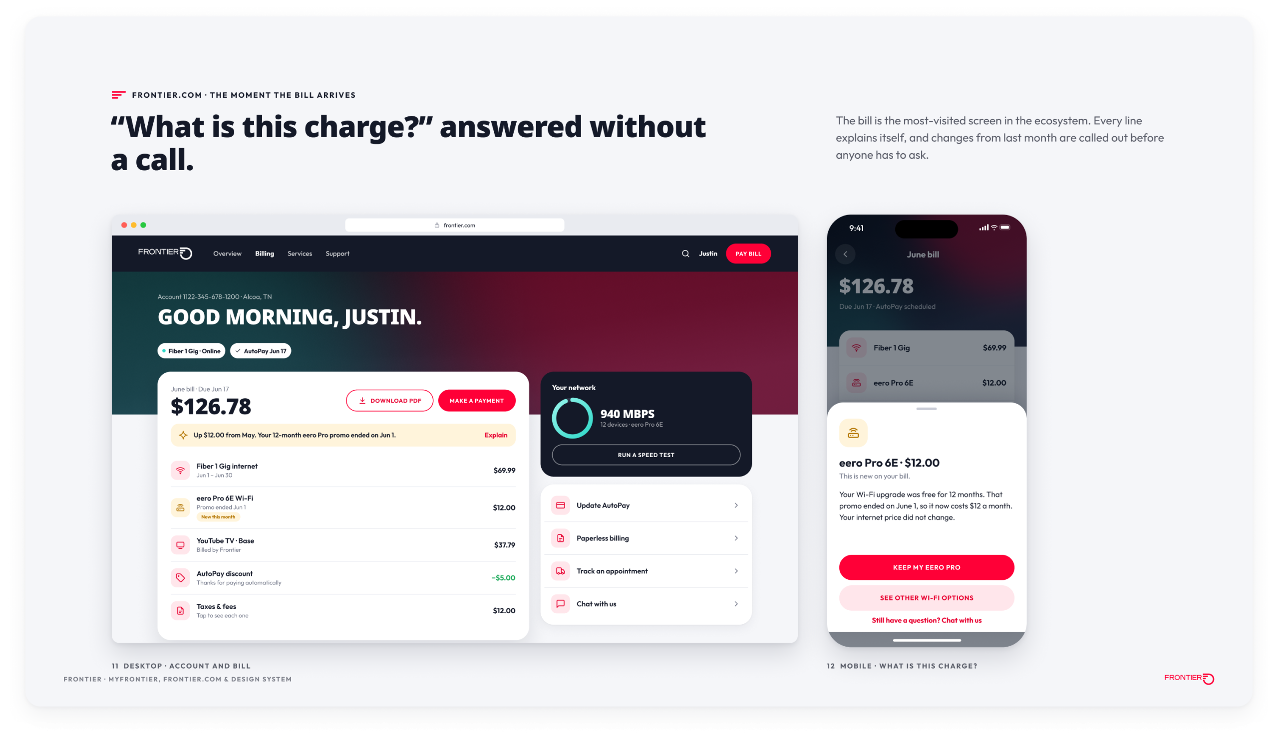
- Frontier.com: address-first shopping, a plan comparison that leads with speed, total cost, terms and install date, and an account experience where “what is this charge” is answerable without a call.
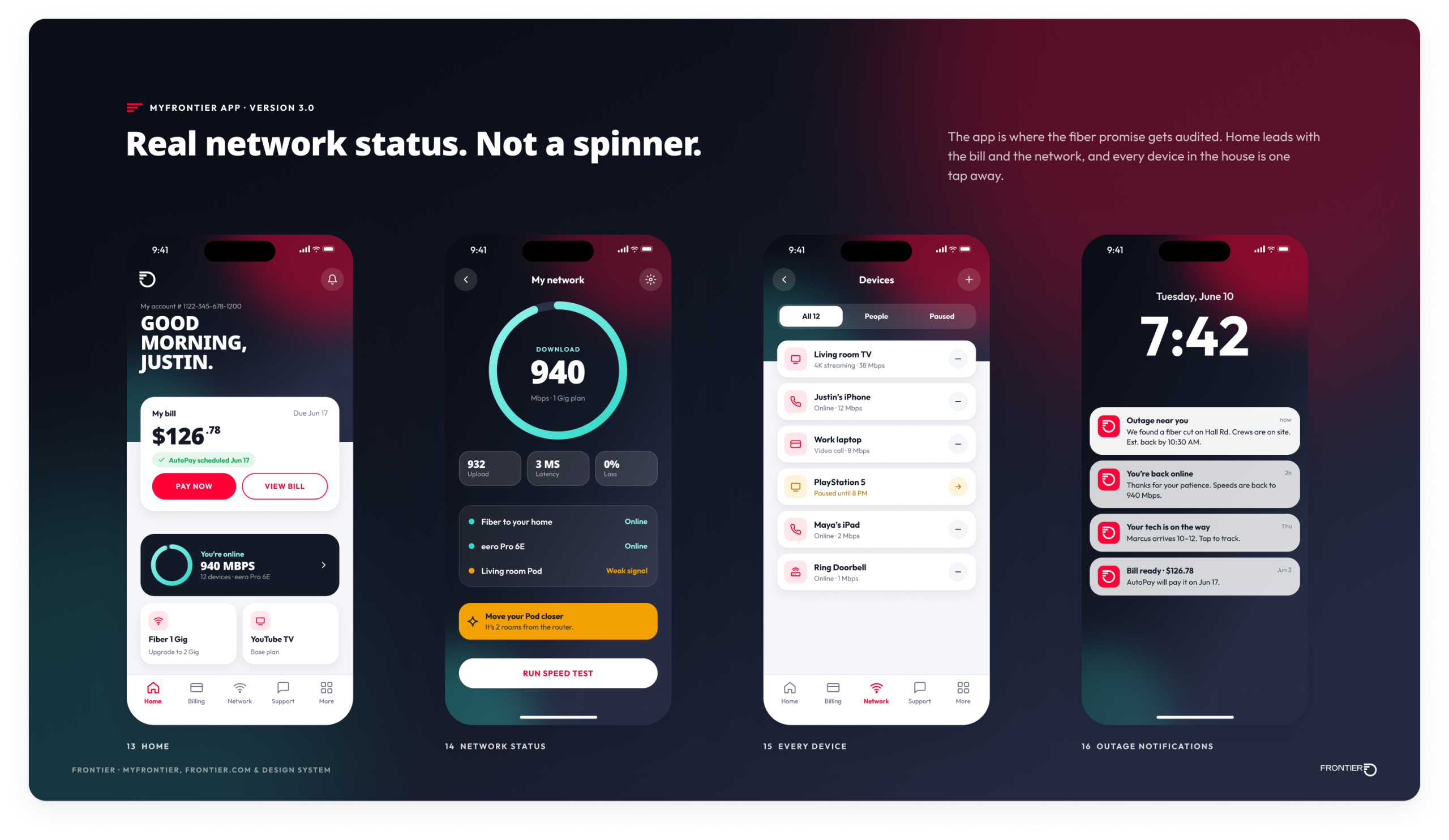
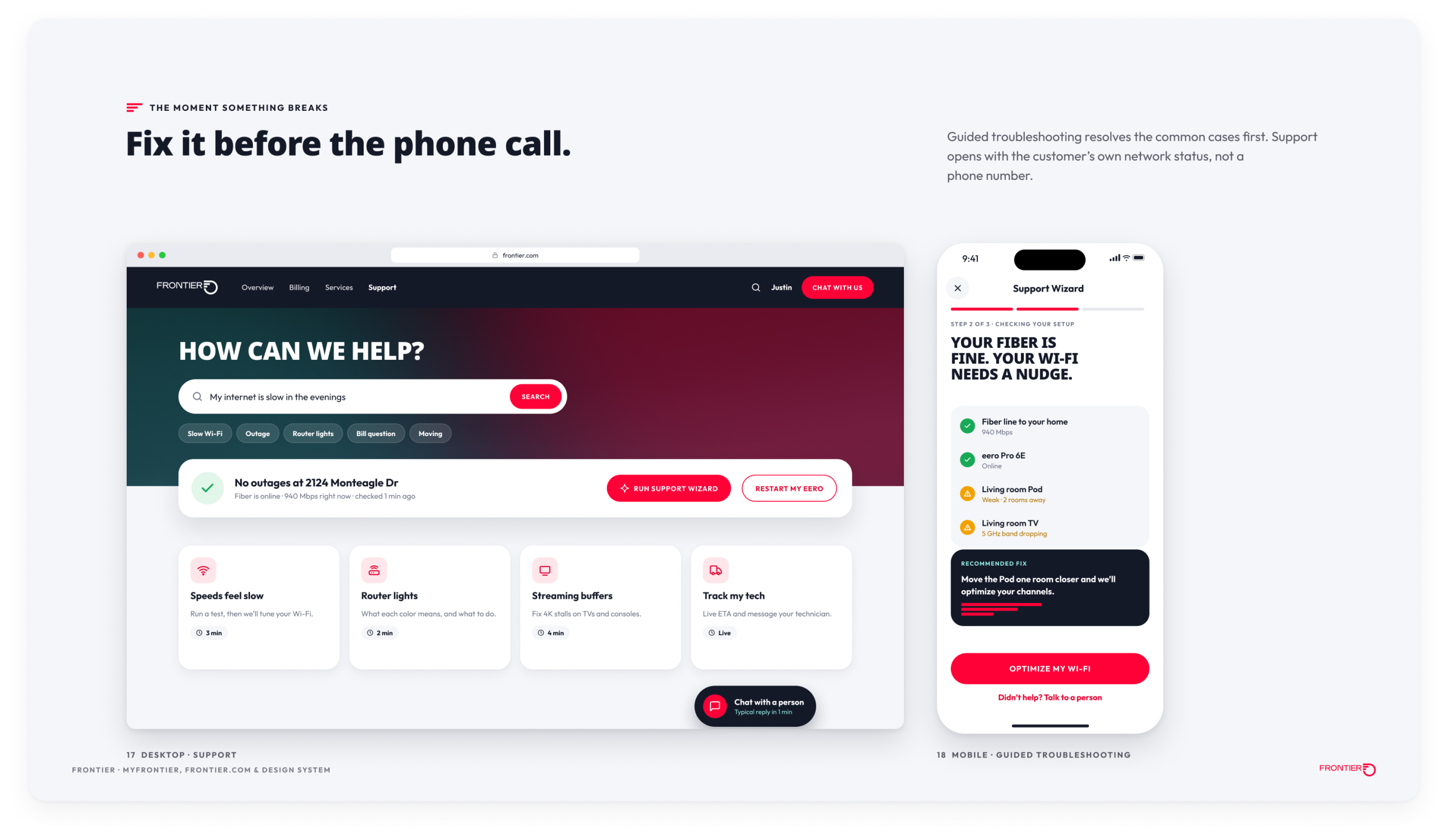
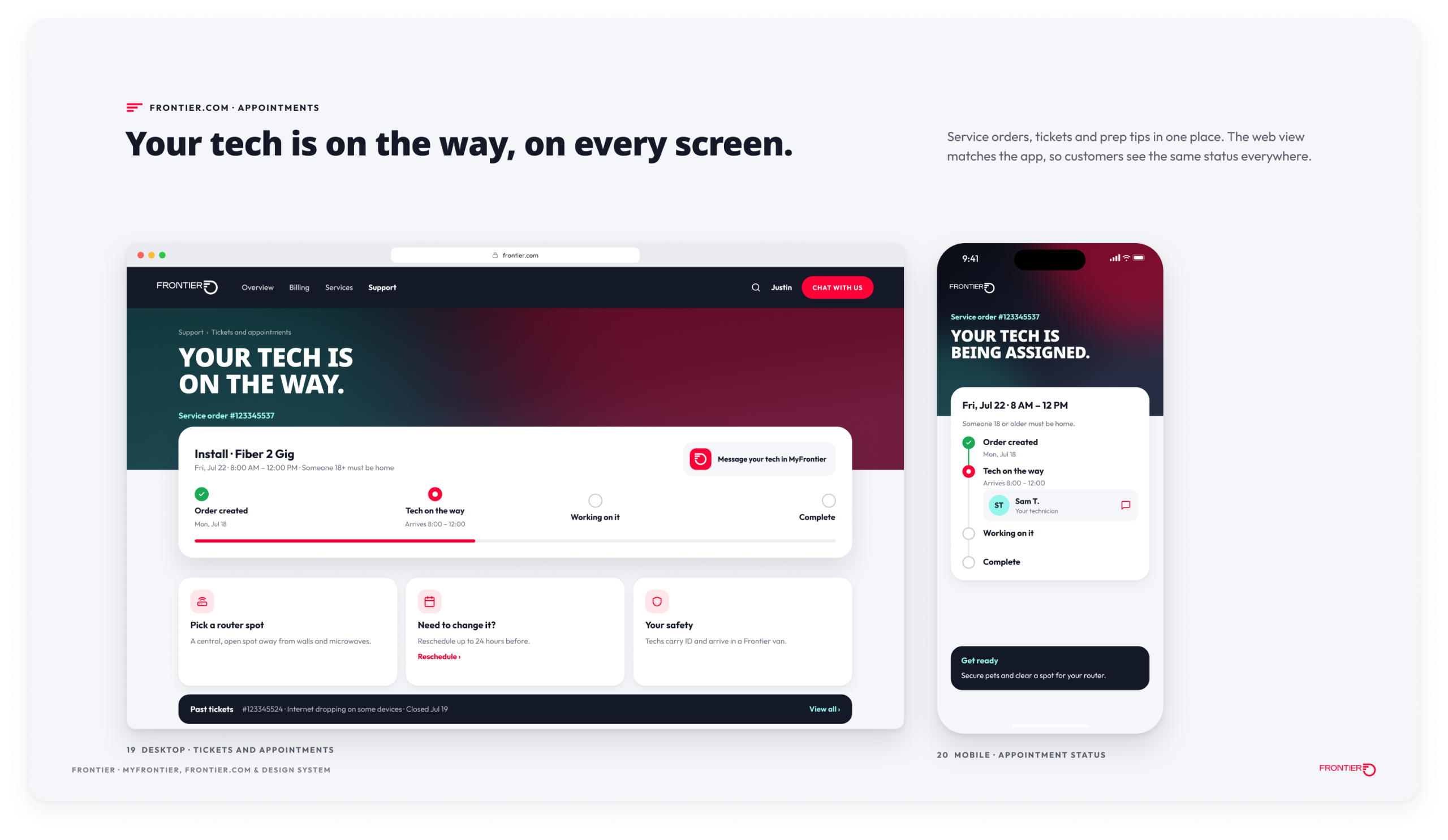
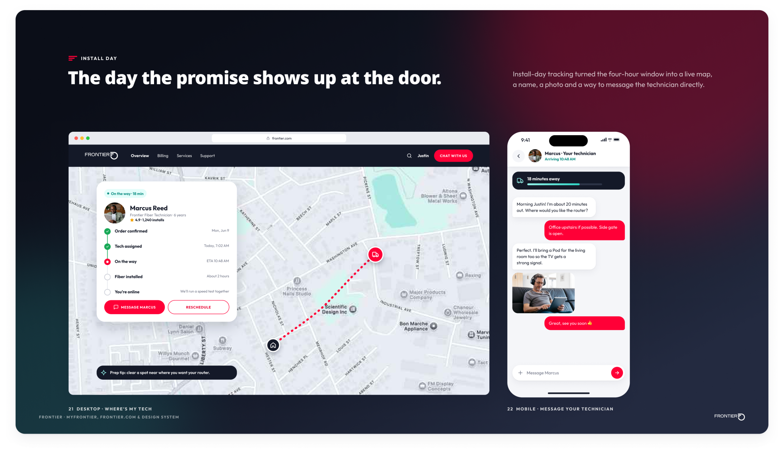
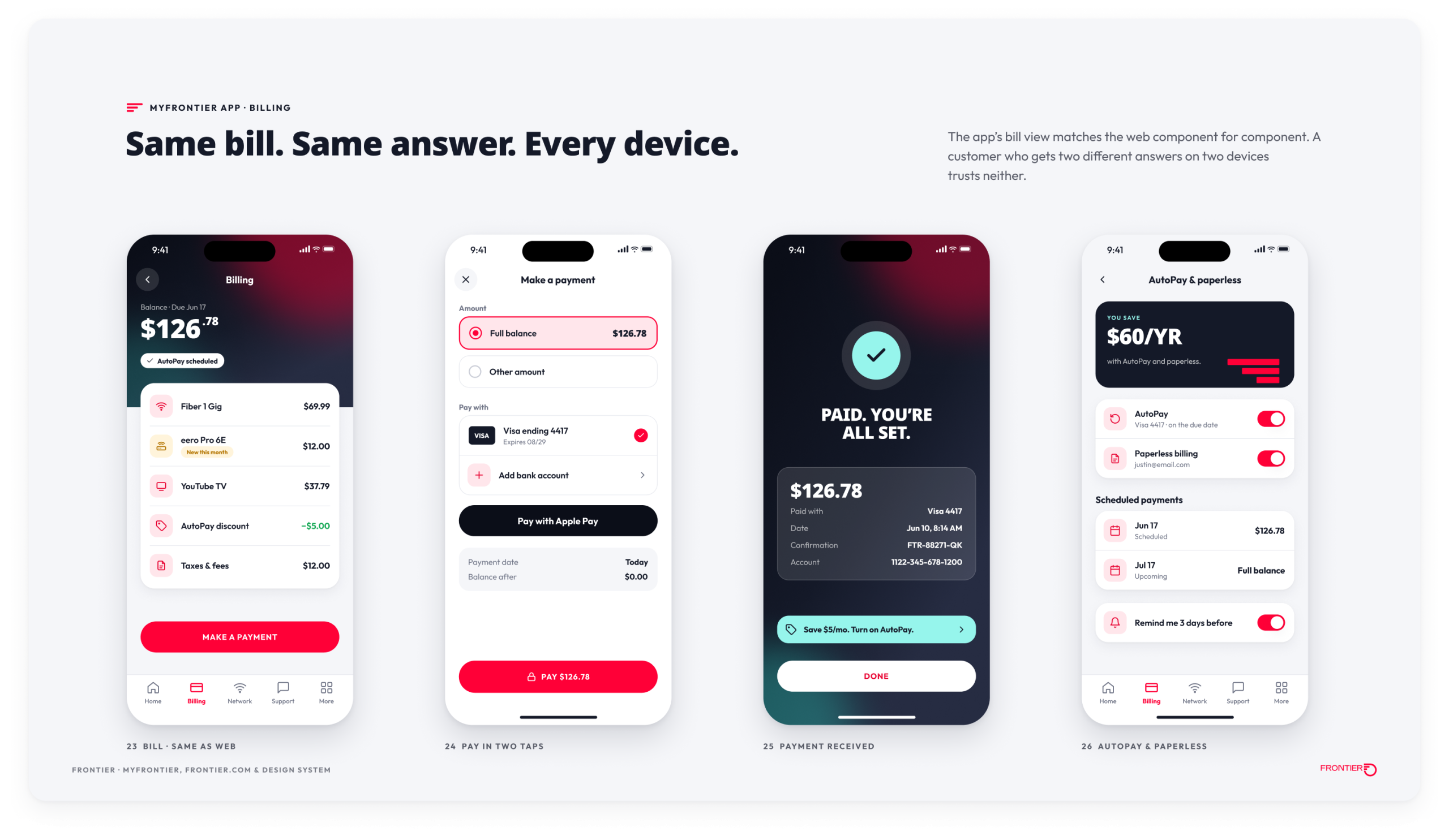
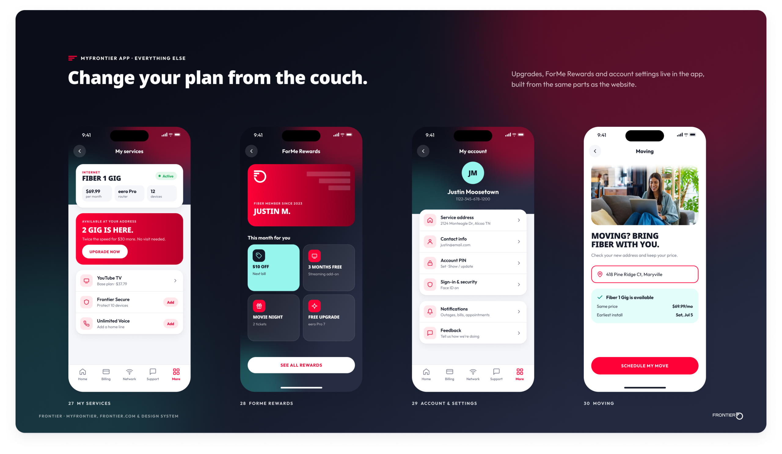
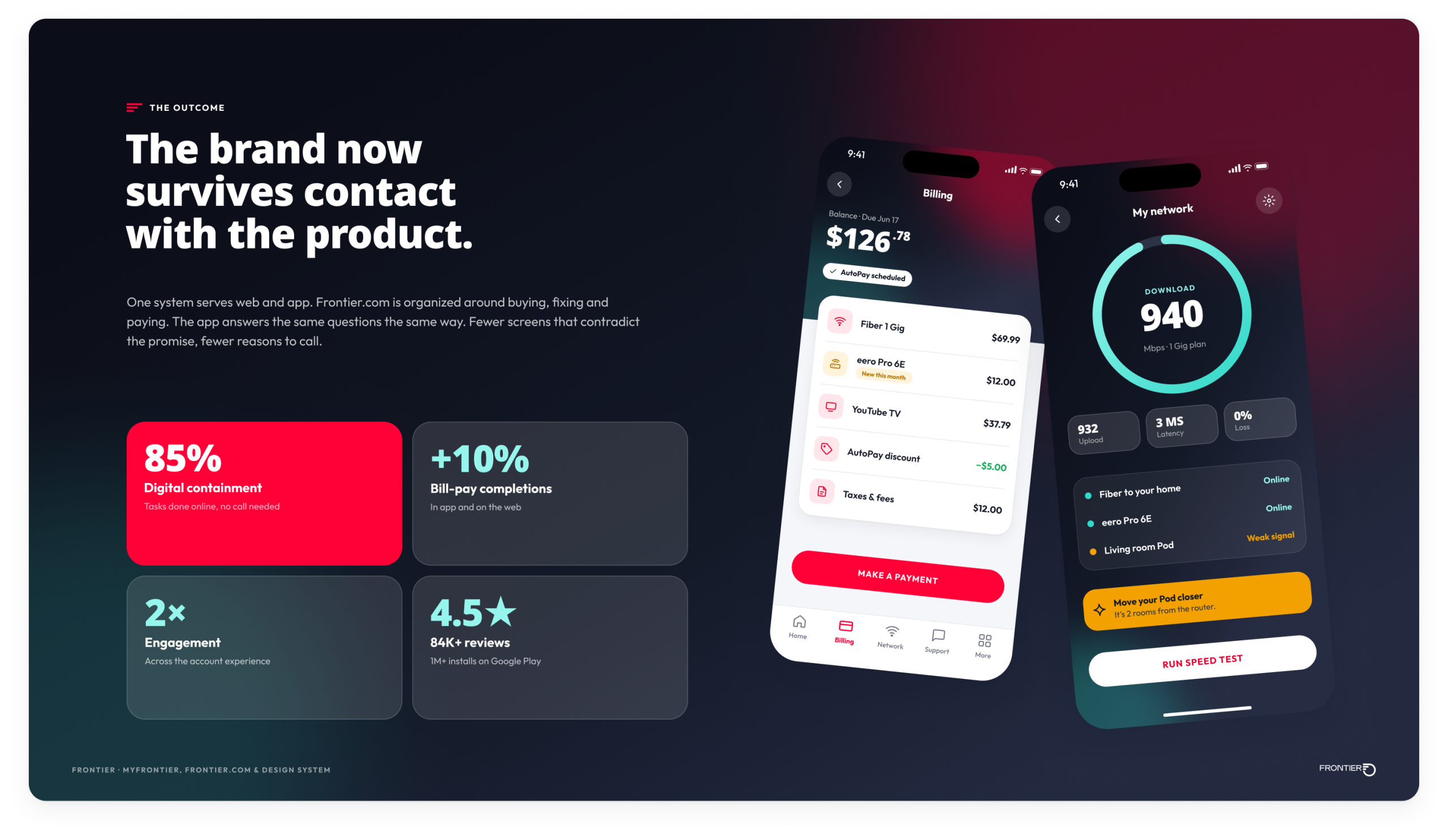
- MyFrontier 3.0: real network status, guided troubleshooting, install-day tracking, outage notifications, and a bill that matches the web component for component.
The results: 85% digital containment, bill-pay completions up 10%, self-service conversions up as much as 5%, and engagement doubled across the account experience. The app holds a 4.5-star rating across more than 84,000 Google Play reviews, with over a million installs.