Samsung Collateral Rebranding
Client
Samsung
Category
Branding, Print, StrategyAbout This Project
The Setup
Samsung’s collateral needed a single, repeatable design language instead of one-off pieces. Spec sheets, product guides, ads and digital banners were being built piece by piece, so the same product could look different from one channel to the next.
What I Led
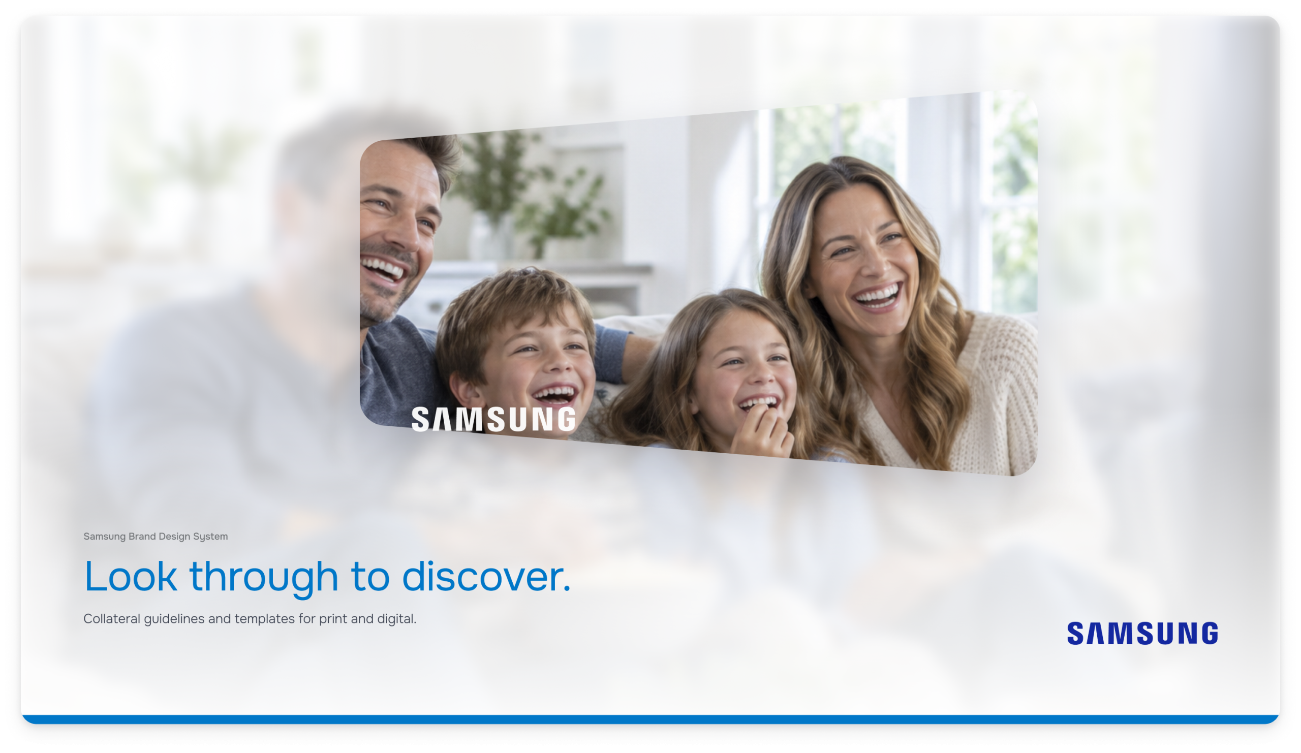
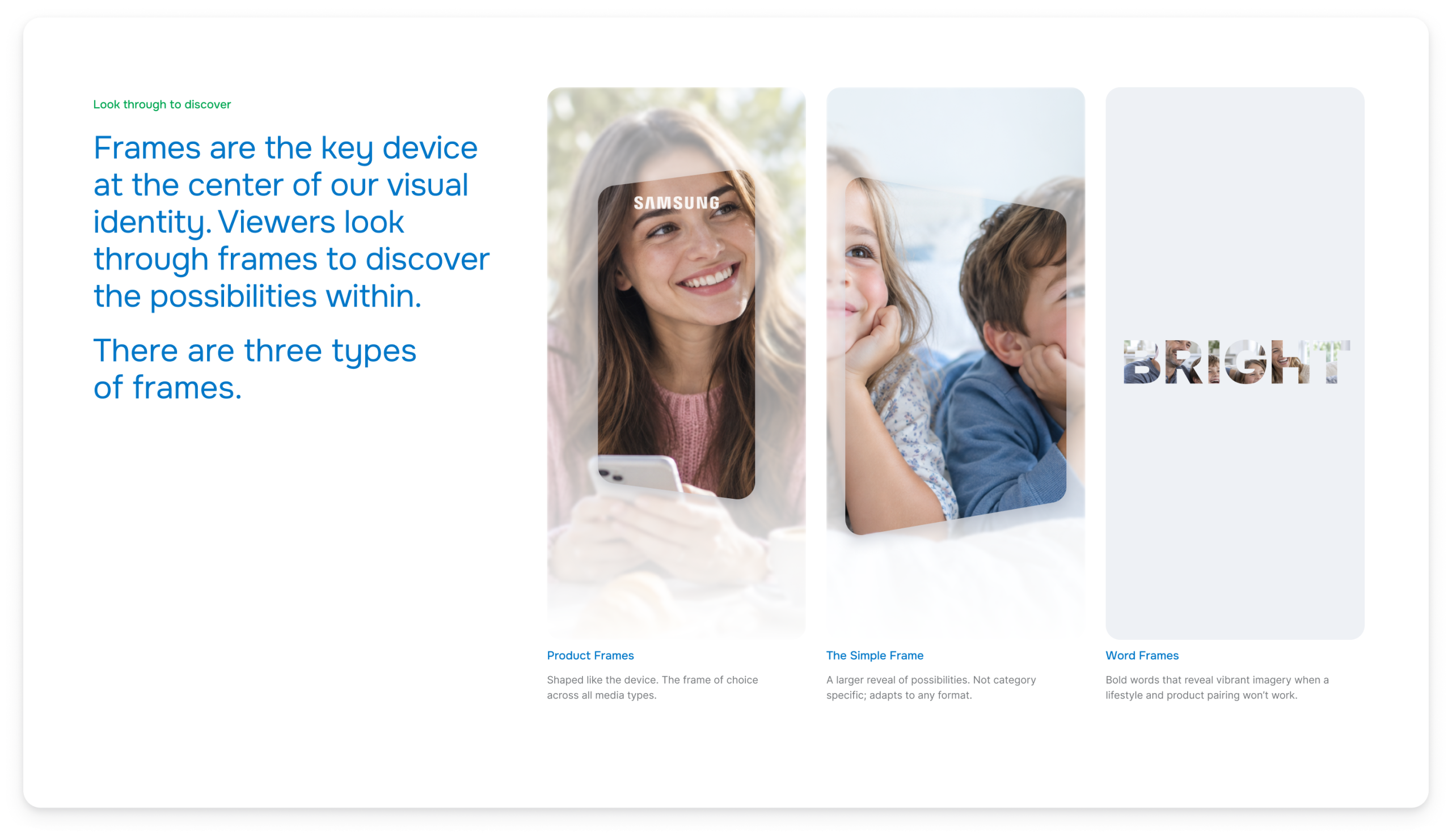
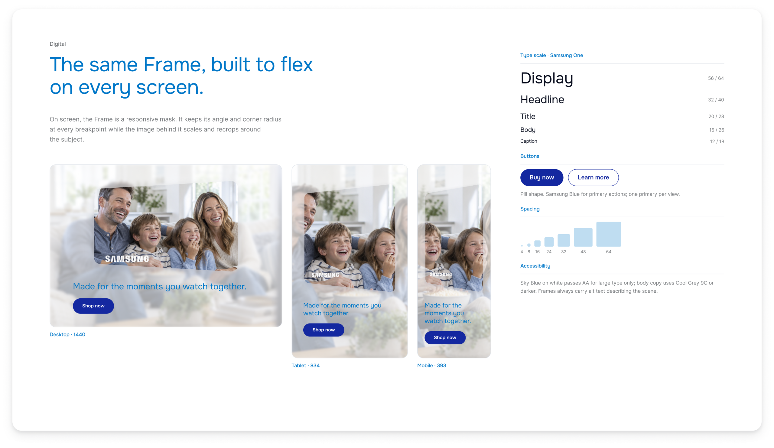
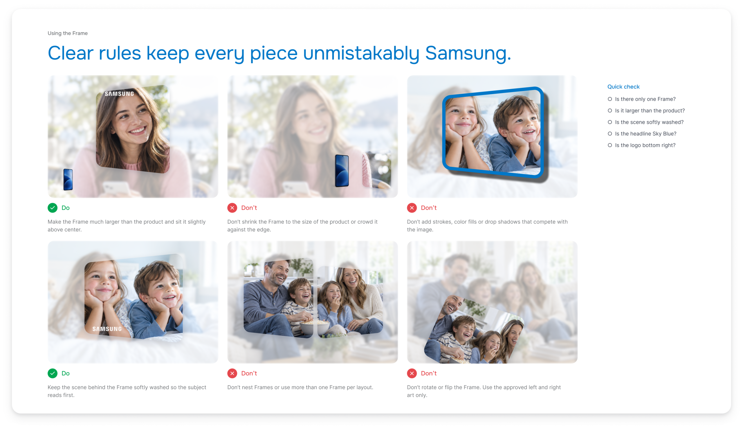
I led the collateral rebranding and the template creation that came with it. I built the work around the brand’s central idea, the Frame, which viewers look through to discover the possibilities within. I turned it into rules anyone could follow: where the Frame sits, how large it runs against the product, how the image behind it is washed and faded, and how headline, body copy, logo and footer band lock into place. From there I designed the templates for print and digital, so a new spec sheet, guide page, email or banner starts from an approved layout instead of a blank page.
What We Delivered
We delivered a rebranded collateral system and templates, which became the foundation of the new Samsung Brand Design System.
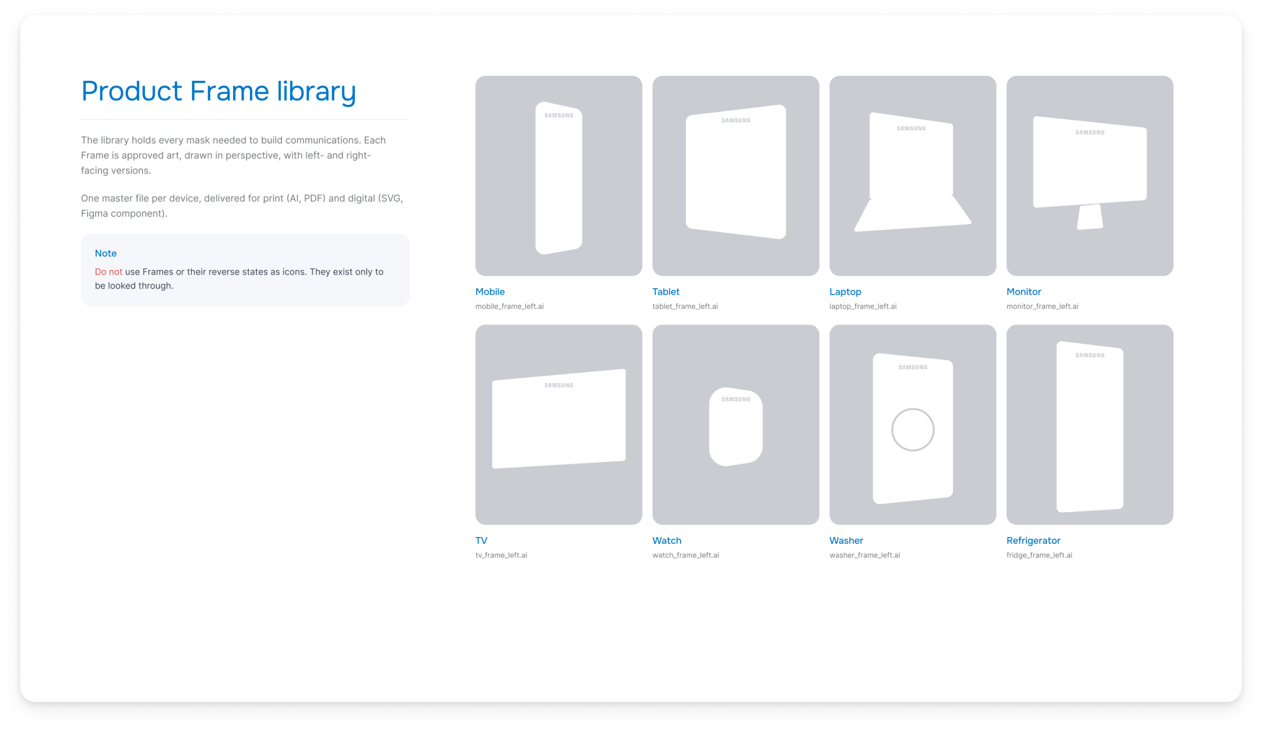
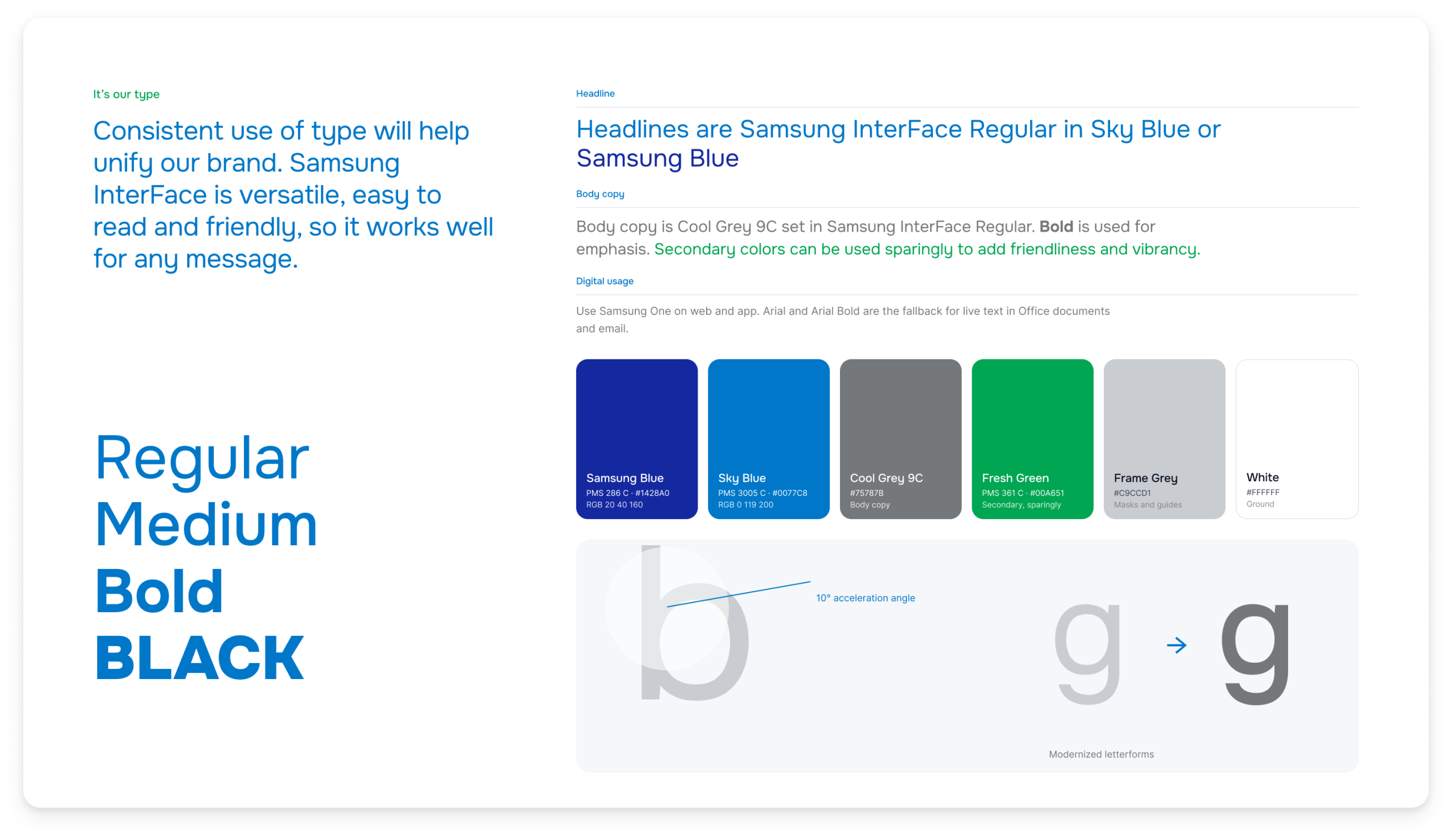
Brand guidelines. Guidelines covering the Frame system, the Product Frame library, typography, color and usage rules.
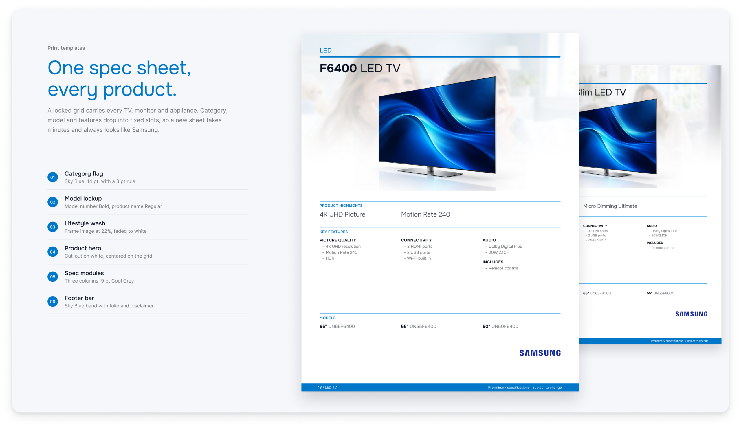
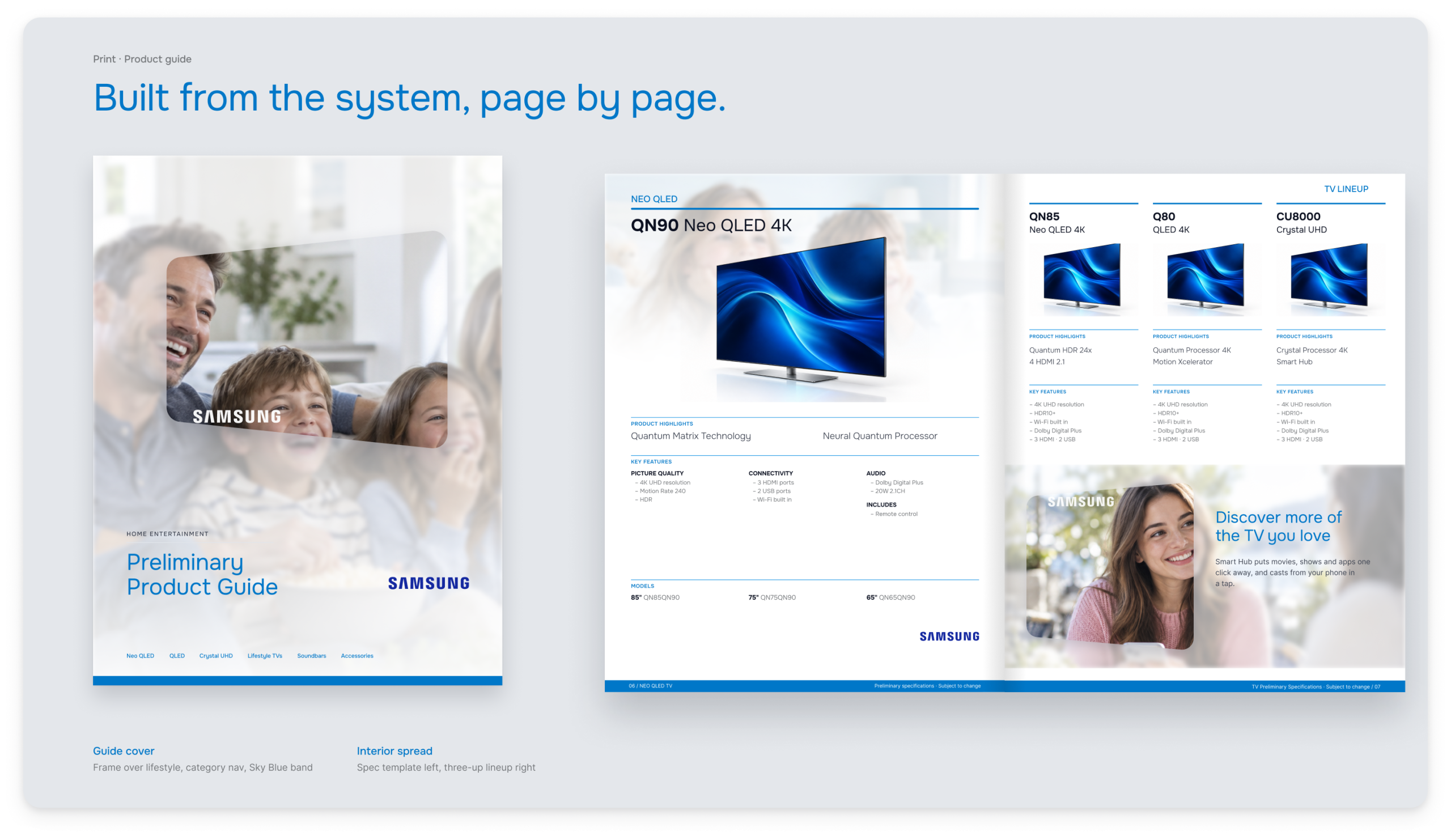
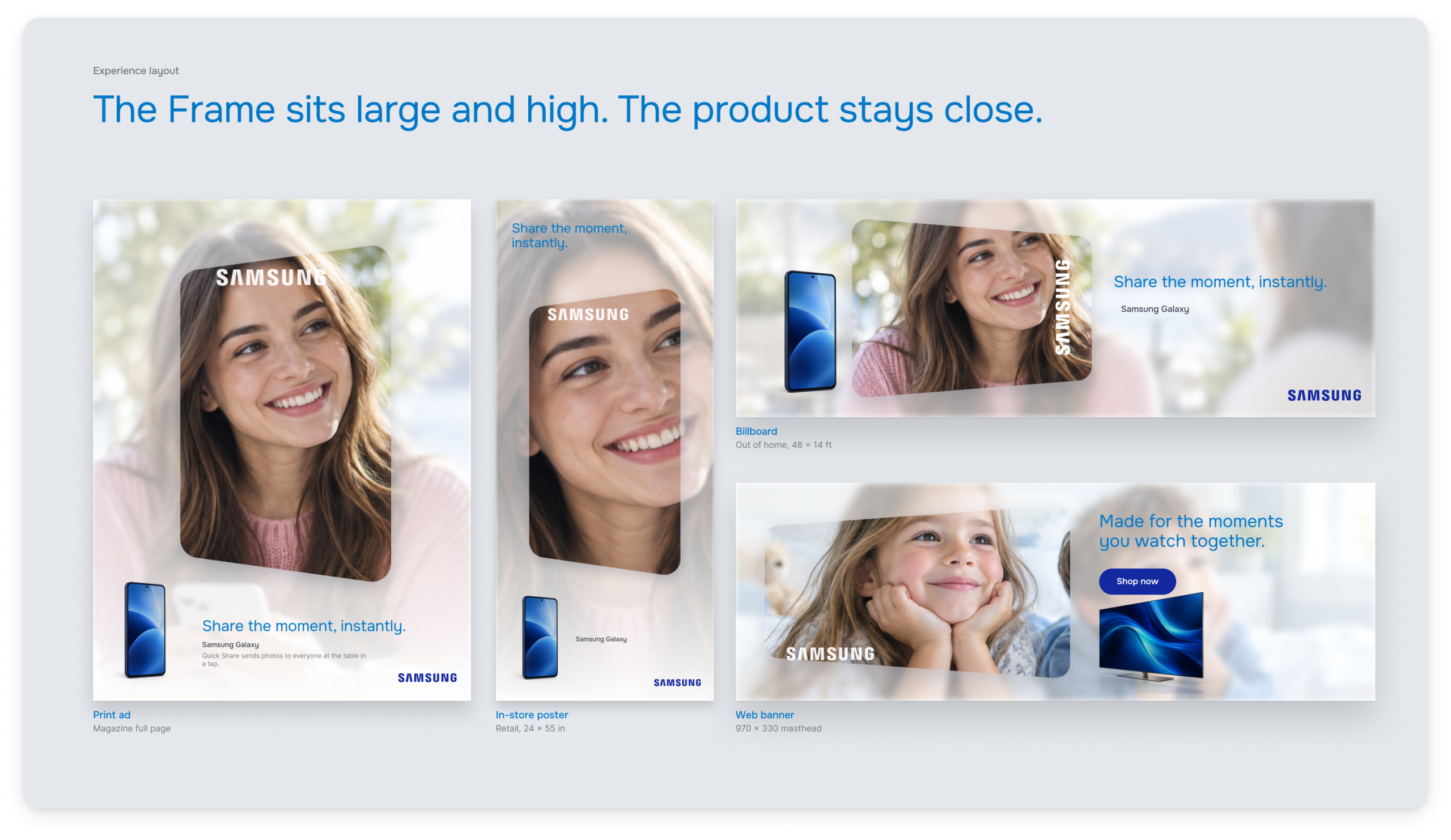
Print and Experience templates. Print templates for spec sheets and product guides, and Experience layouts for print, retail and out-of-home.
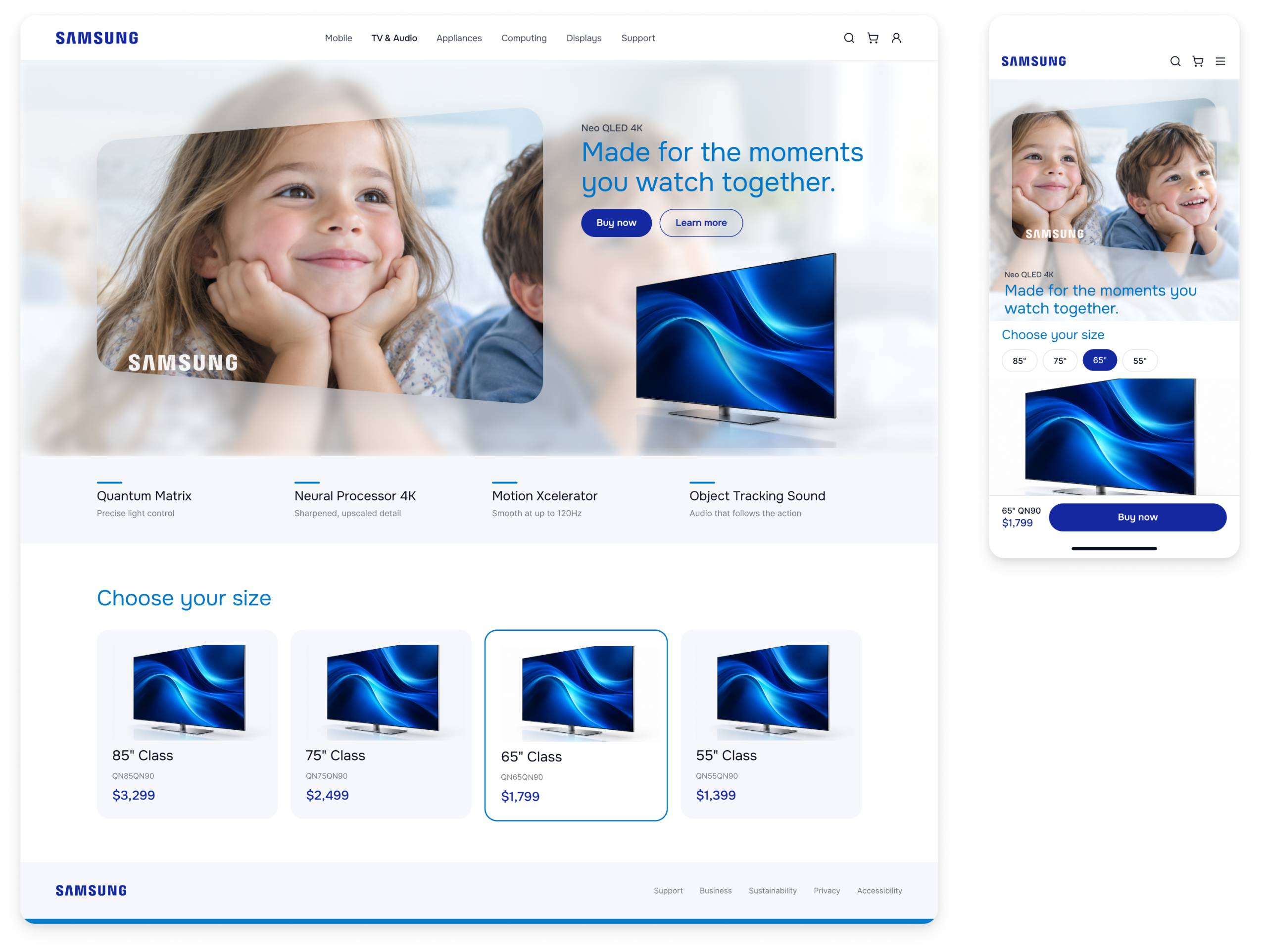
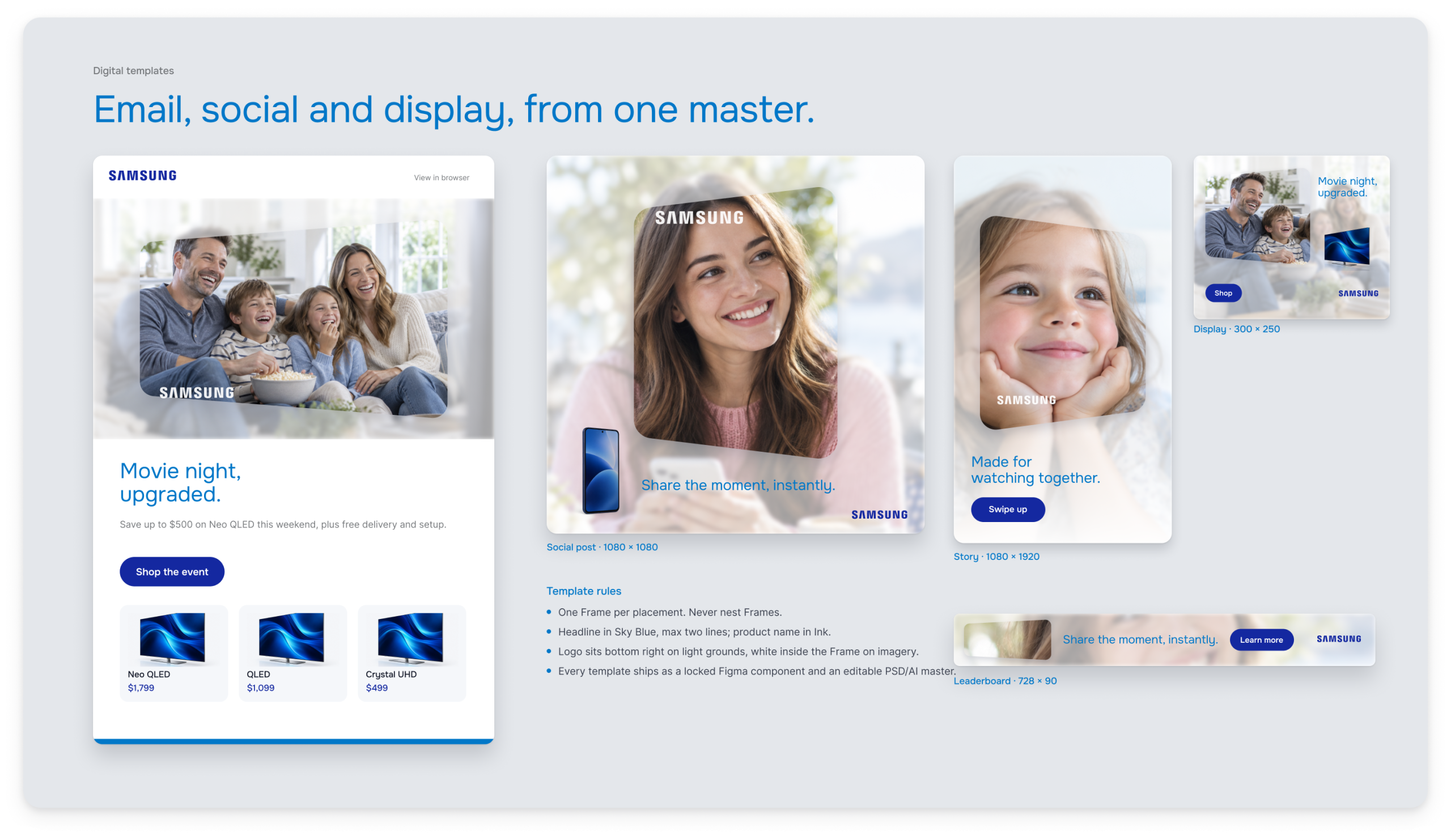
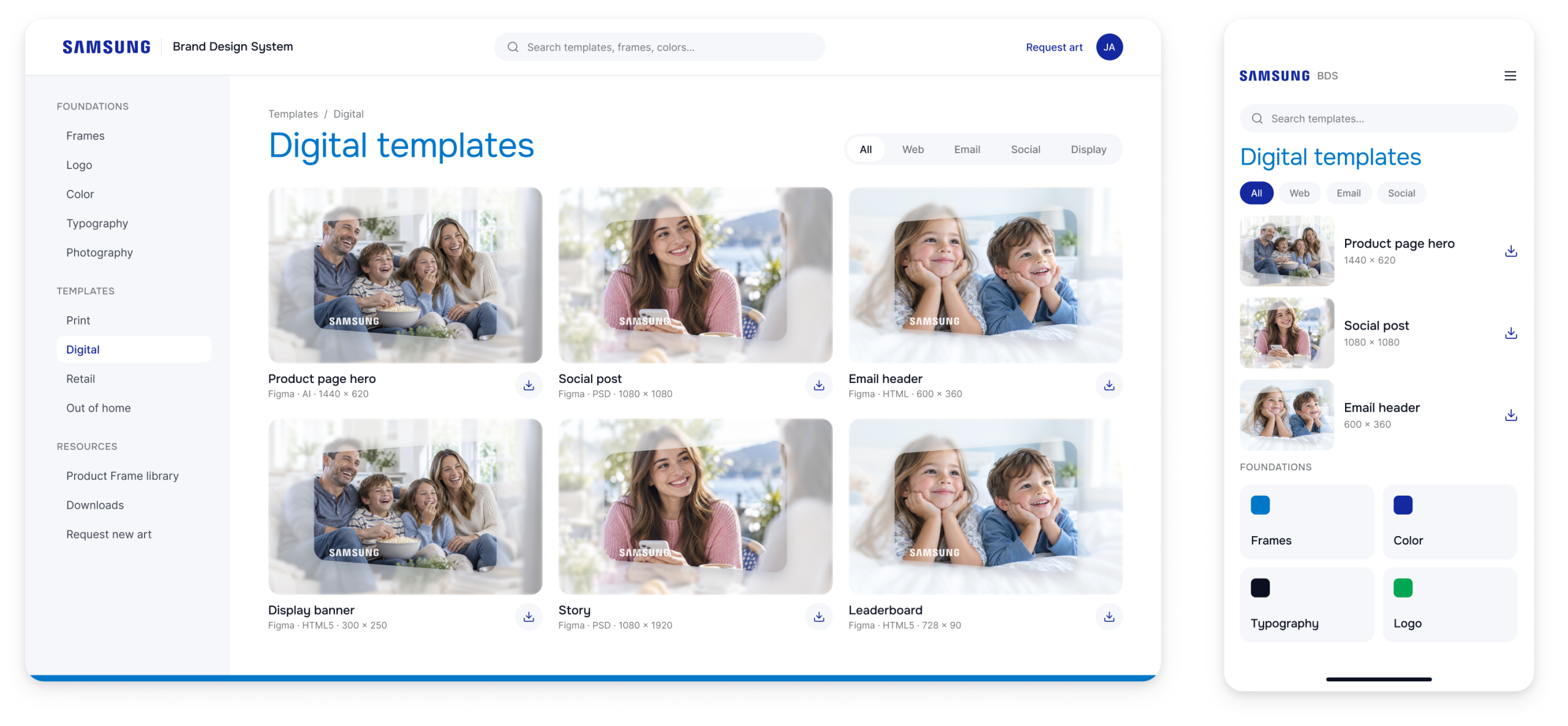
Digital templates, in one portal. Responsive web, email, social and display templates, all published to one portal where teams can find and download them.