G-Shock 30th Anniversary × Eminem
Category
Experiential, WebAbout This Project
Setup
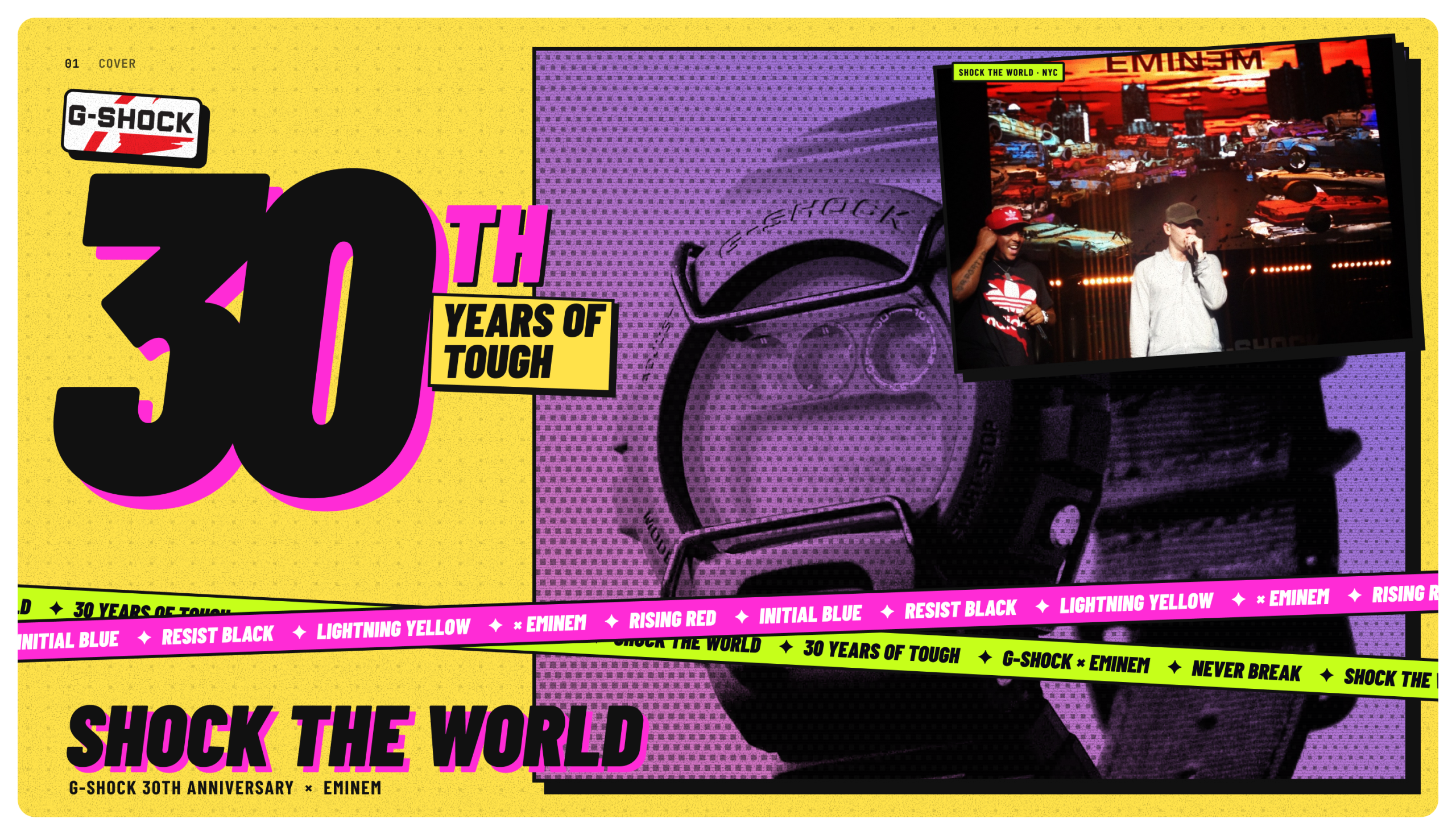
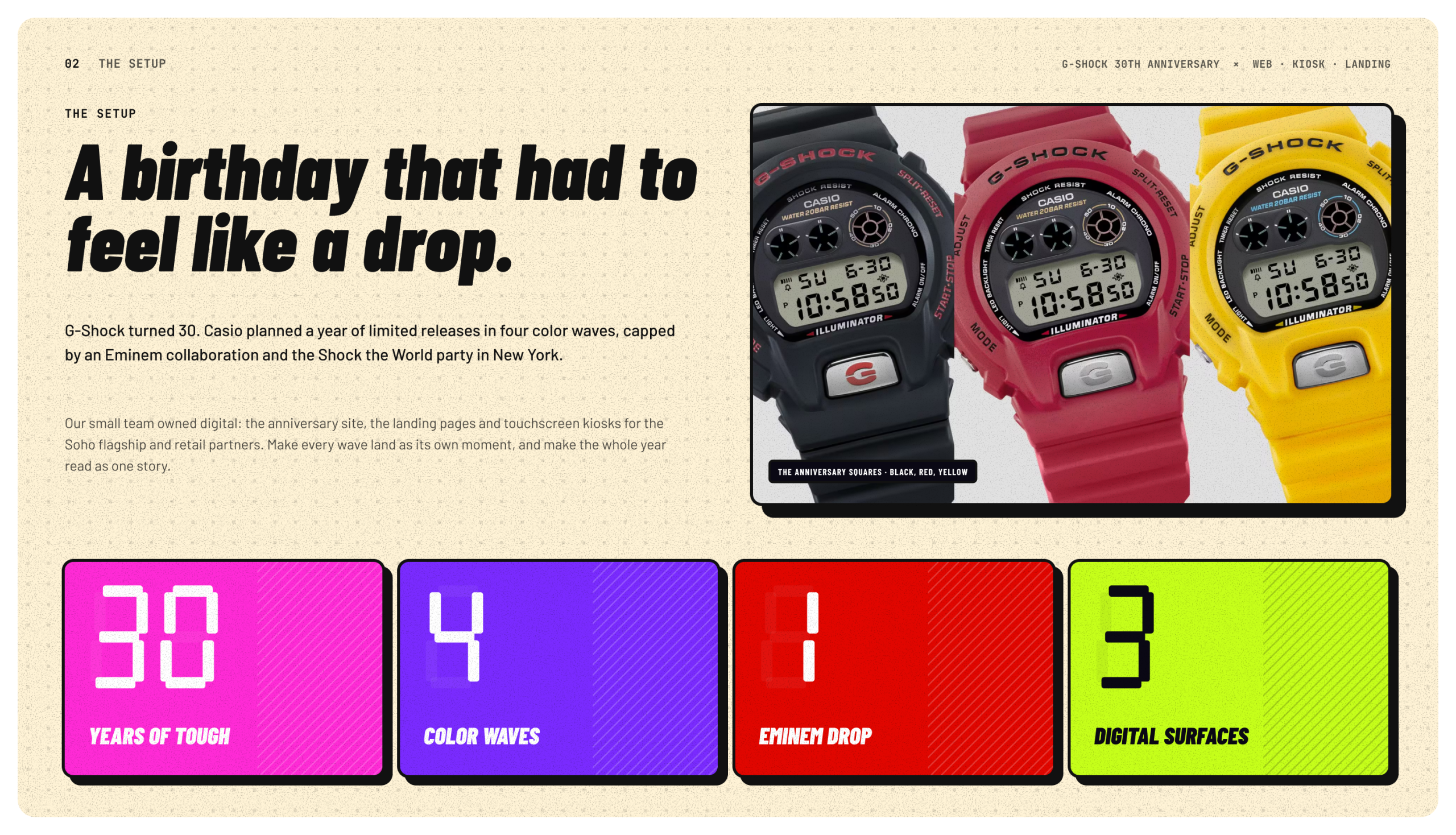
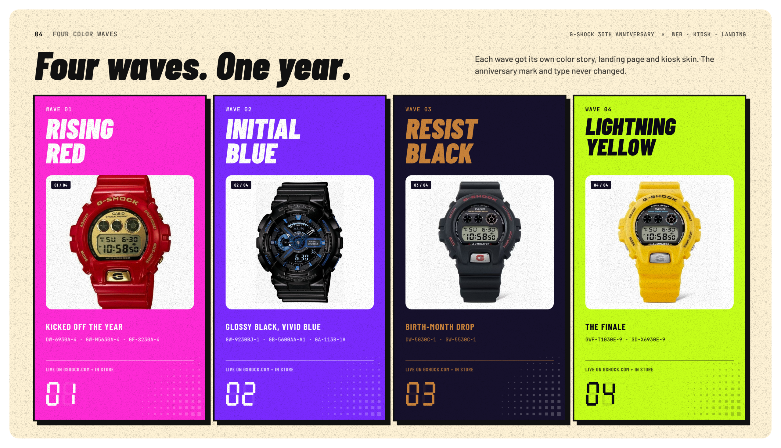
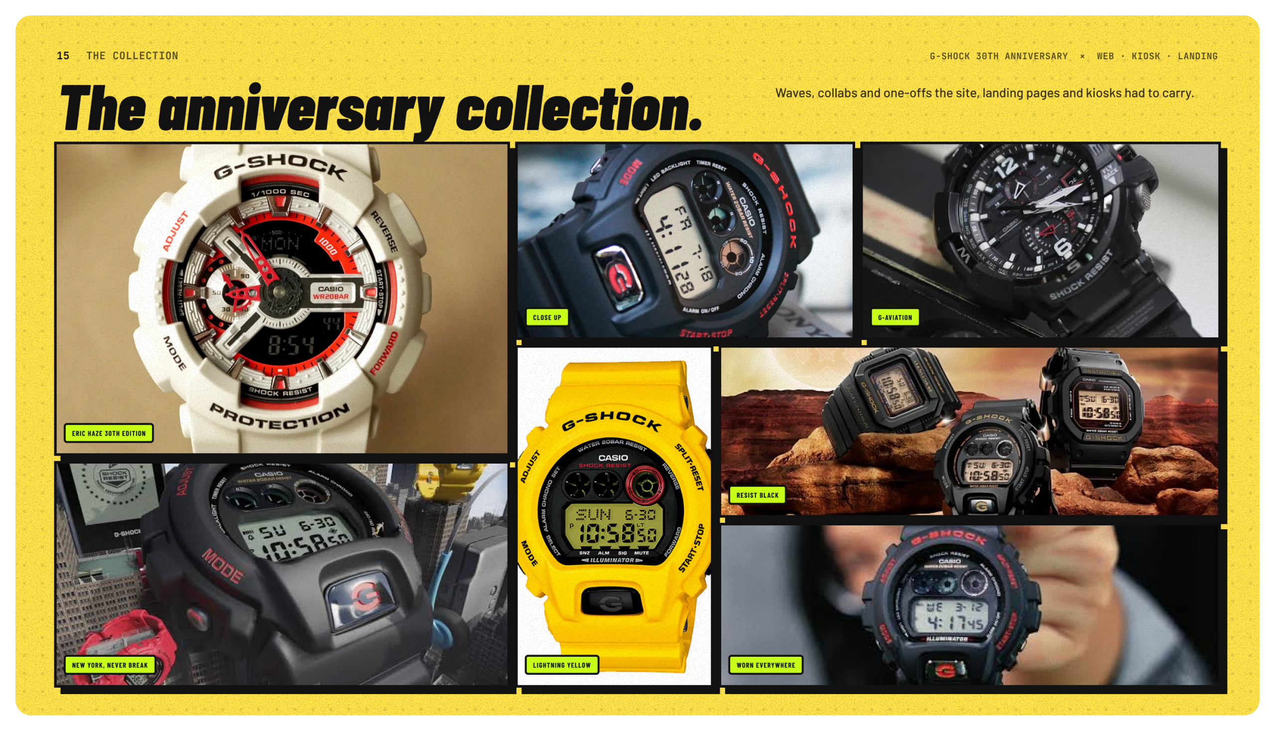
G-Shock turned 30, and Casio treated it like a year-long drop. They released limited editions in four color waves: Rising Red, Initial Blue, Resist Black and Lightning Yellow. Every anniversary piece carried a case back stamped with Eric Haze’s 30th anniversary mark. The headline moment was a collaboration with Eminem, announced on August 7th with an unforgettable exclusive performance at G-Shock’s Shock The World event in New York City. The watch didn’t go on sale until December.
We were asked to concept the digital layer for the anniversary: the website, landing pages and in-store kiosks. The challenge was keeping people’s attention for a whole year. Each wave had to land as its own moment, the Eminem watch had a four-month gap between announcement and sale, and the website, the store floor and the launch night had to feel like one story.
What I Led
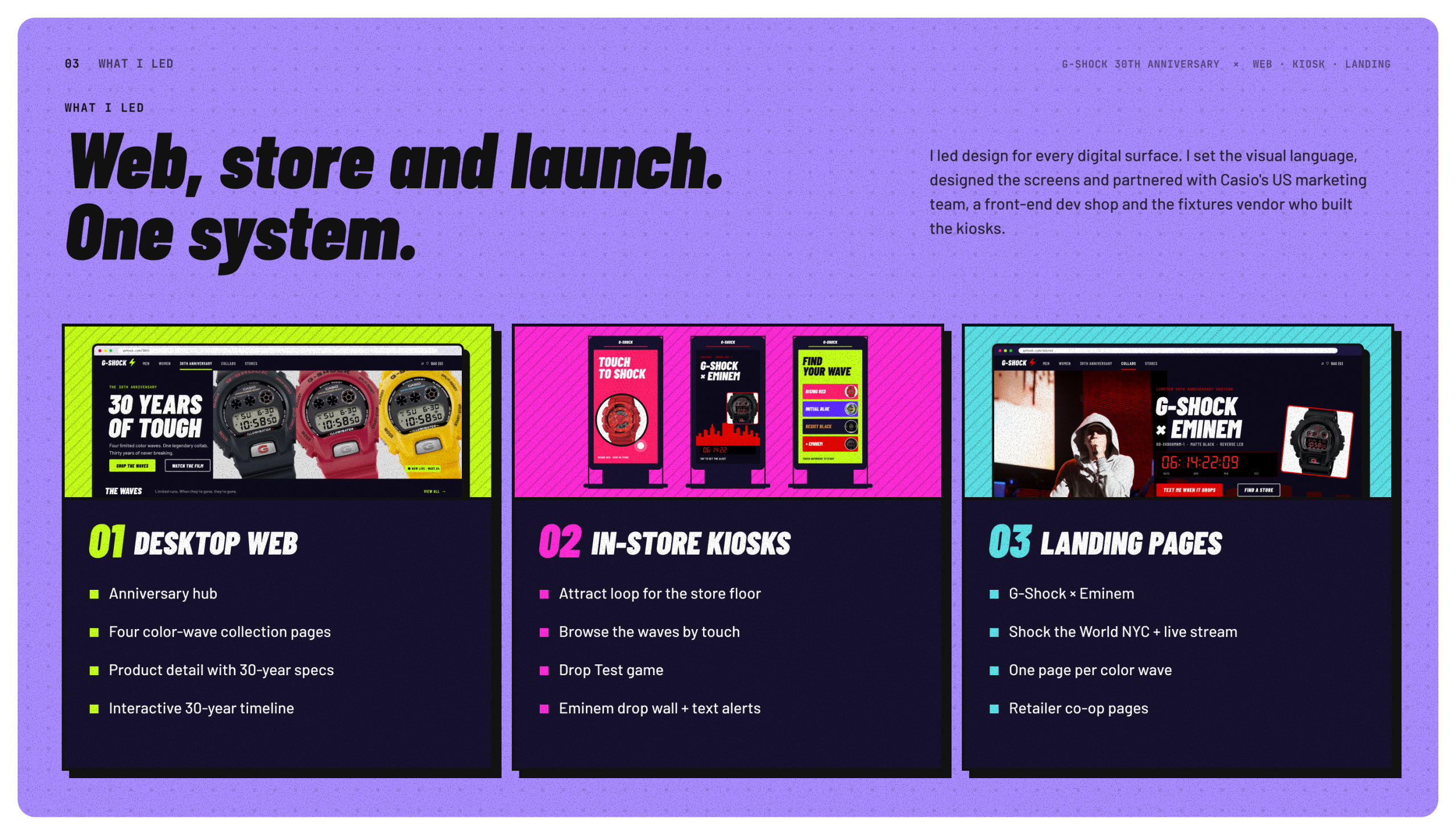
I led design on the concept across desktop web, landing pages and in-store kiosks.
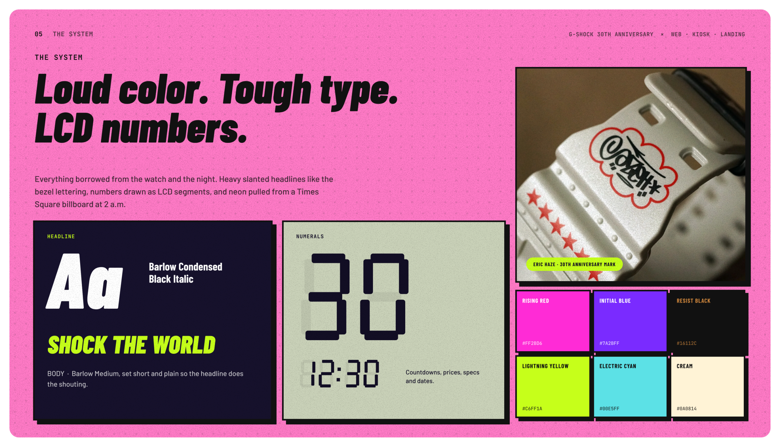
I built the visual language from the watch itself. Headlines are heavy and slanted like the bezel lettering. Prices, specs and countdowns are drawn like the watch’s LCD numbers. Each wave owns a color, and the anniversary mark shows up everywhere.
For the website, I designed:
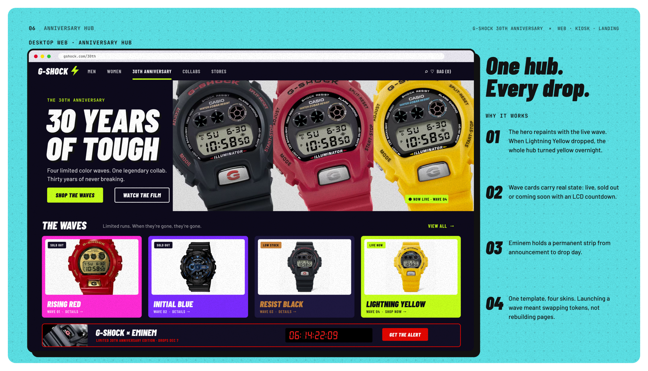
- An anniversary hub that changes with each live wave and shows what’s live, sold out or coming soon.
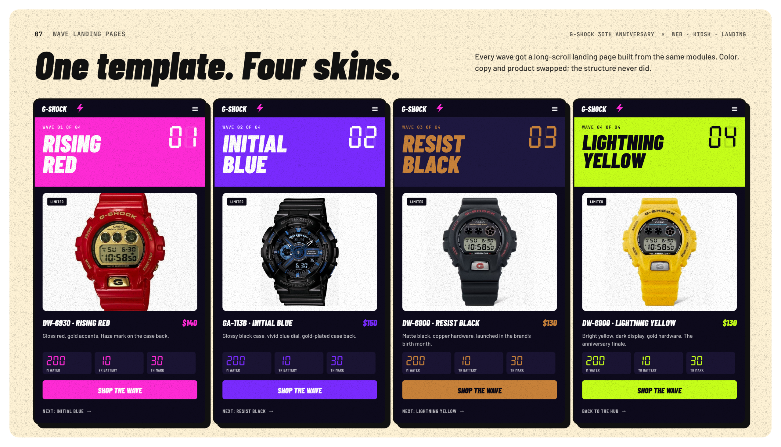
- A single landing page template, reskinned for all four waves.
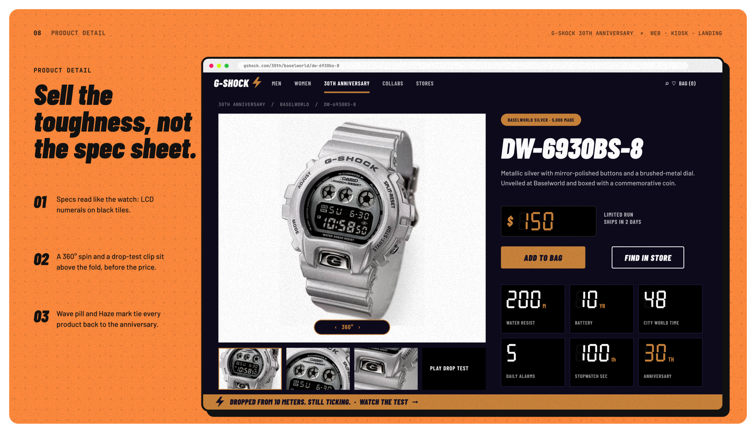
- Product pages that sell toughness before price.
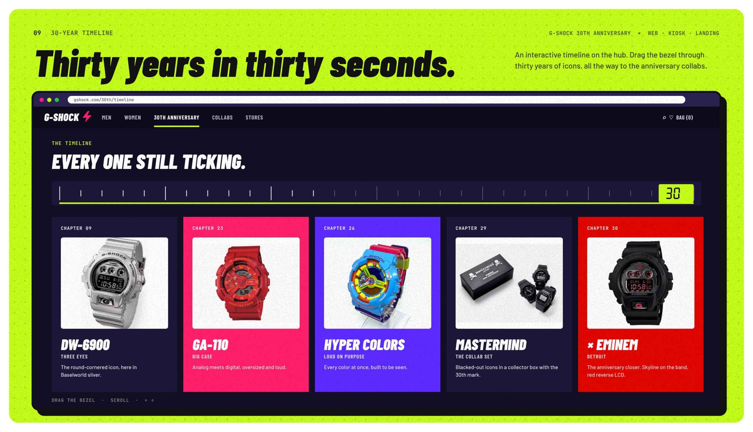
- An interactive 30-year timeline.
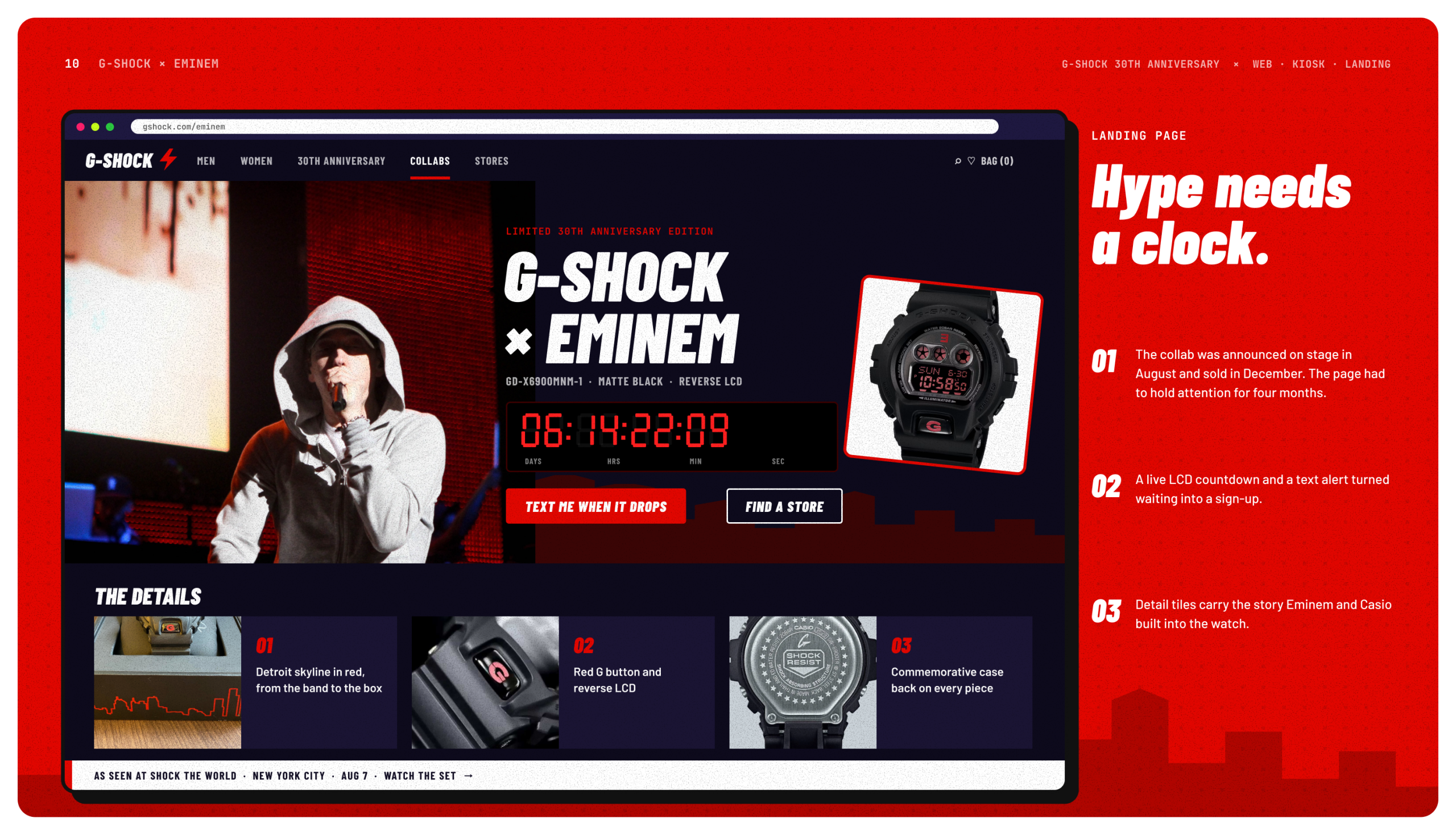
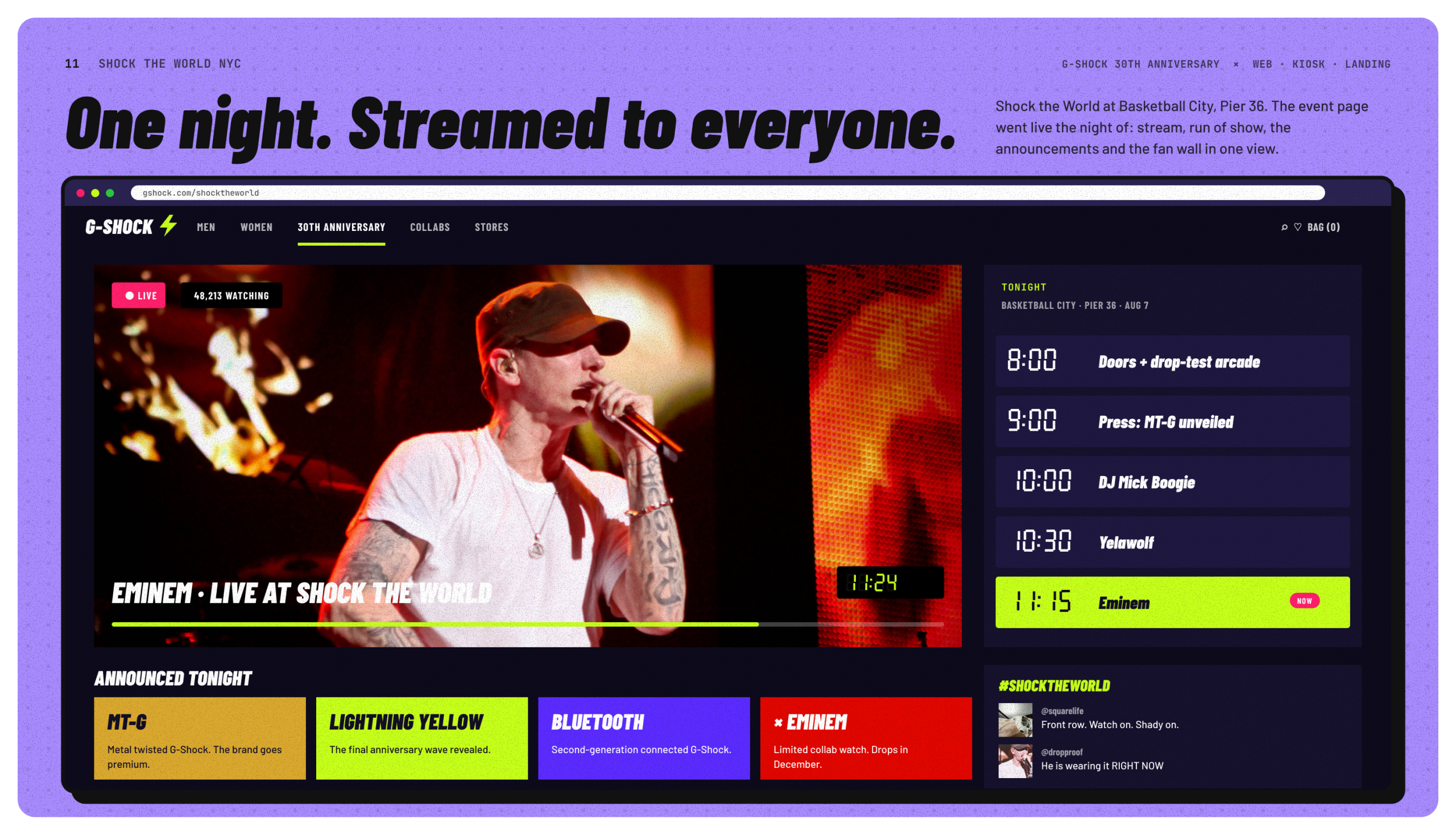
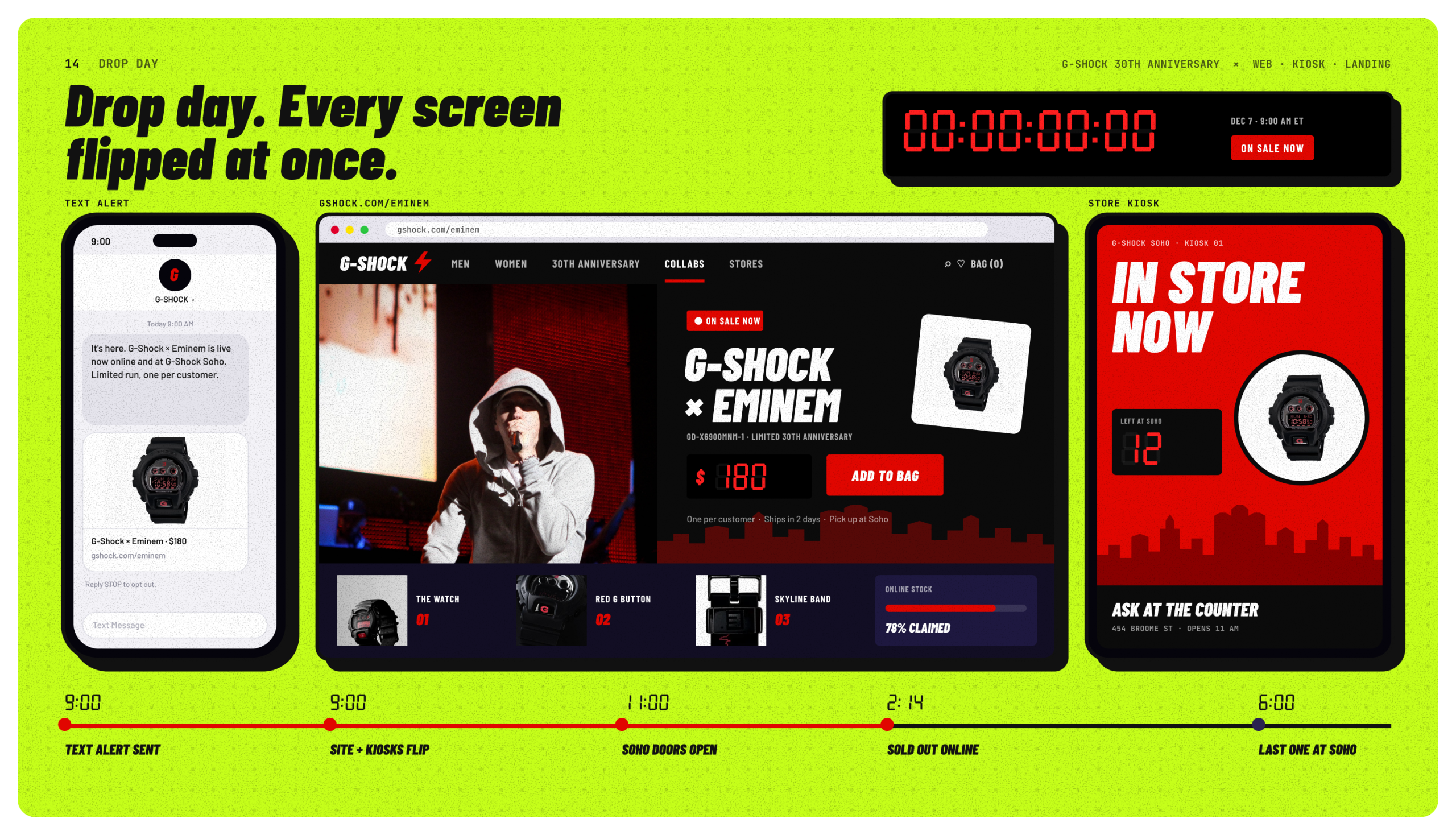
For the Eminem collaboration, I designed a landing page with a live countdown and a text alert sign-up to bridge the months between announcement and launch. I also designed an event page for Shock the World that brings together the live stream, the run of show and the night’s announcements.
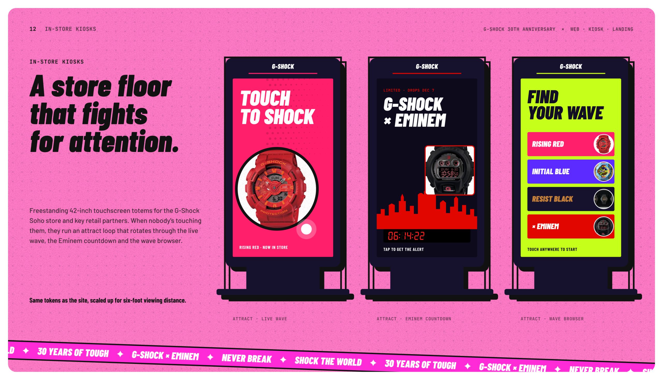
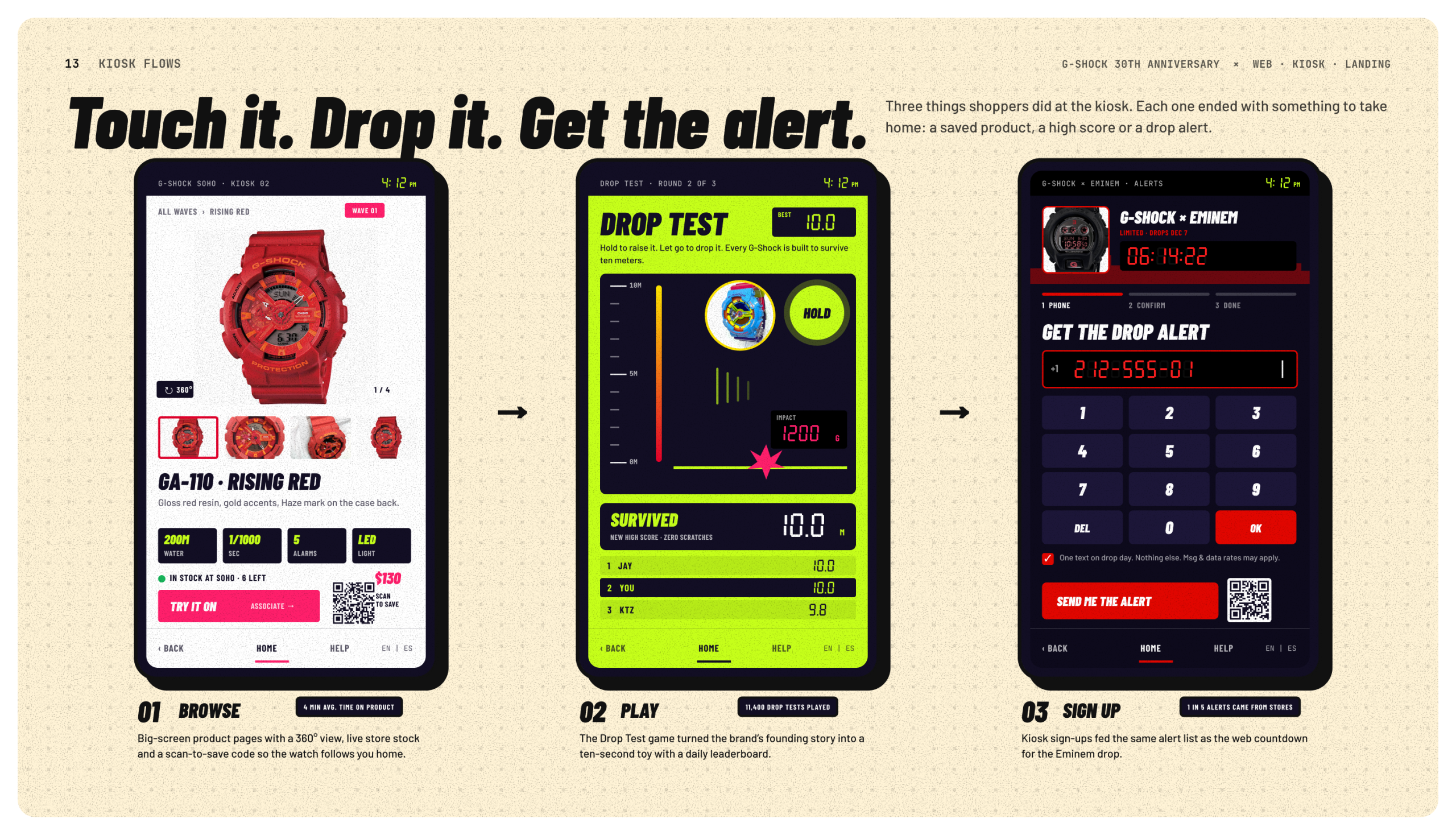
For stores, I designed touchscreen kiosks for the G-Shock Soho store and retail partners. They run an attract loop when no one is using them, let shoppers browse the waves by touch, offer a Drop Test game and include a sign-up for the Eminem drop alert.
What We Delivered
We delivered a complete concept across three surfaces:
- An anniversary hub, four wave landing pages, the G-Shock × Eminem landing page, an event page with a live stream and an interactive timeline.
- Three kiosk experiences.
- A drop-day plan where one switch moves the text alert, the website and every kiosk from countdown to on sale at the same moment.
Everything sat on one design system, so launching a new wave meant swapping color and content instead of rebuilding pages. That made the concept easy for Casio to extend as each wave arrived.