Mercedes-Benz — ‘This is Why’




Category
Branding, Digital, Print, StrategyAbout This Project
The Setup
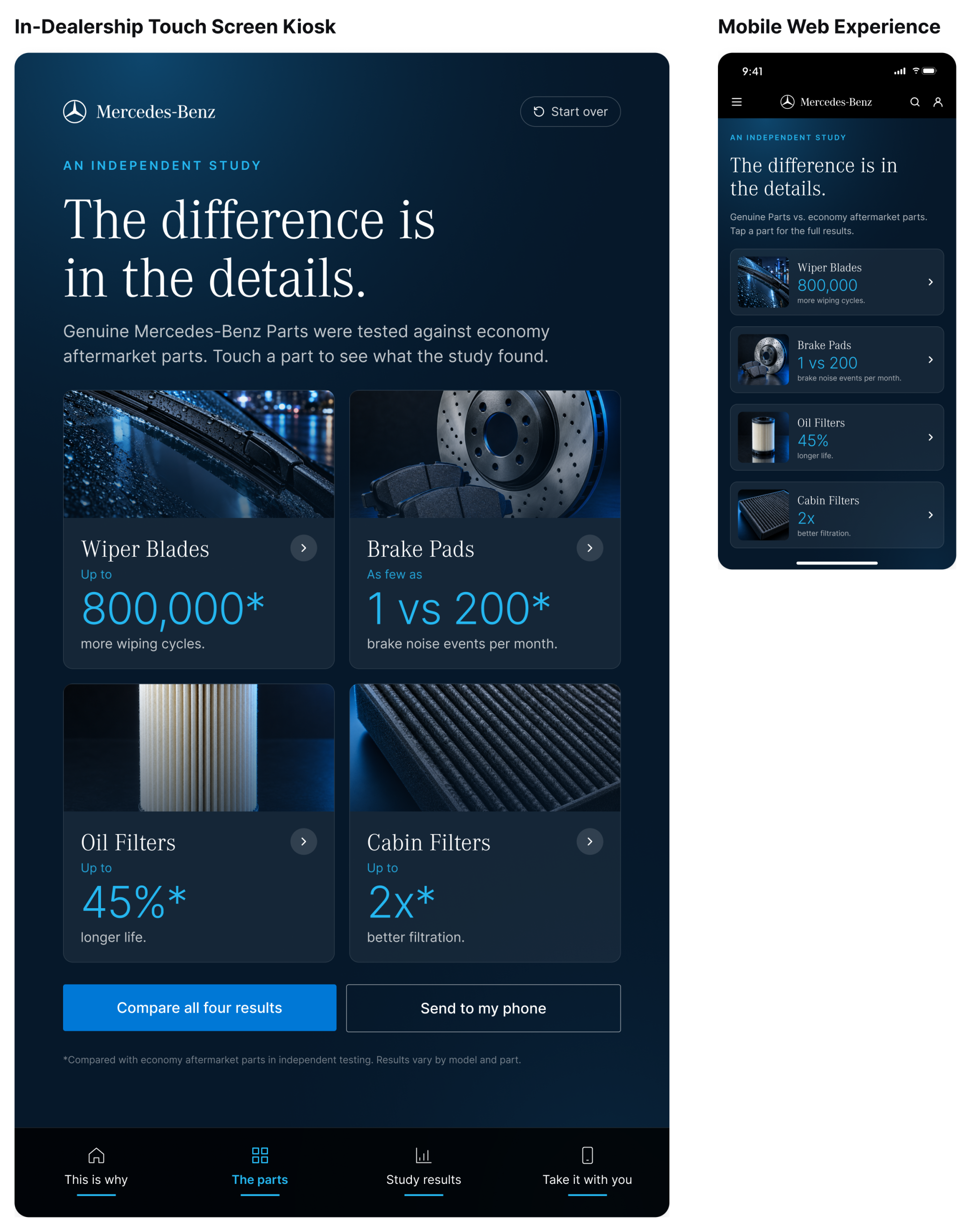
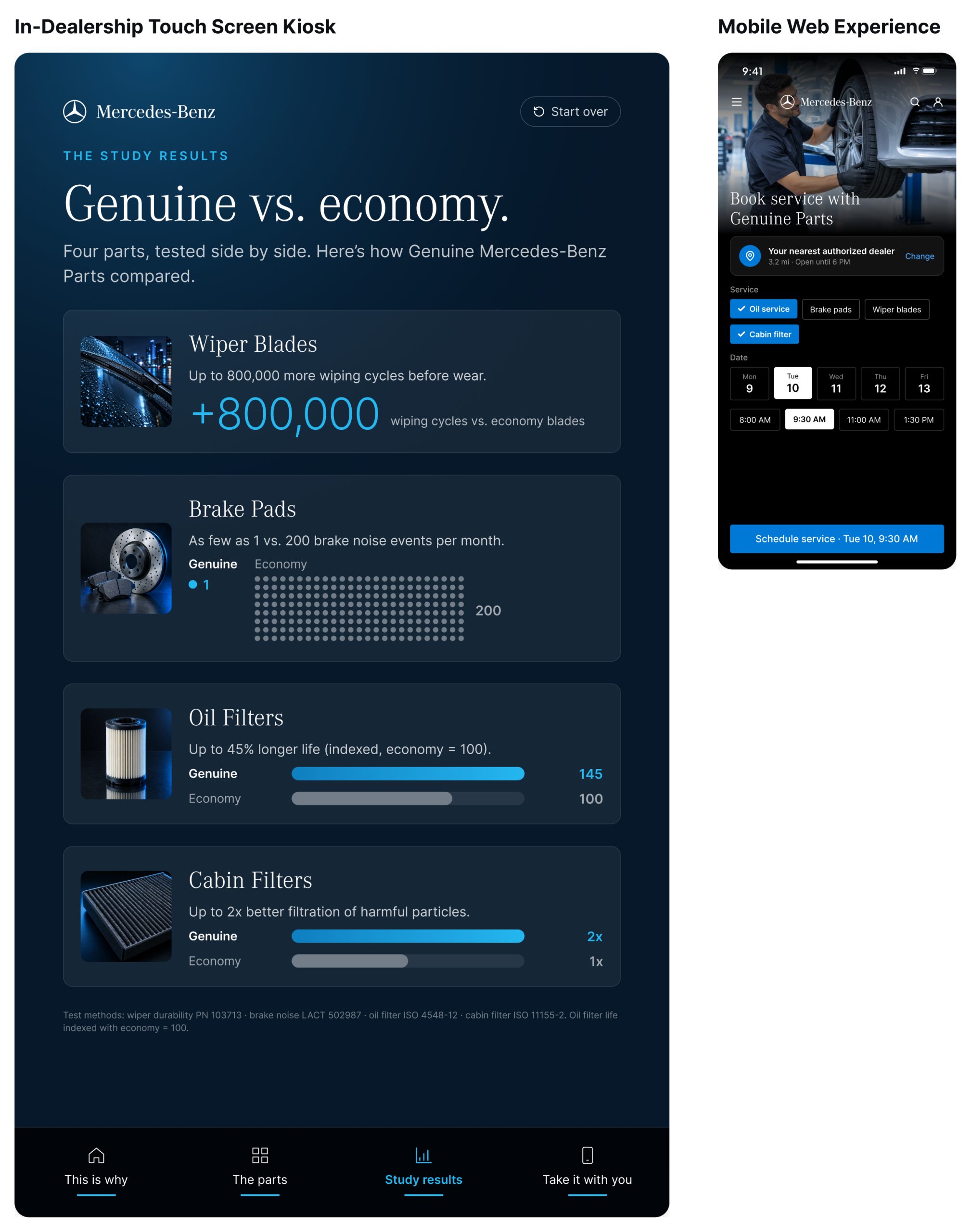
Mercedes-Benz had the data to prove what its service teams already knew. An independent study compared Genuine Mercedes-Benz Parts with economy aftermarket parts, and Genuine won on every measure: wiper blades that last up to 800,000 more wiping cycles, brake pads with as few as 1 noise event a month versus 200, oil filters with up to 45% longer life, and cabin filters with up to twice the filtration.
The challenge was getting customers to care. Wiper blades and oil filters rarely make anyone stop and read, and a dealership service lounge is full of people checking their phones while they wait. We were asked to turn the study into a reason to choose Genuine, right where the decision happens.
The insight: people don’t buy brake pads for the brake pads. They buy them for whoever is riding in the back seat. So we led with that, and let the data follow.
What I Led
I was creative director and lead designer on This Is Why. I led the concept from the first insight through every touchpoint: the two-sided display and its die-cut magnetic wrap, the in-dealership touch screen kiosk and the mobile web experience. I owned the creative direction and designed the experience end to end, making sure the emotional side of the story and the study data worked together as one campaign.
What We Delivered
This Is Why is a single campaign told across three connected touchpoints: a physical display, an in-dealership touch screen kiosk and a mobile web experience. Together they follow one customer from an emotional first impression to the proof to a booked service.
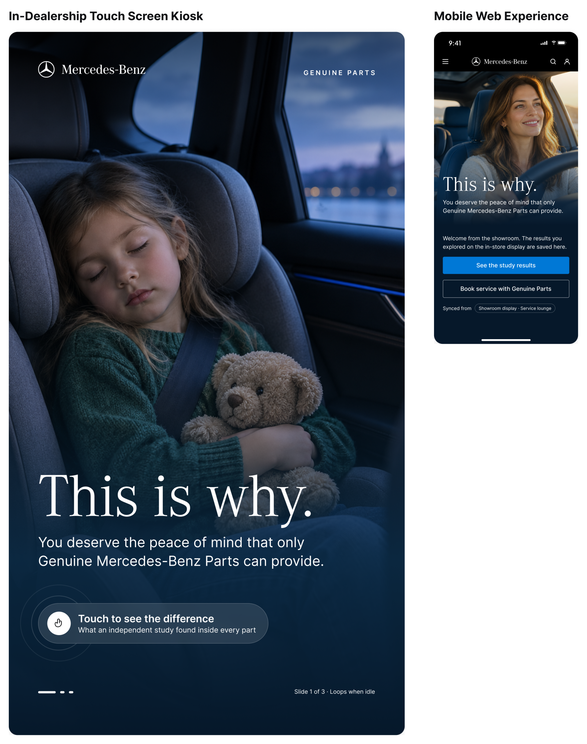
The display. We designed a two-sided display that tells the story in the order people actually feel it. The first side shows a young girl asleep in her car seat under a single line of type, “This is why.” It’s quiet and unmistakably emotional, and it gives the customer a reason to walk around to the other side.
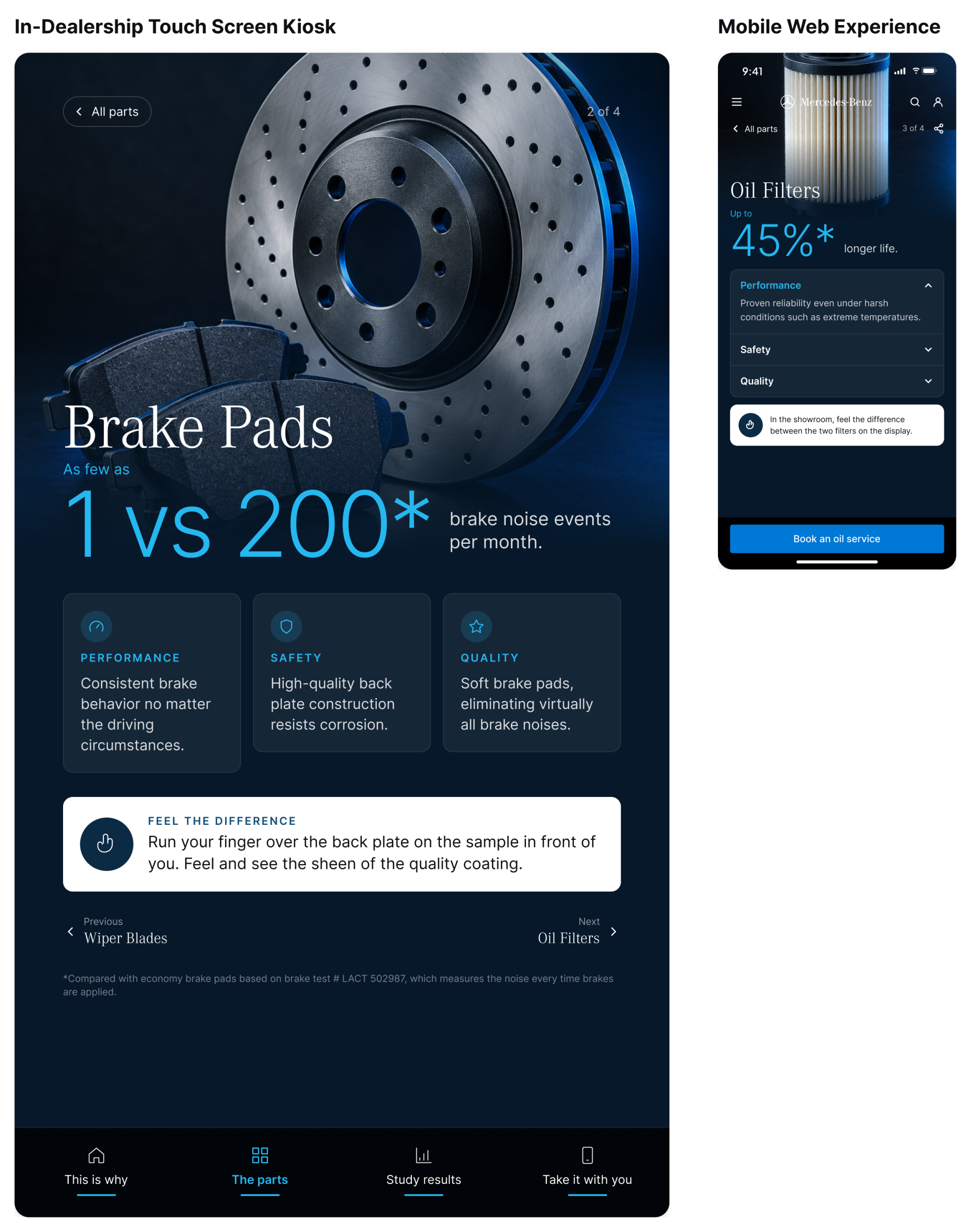
That side is where the proof lives. Each of the four parts has its own panel, with real samples of the Genuine and economy versions mounted side by side. A short prompt on each panel invites the customer to touch the difference: the maintenance indicator on the tip of a wiper blade, the sheen of the coating on a brake pad’s back plate, the denser charcoal layers of a cabin filter. The study’s headline numbers sit right next to the parts, so the evidence is something you can read and hold at the same time. We wrapped the whole unit in custom die-cut magnetics, which let us swap panels and keep the display looking sharp in a busy service area.
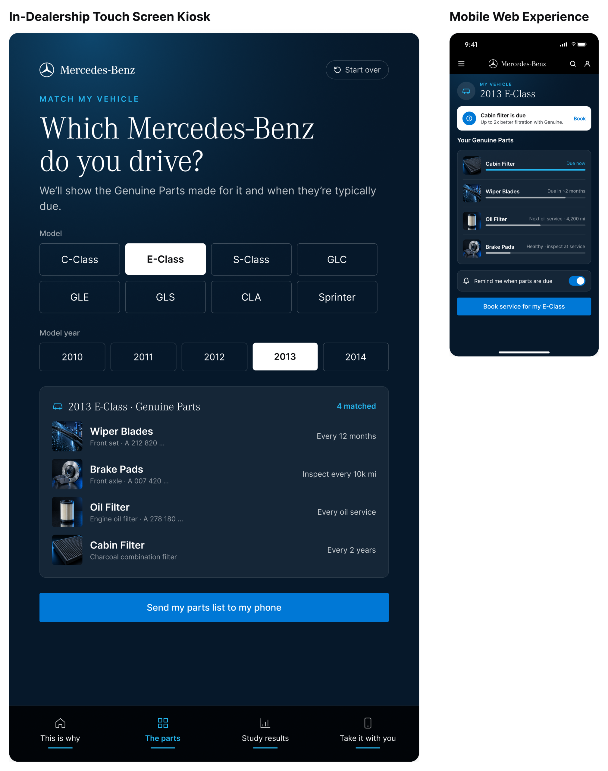
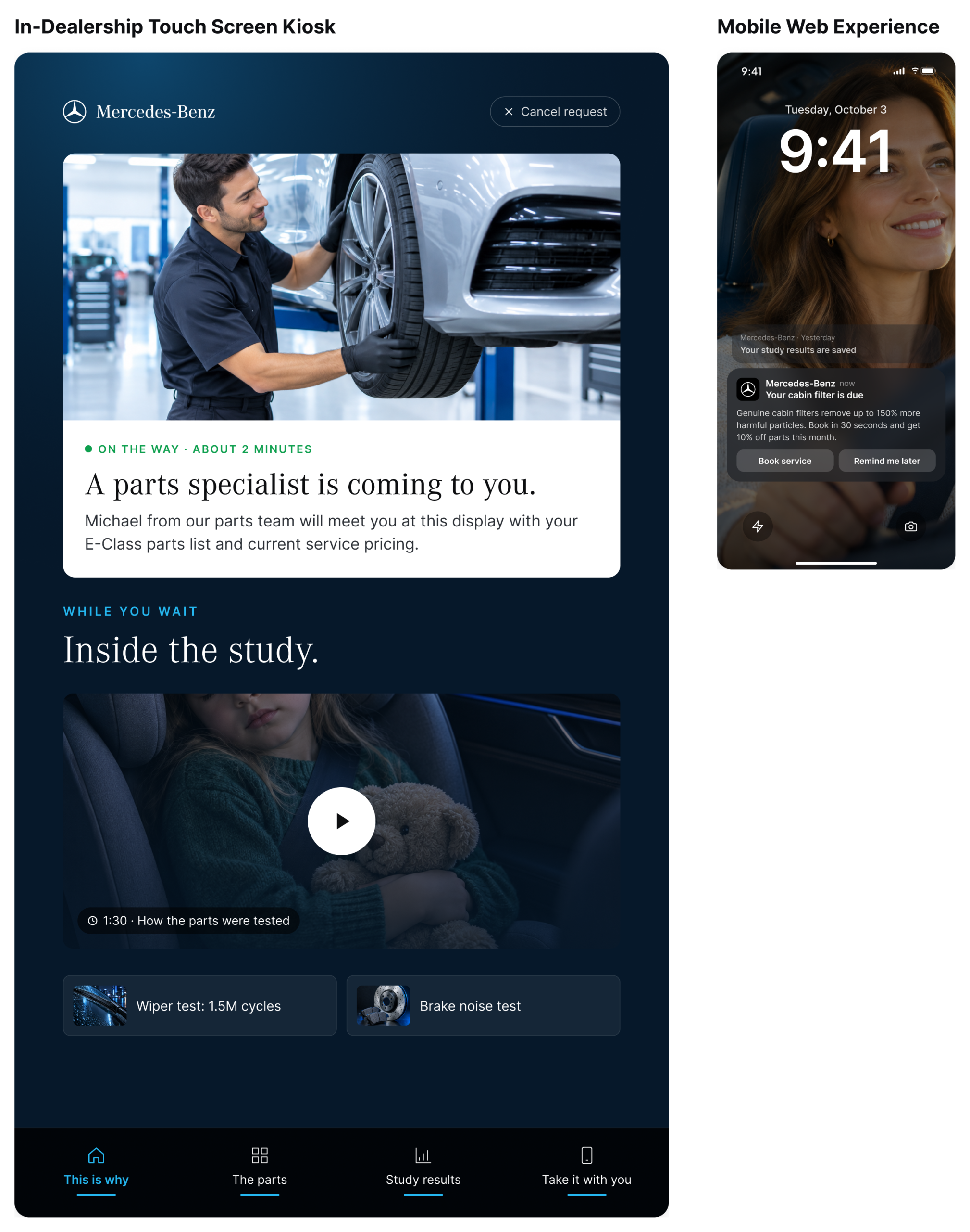
The touch screen kiosk. Next to the display, a portrait touch screen brings the study to life. When no one is using it, the screen loops through the “This is why” family moments. A touch opens the study, one part at a time, with each result shown as a simple visual: a single noise event against a grid of 200, and filter life side by side with economy. Each part screen points back to the physical samples, so the customer can see the result and feel it in the same moment. From there, customers can match the results to their own model and year, see which Genuine Parts fit their car and when they’re typically due, and call a parts specialist over from the screen.
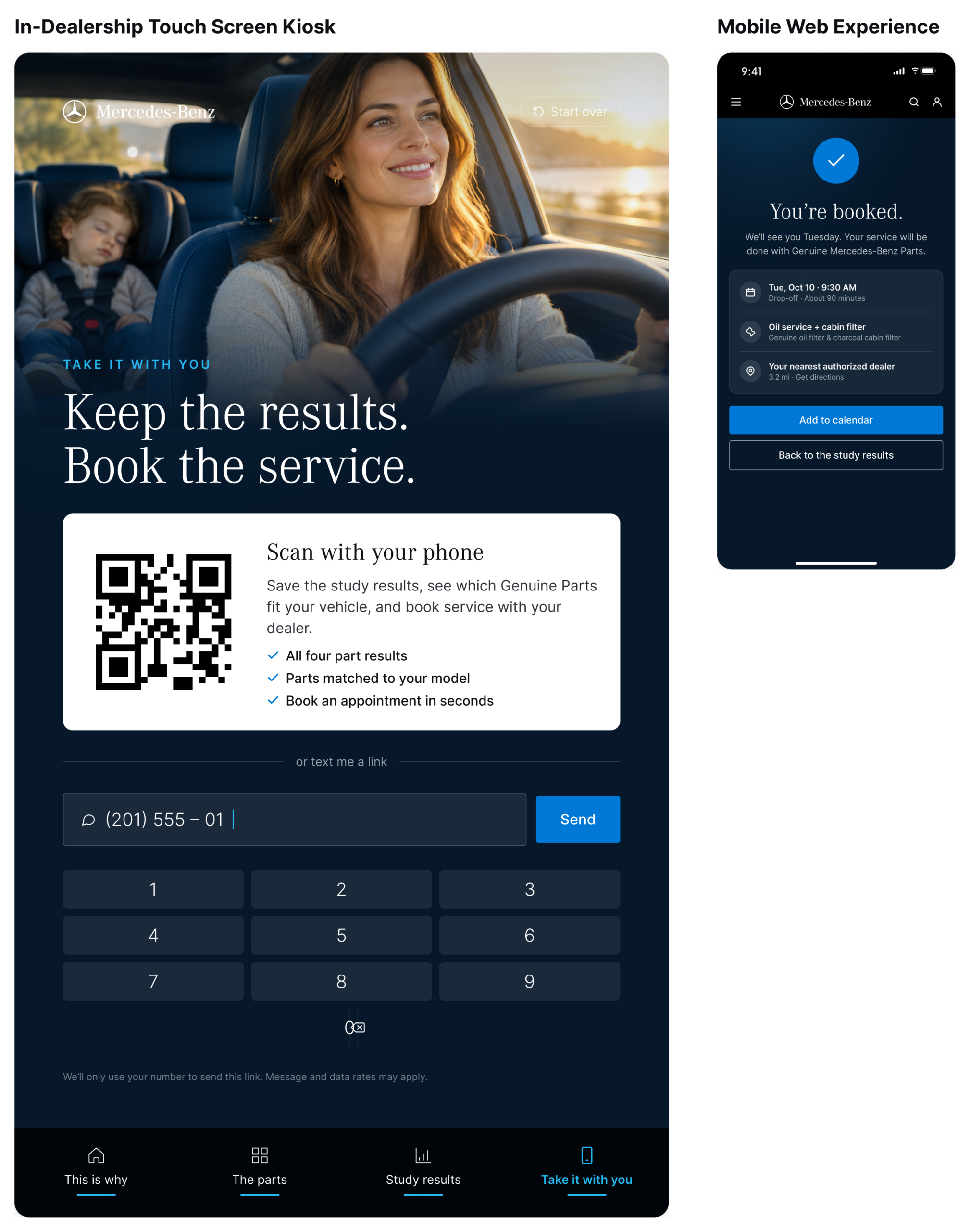
The mobile web experience. A QR code, or a text with a link, sends the customer’s results to their phone. From there they can revisit any part, track what’s coming due on their vehicle and book service with their dealer in a few taps. When a part comes due weeks later, a reminder arrives, and the conversation that started in the service lounge turns into the next appointment.
Outcomes
The campaign quickly outgrew the dealership. Mercedes-Benz adopted This Is Why for other departments, and it went on to become the brand campaign for all Mercedes-Benz Genuine Parts communication.
Credit to Paul Taylor for video art direction.