Merrill Lynch Advisor Workstation + Playbook
Category
Branding, Digital, Strategy, UX, WebAbout This Project
The Setup
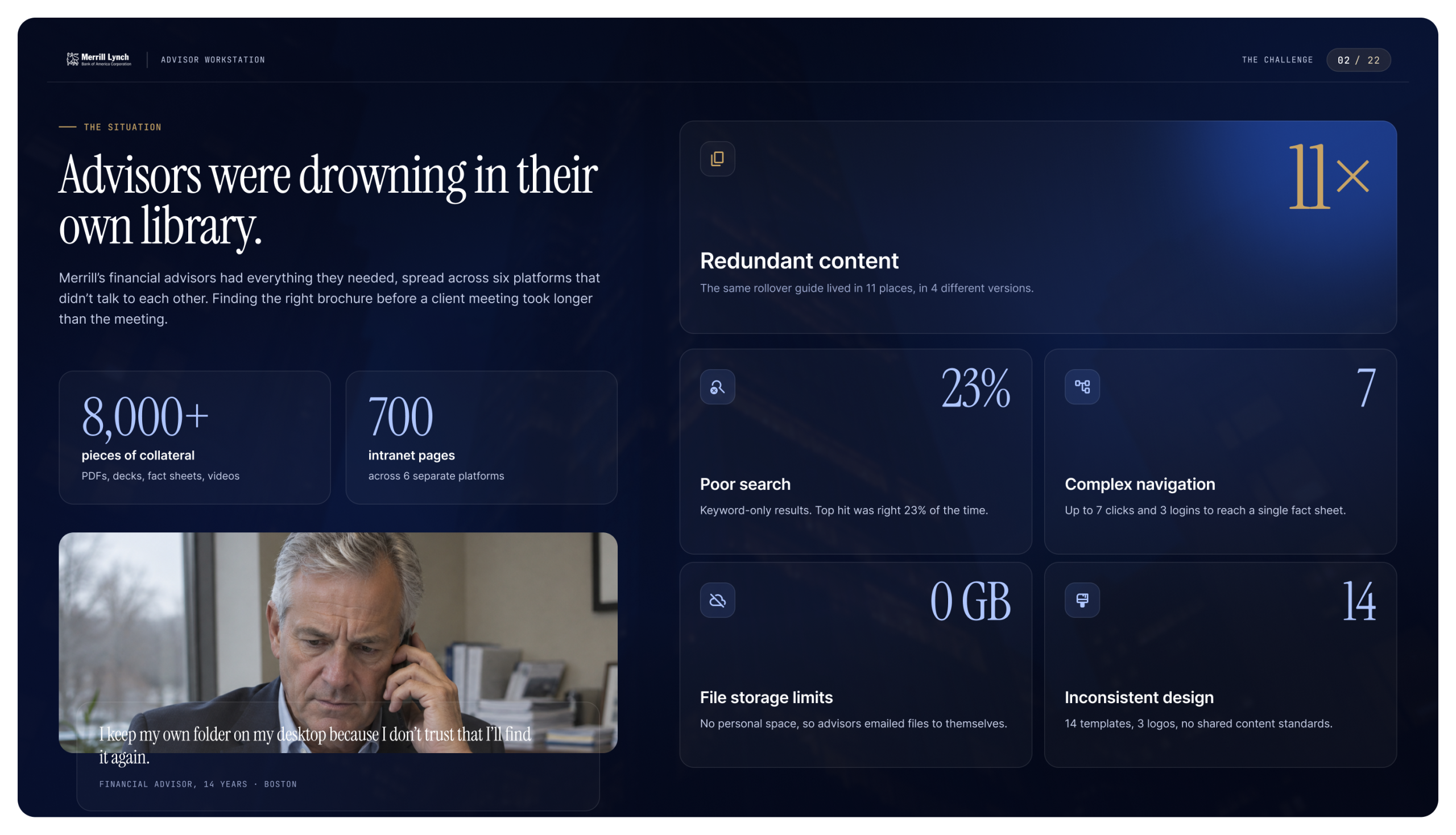
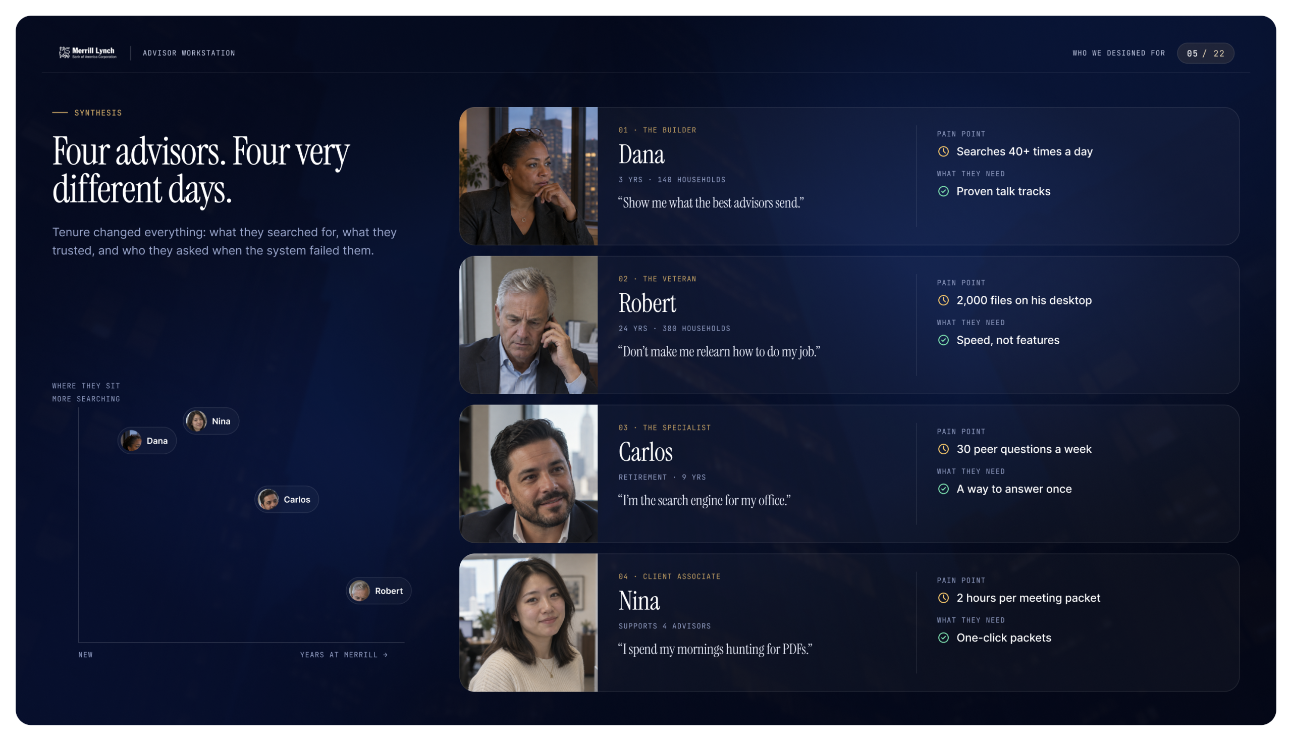
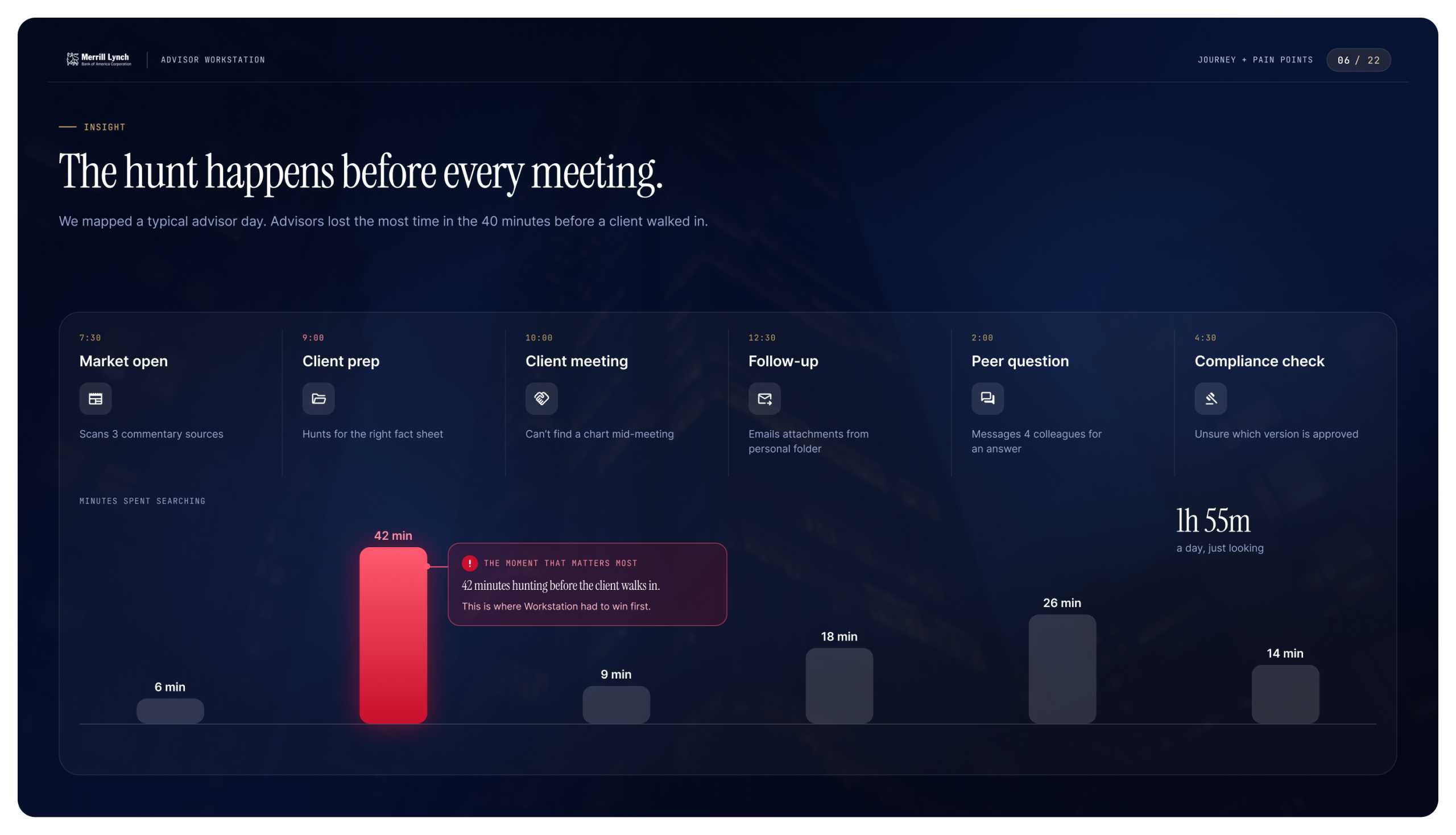
Merrill’s financial advisors had everything they needed, and couldn’t find any of it. More than 8,000 pieces of collateral and 700 intranet pages were spread across six platforms that didn’t talk to each other. The same rollover guide lived in eleven places, in four versions. Search was keyword-only, the navigation was deep, there was no personal storage, and the content had no shared design standards. Advisors coped by keeping their own folders on their desktops. Before almost every client meeting they lost time just looking. Sparks Grove was brought in to rethink the whole advisor experience and to cut the content down without losing anything advisors actually used.
What I Led
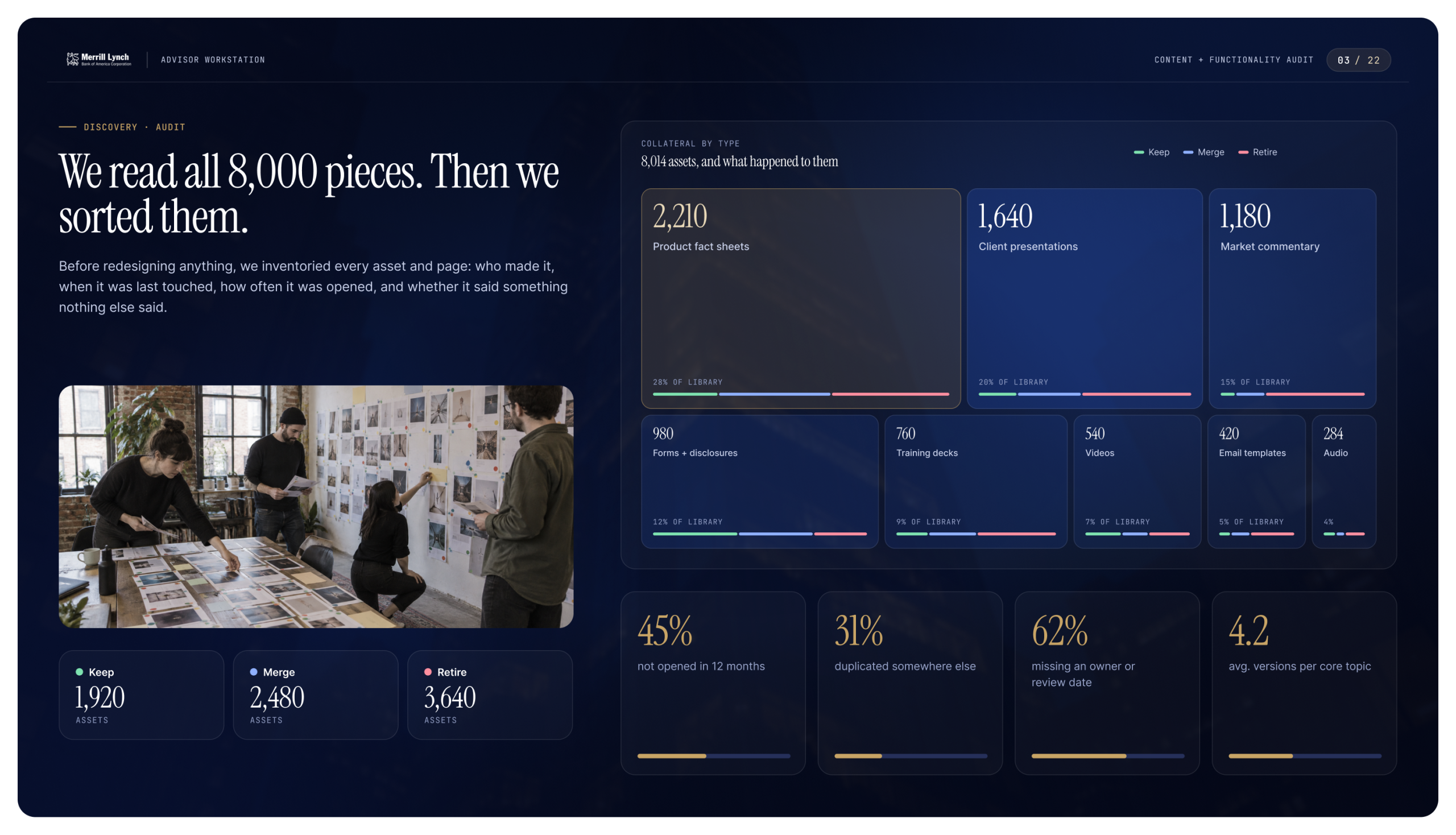
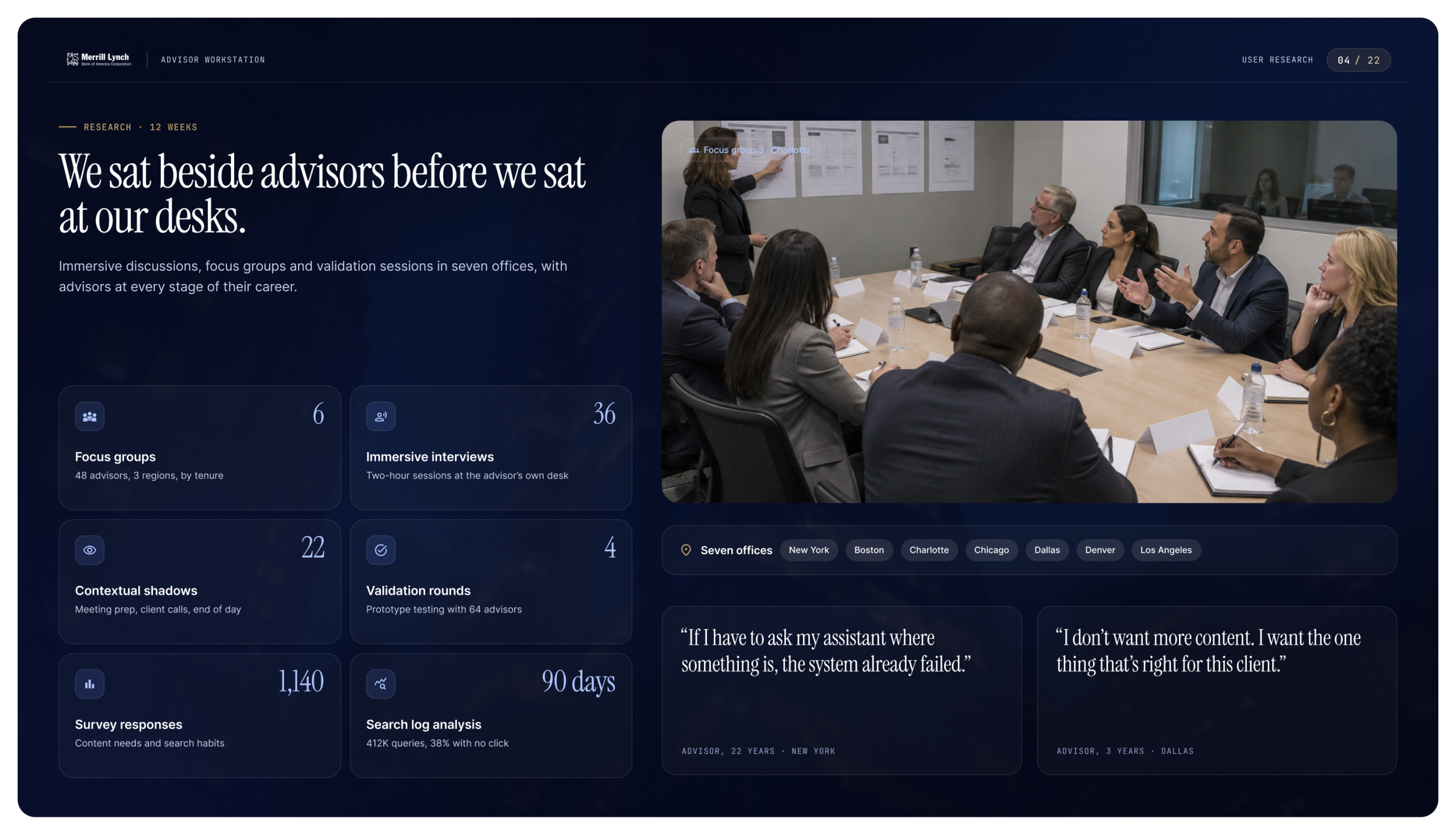
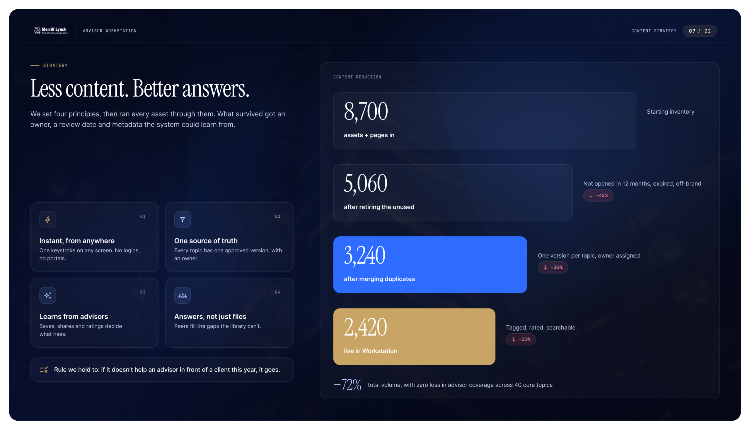
I led the experience strategy and design from first audit to final validation. We started by reading everything. We inventoried every asset and page, scored each one on use, freshness and overlap, and sorted it into keep, merge or retire. At the same time we spent twelve weeks with advisors: focus groups, two-hour interviews at their own desks, and shadowing them through meeting prep. The pattern was clear. The worst moment of an advisor’s day was the forty minutes before a client walked in. That became the design brief.
From there we set four principles:
- Instant, from anywhere.
- One source of truth.
- Learns from advisors.
- Answers, not just files.
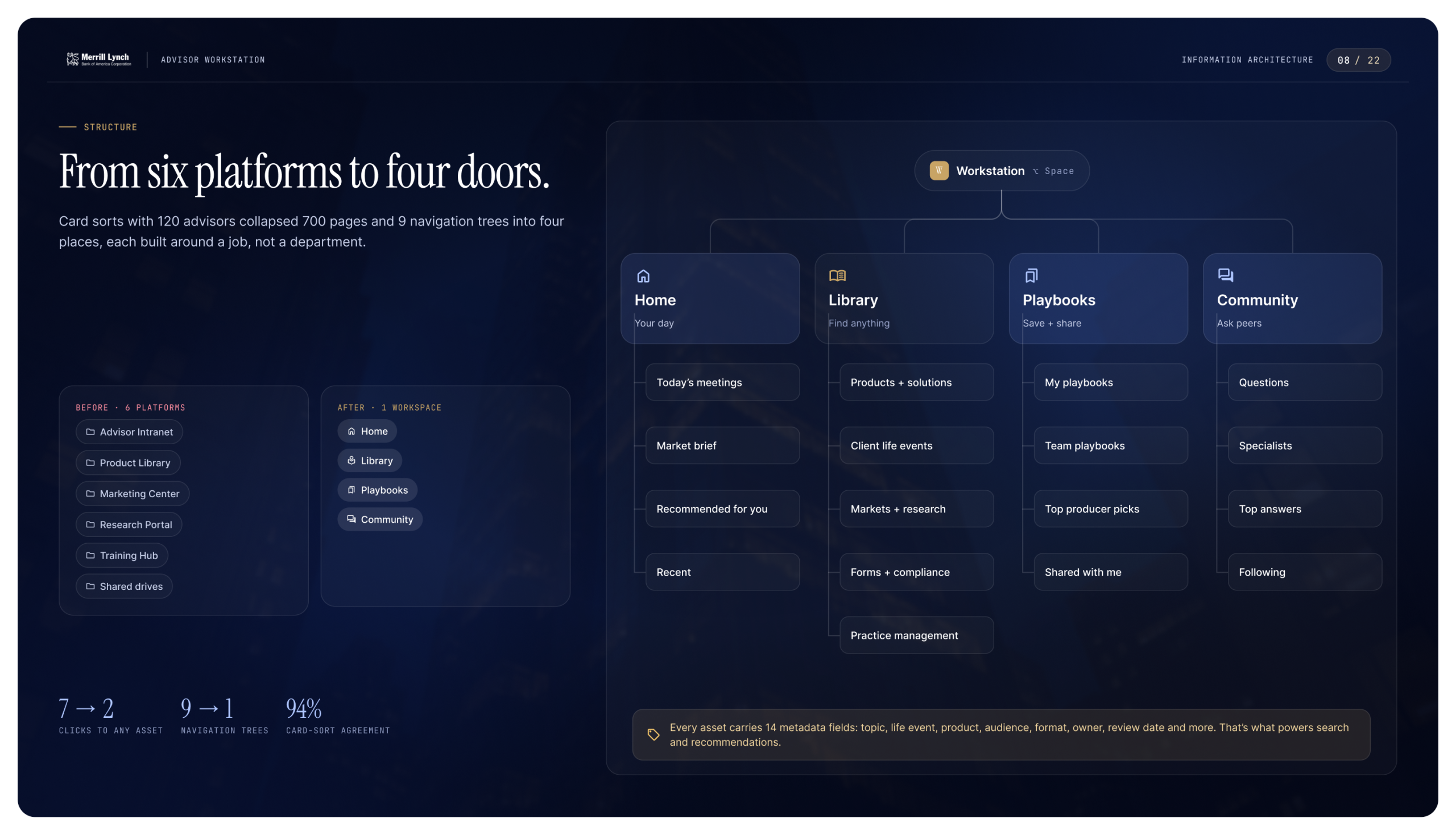
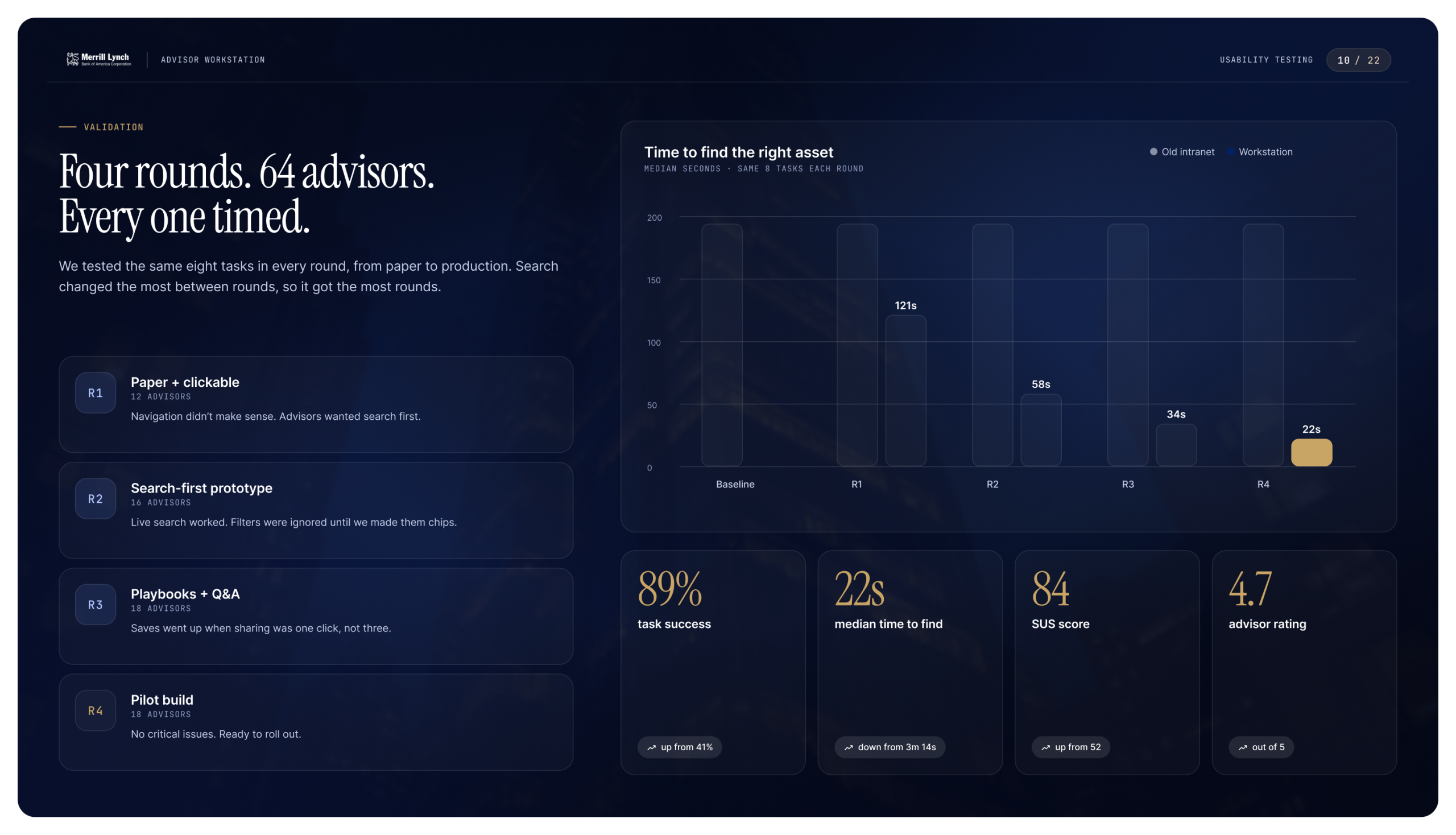
We rebuilt the information architecture around four places: Home, Library, Playbooks and Community. Card sorts with advisors shaped it. Then we tested search-first prototypes in four rounds, timing the same eight tasks every time until finding the right asset took seconds, not minutes.
What We Delivered
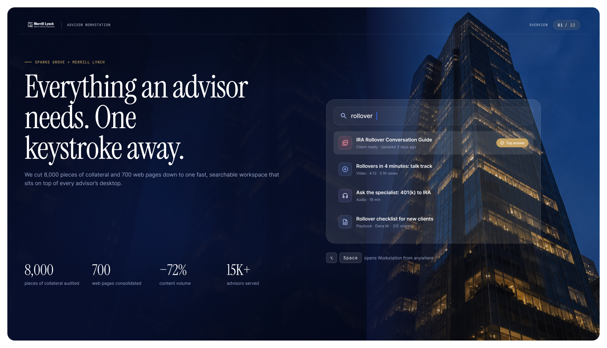
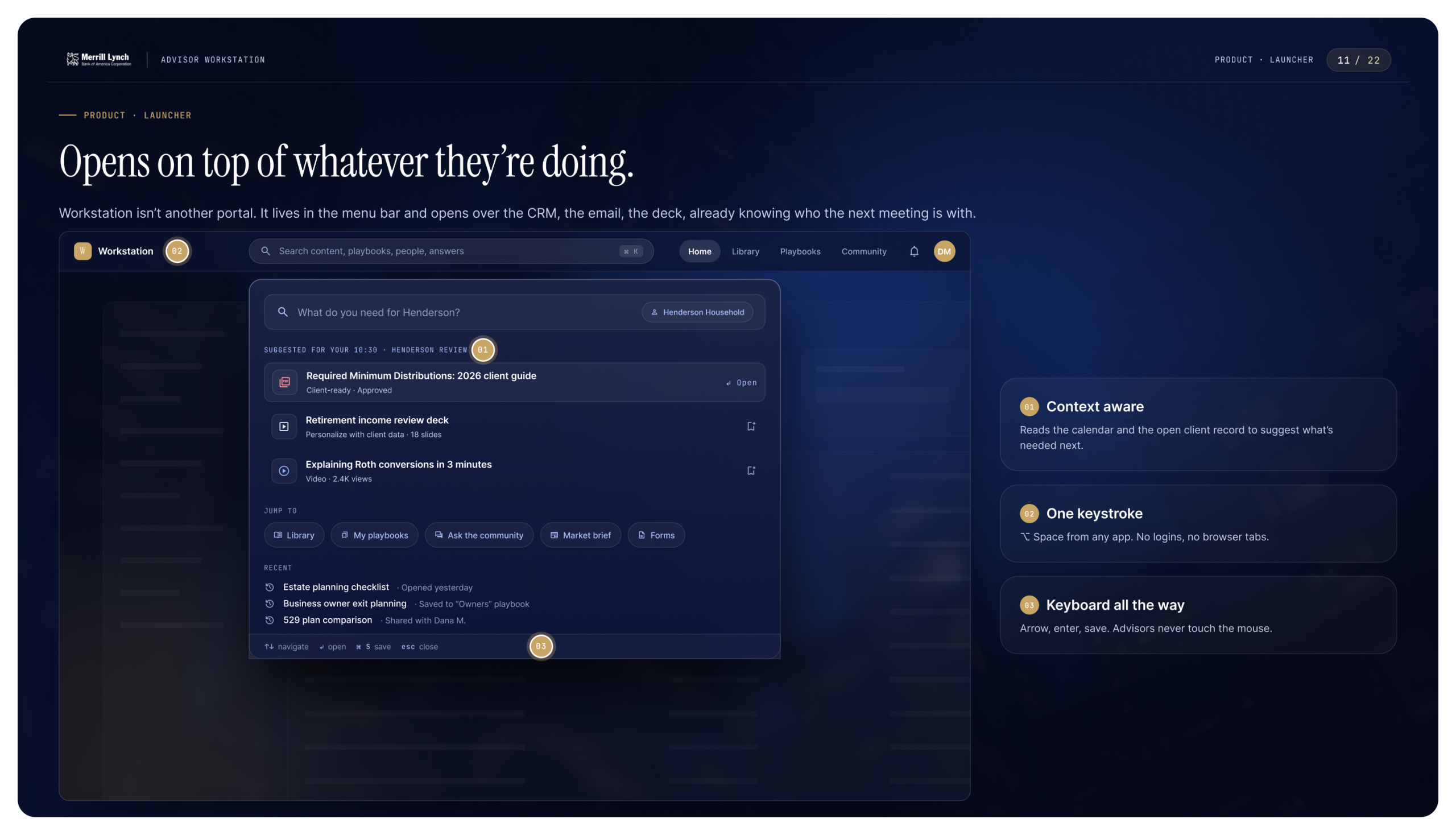
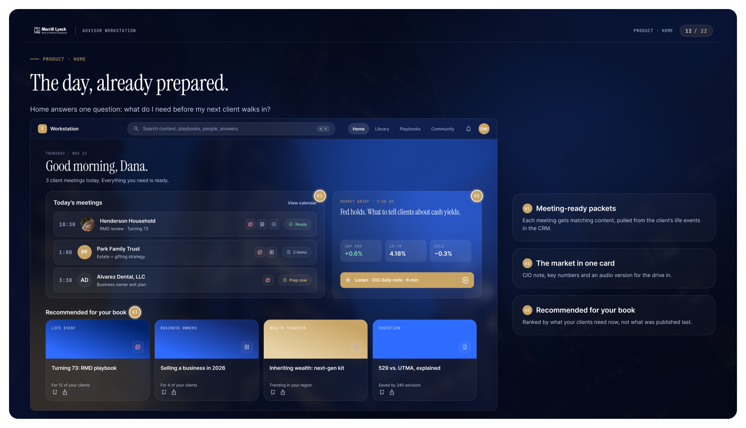
Workstation is a layer that sits on top of an advisor’s desktop and opens with one keystroke over whatever they’re working in. It’s built from these pieces:
- Context. It reads the calendar and the open client record, so the right materials are waiting before the meeting.
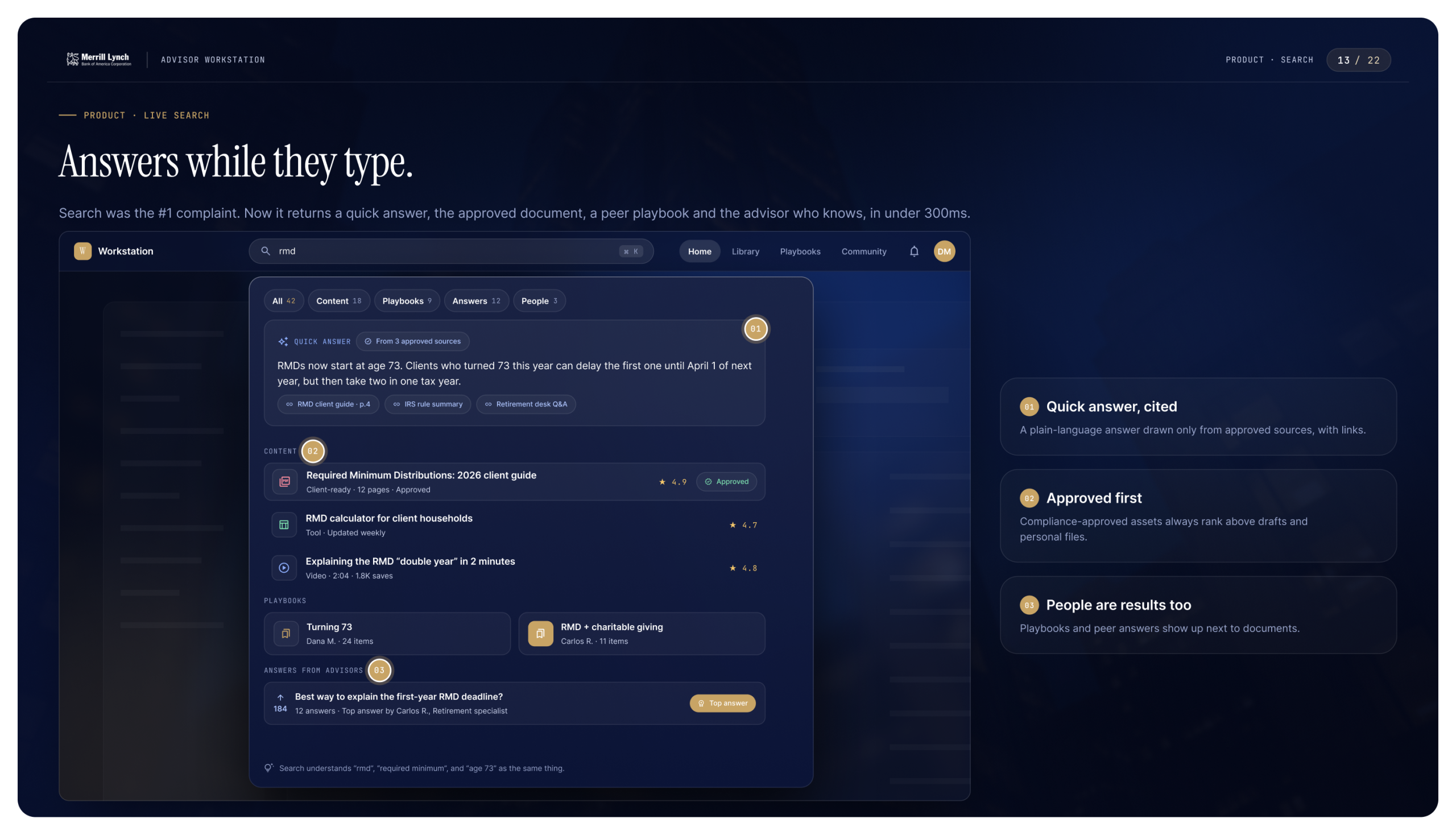
- Live search. Results arrive as the advisor types: a plain-language answer drawn only from approved sources, the approved document, a colleague’s playbook, and the person who knows.
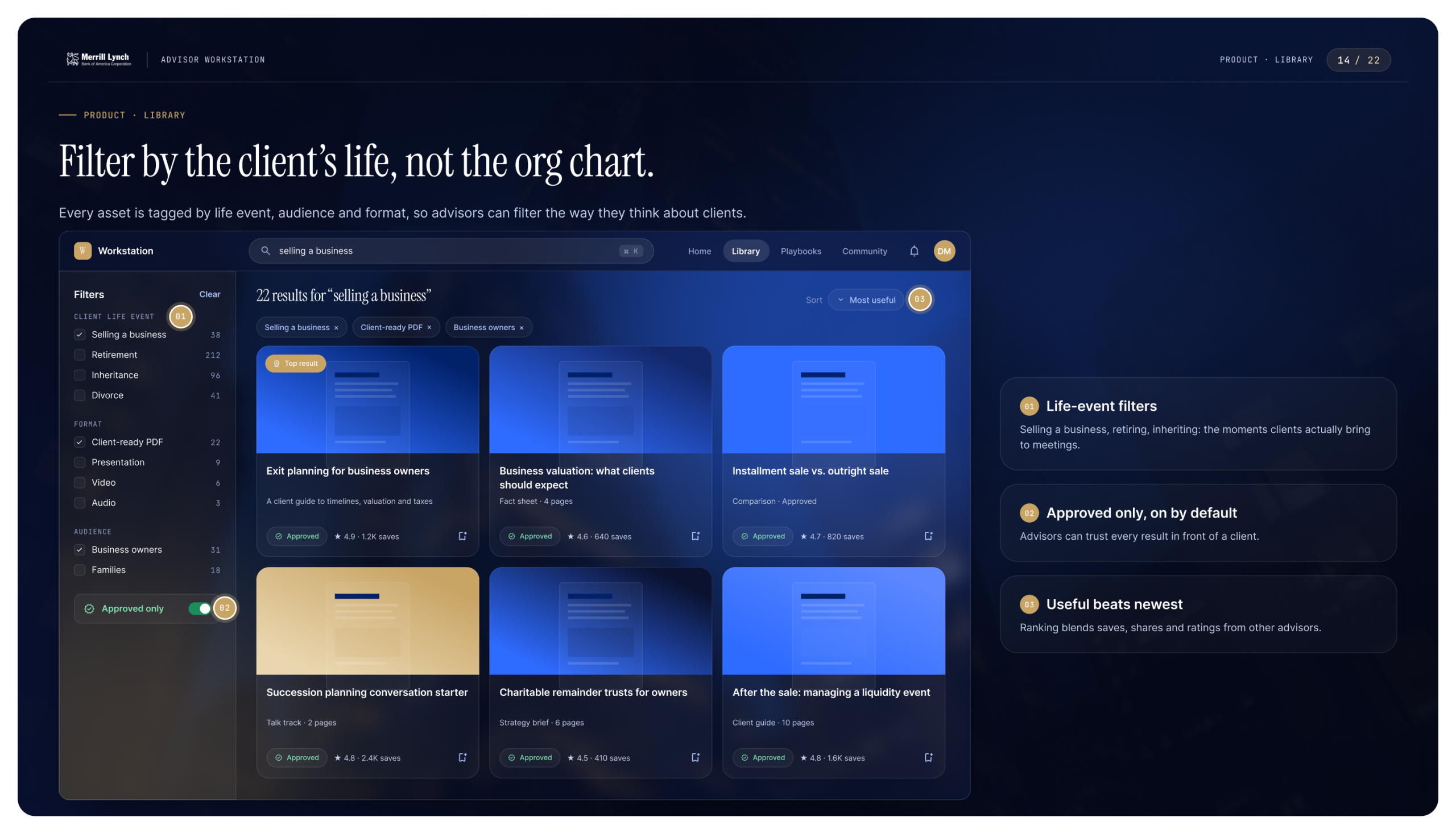
- Library. It filters by the client’s life event, such as selling a business, retiring or inheriting, rather than by department.
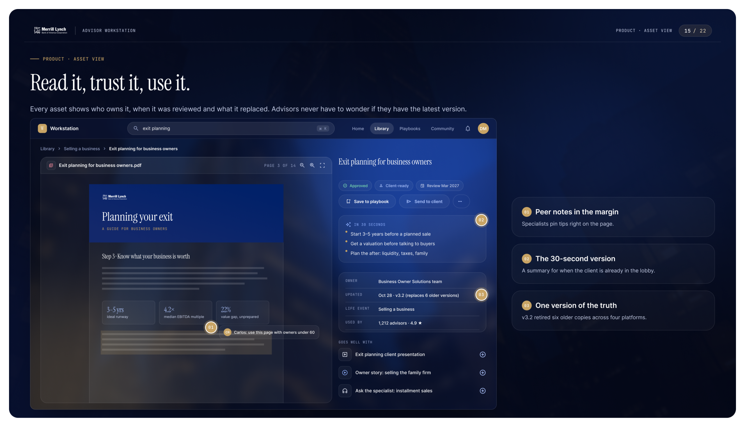
- Asset pages. Every asset shows its owner, its review date and the older versions it replaced.
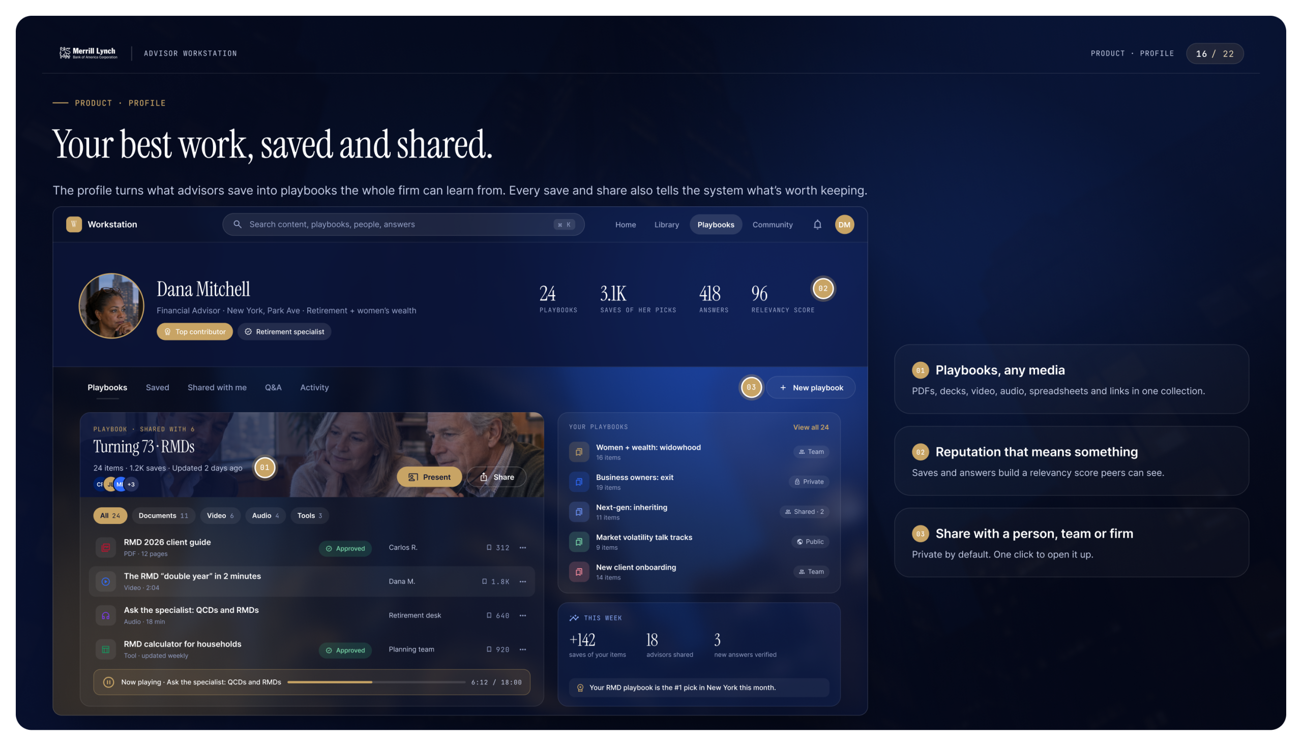
- Playbooks. In their profiles, advisors save and share documents, decks, video and audio. Every save and share also tells the system what’s worth keeping.
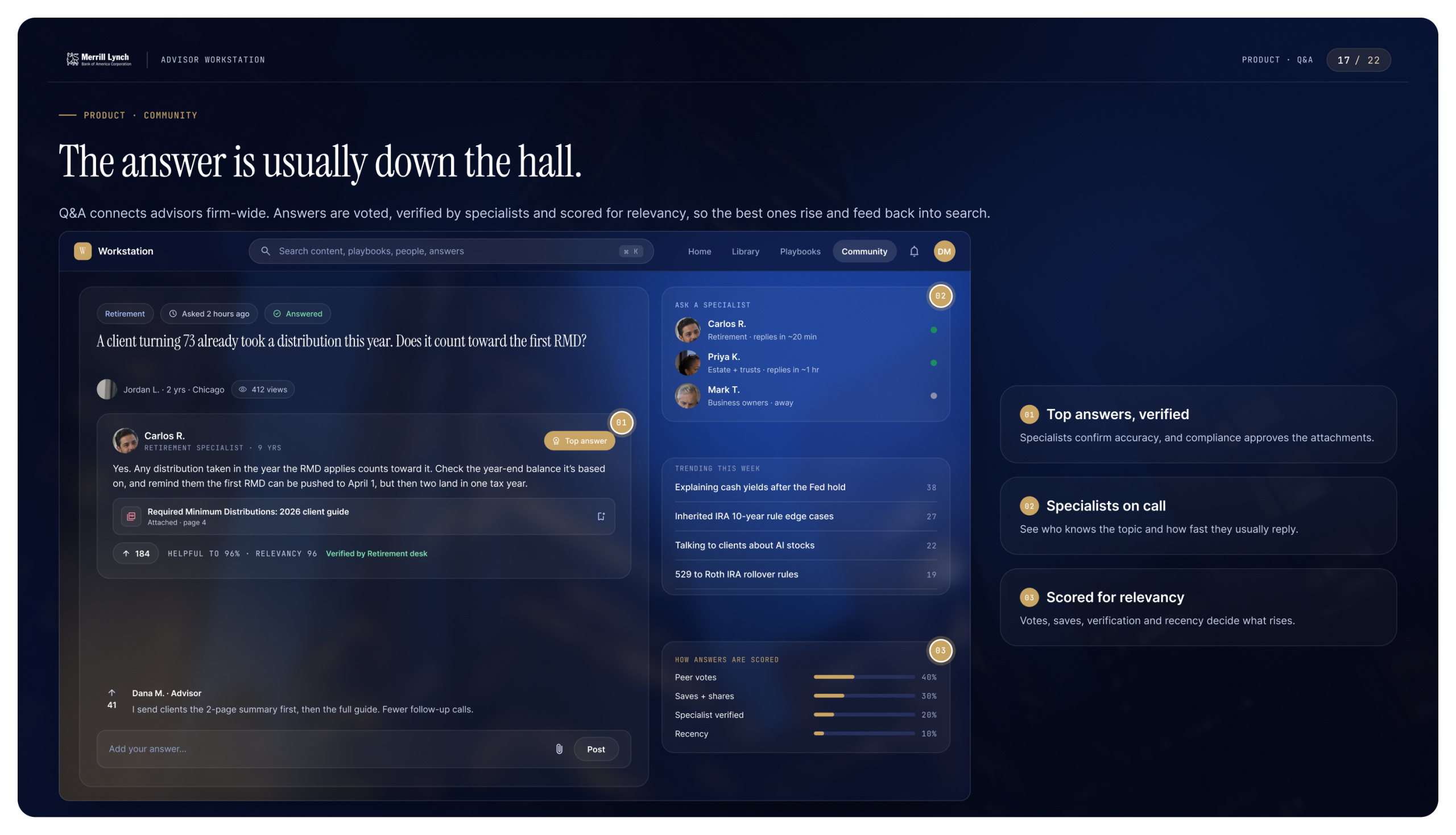
- Q&A. Advisors can ask each other questions across the firm. Specialists verify answers, and answers are scored for relevancy, so the best ones rise and feed back into search.
The library shrank by 72%, from roughly 8,700 assets and pages to 2,420 that are tagged, owned and searchable.