Frontier Communications Web &App
Category
Digital, eCommerce, Product, Strategy, UX, WebAbout This Project
Frontier Communications — uniting a new brand identity with the product ecosystem
The setup
In April 2022, Frontier unveiled a new brand. A roundel logo meant to stand for an inclusive, connected nation. Staggered line work built to suggest speed. A new typeface. A deliberately punchy color palette. All of it rallied behind a single purpose: Building Gigabit America.
It was a good brand. It had a real strategic argument underneath it — a company that had come out of bankruptcy a year earlier and was rebuilding itself as a fiber business, laying infrastructure toward 10 million locations, serving millions of customers across 25 states.
And it stopped at the edge of the product.
That’s the part nobody puts in the press release. A brand launch produces campaign assets, a logo lockup sheet, a set of hero images. What it does not produce is a checkout flow, an outage status page, a bill detail screen, or an app that a customer opens at 11pm because their router is blinking. Those surfaces were still wearing the old company. The one people had negative associations with. The one the rebrand was explicitly trying to leave behind.
So the brand was making a promise — betterness, in Frontier’s own language — and the product was where that promise got tested. Every day. By customers who had heard promises from telecom companies before.
My team’s job was to make the brand true where it counted.
The problem, stated honestly
A telecom brand is not built in advertising. It’s built in three moments:
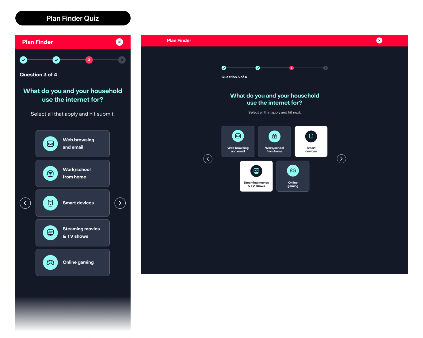
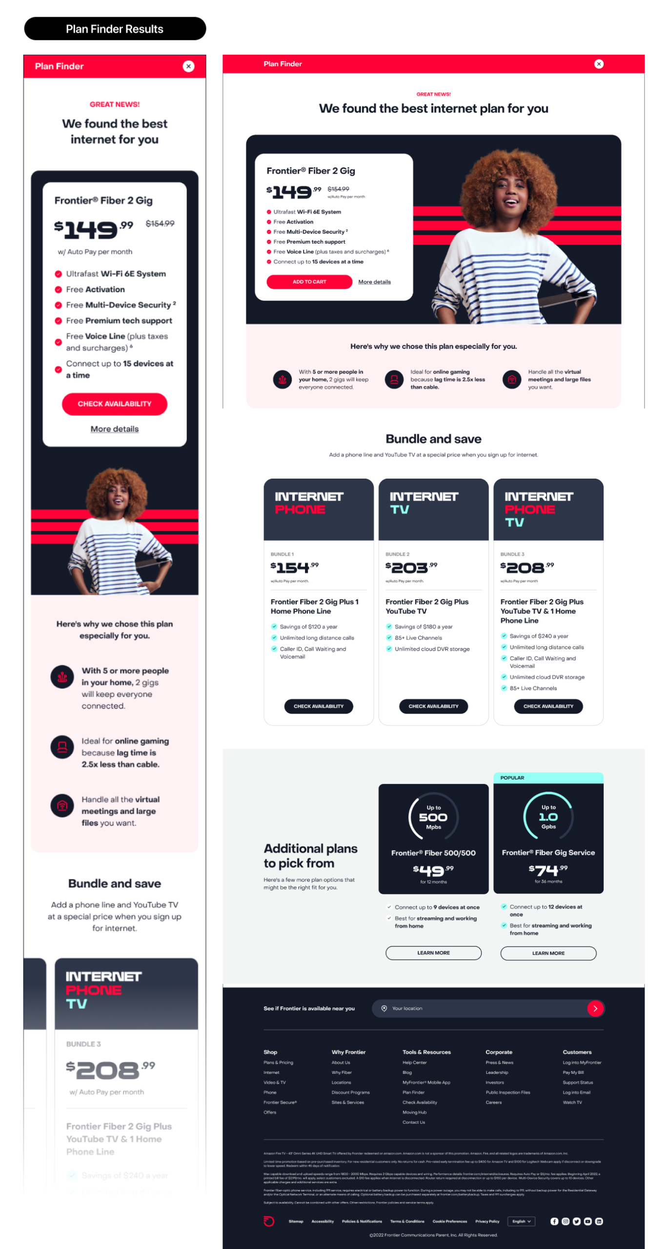
- The moment you buy — address check, plan selection, install scheduling. High intent, high abandonment.
- The moment something breaks — outage, slow speeds, a router that won’t sync. High emotion, high call volume.
- The moment the bill arrives — the single most-visited screen in the entire ecosystem, and the one most likely to generate a support call.
Marketing owns the first impression. Product owns every impression after that. We had a beautiful new identity that had never been stress-tested against any of those three moments, a website assembled over years of incremental additions, an app built on different foundations than the site, and no shared system connecting any of it.
Same company. Four different design languages, depending on where you landed.
What we built
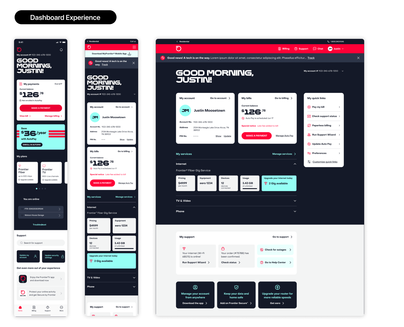
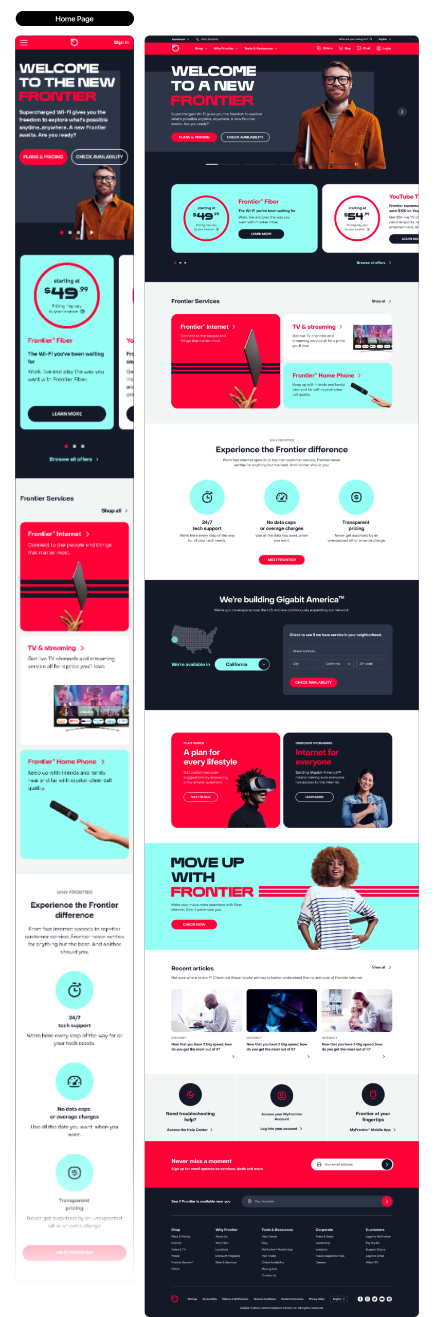
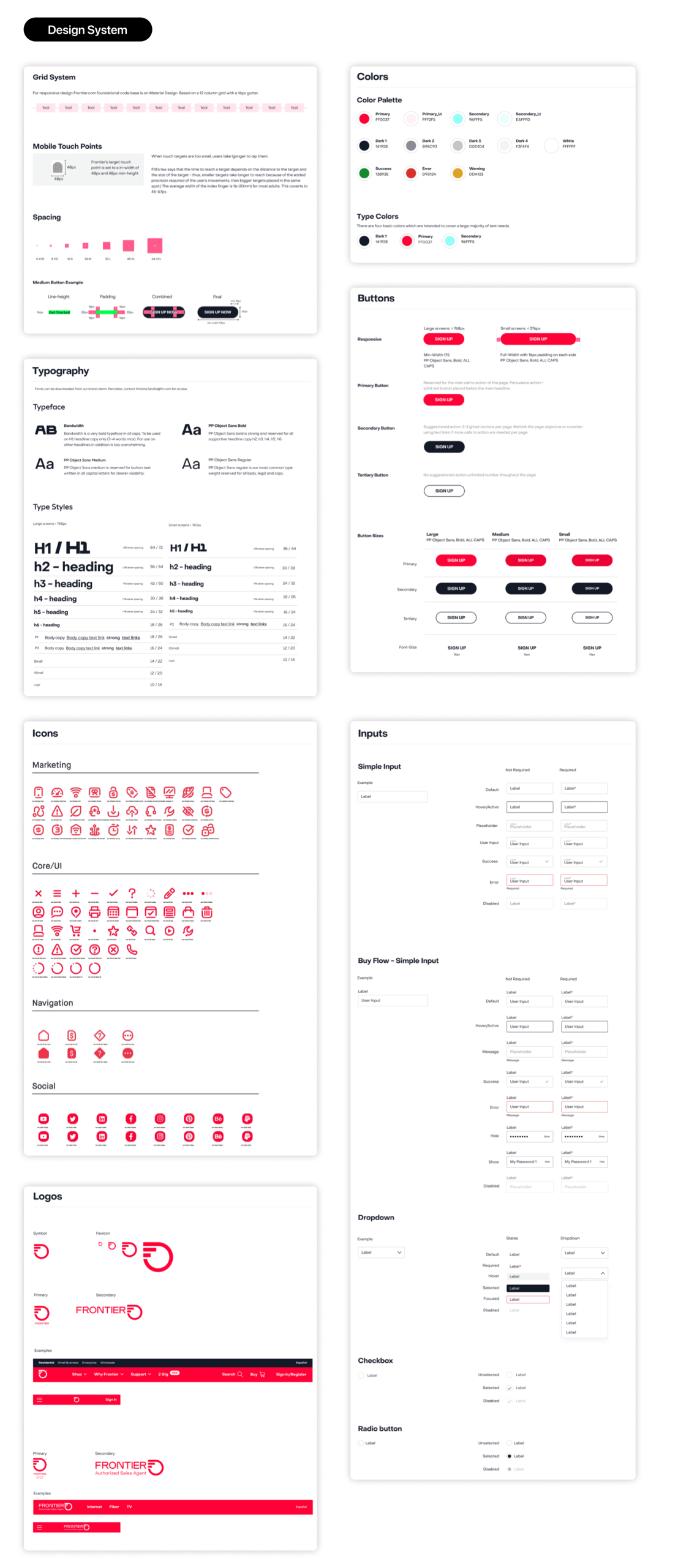
A product design system, from the ground up. Not a sticker sheet. A 80+-component library with semantic tokens, documented interaction states, accessibility criteria baked into every component definition, and a governance model that named who could add to it and how. Built once, consumed by web and app. The measure of success wasn’t how many components existed — it was how few one-off screens got designed after it shipped.
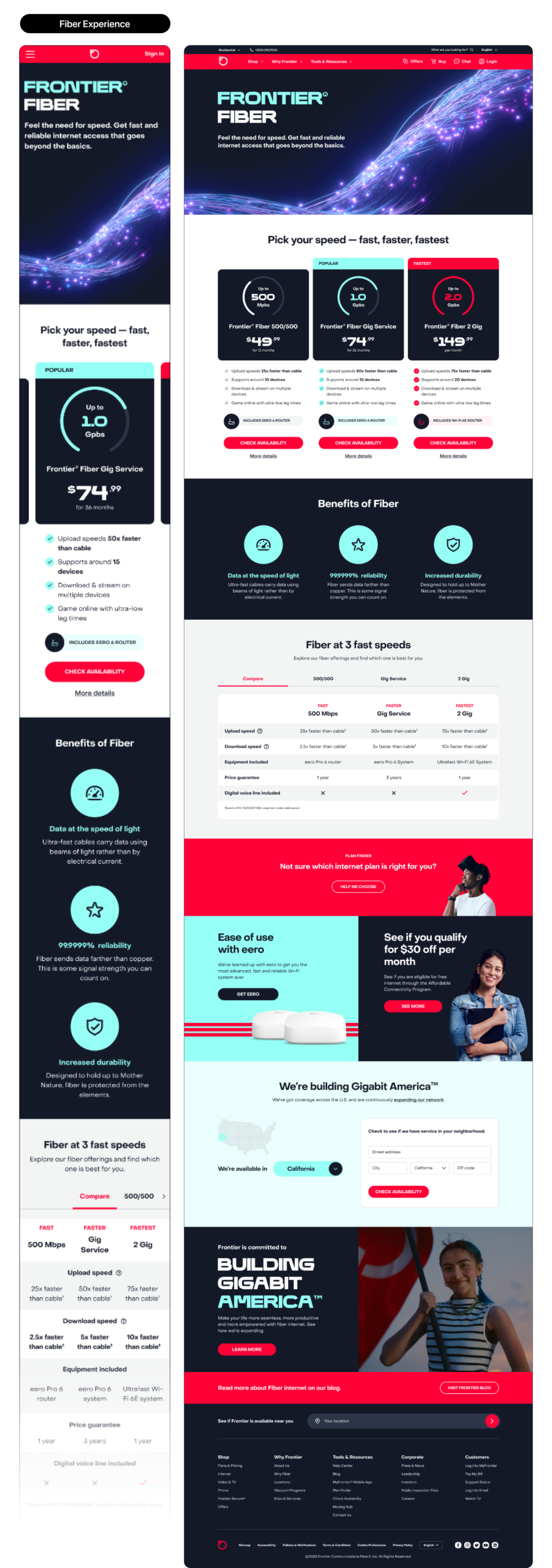
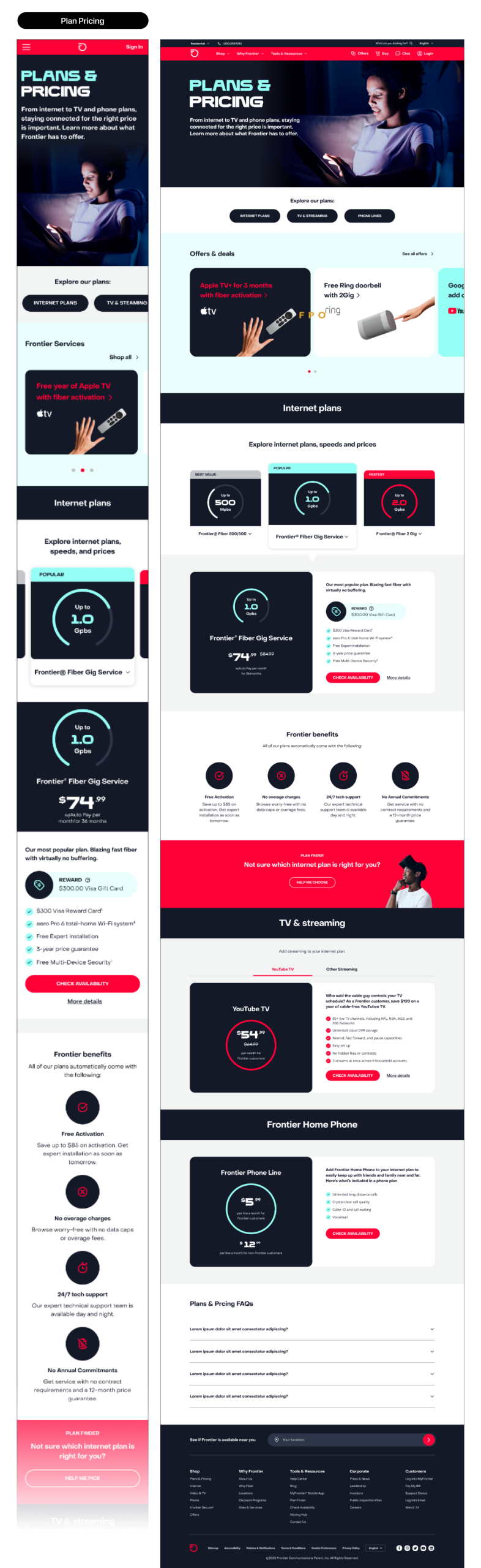
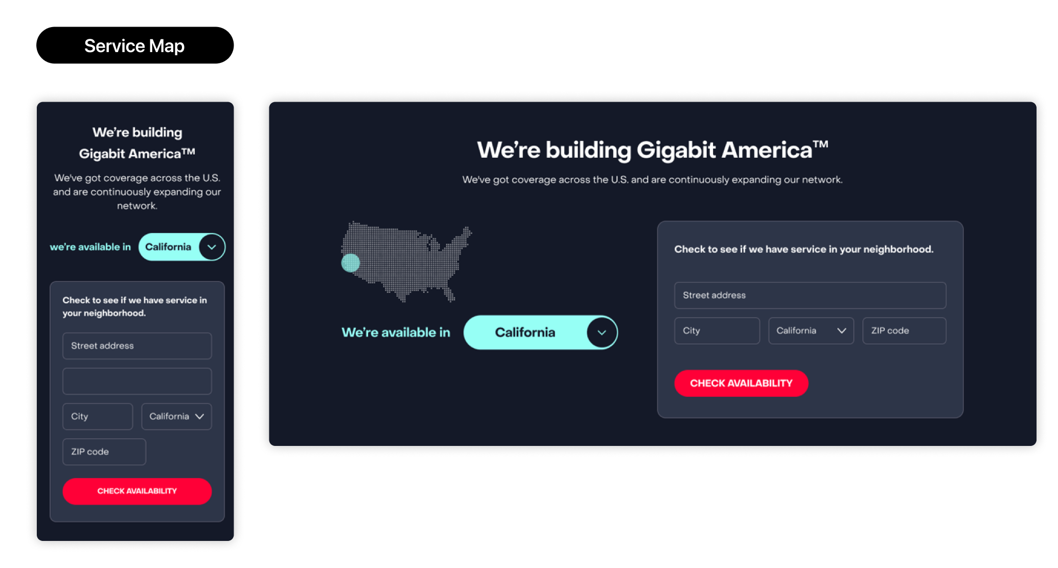
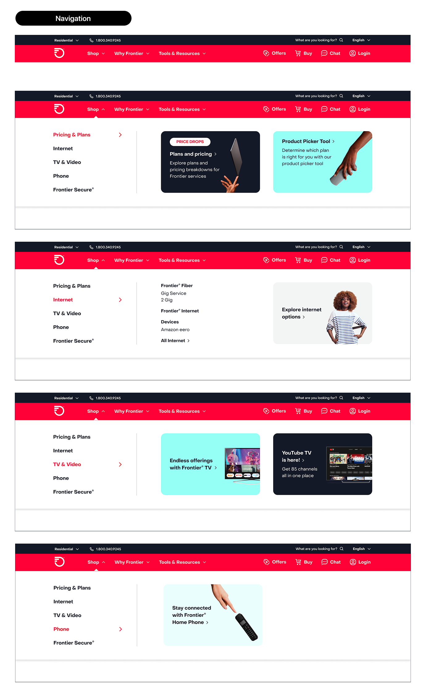
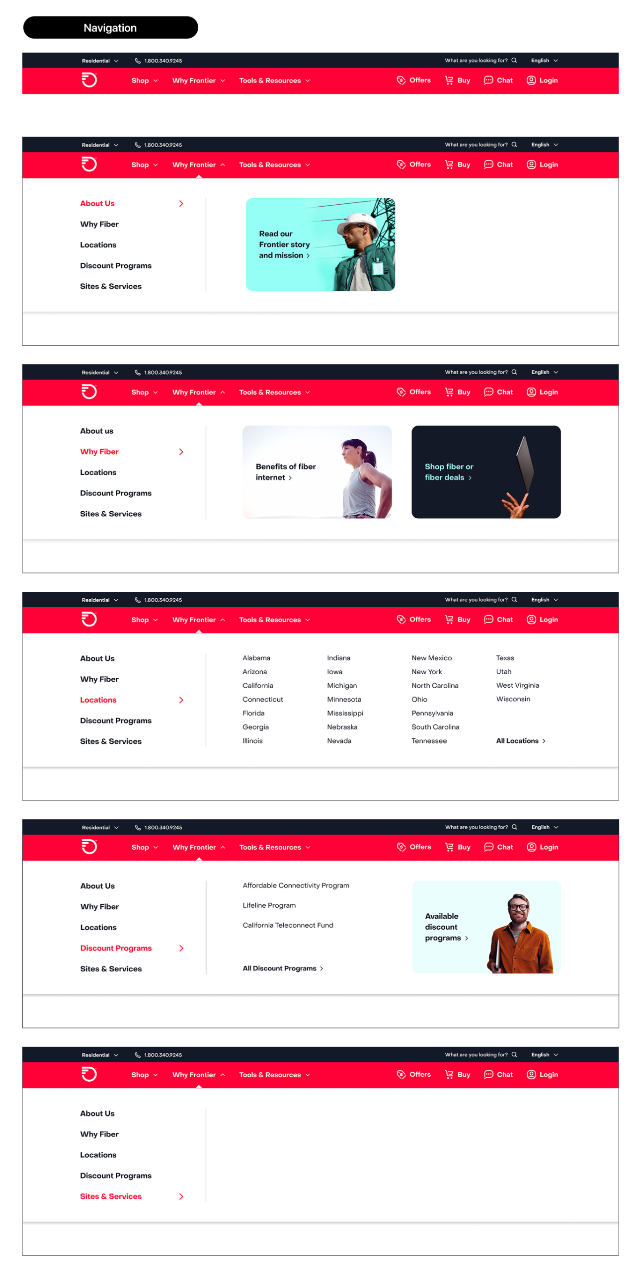
Frontier.com, rebuilt. We rebuilt around the three moments rather than around the org chart. Address-first shopping, so the first thing a customer sees is what’s actually available at their address instead of a national offer they may not qualify for. A plan comparison that leads with what people actually decide on — speed, total monthly cost, contract terms, install date — and stops burying fees. An account experience where “what is this charge” is answerable without calling anyone.
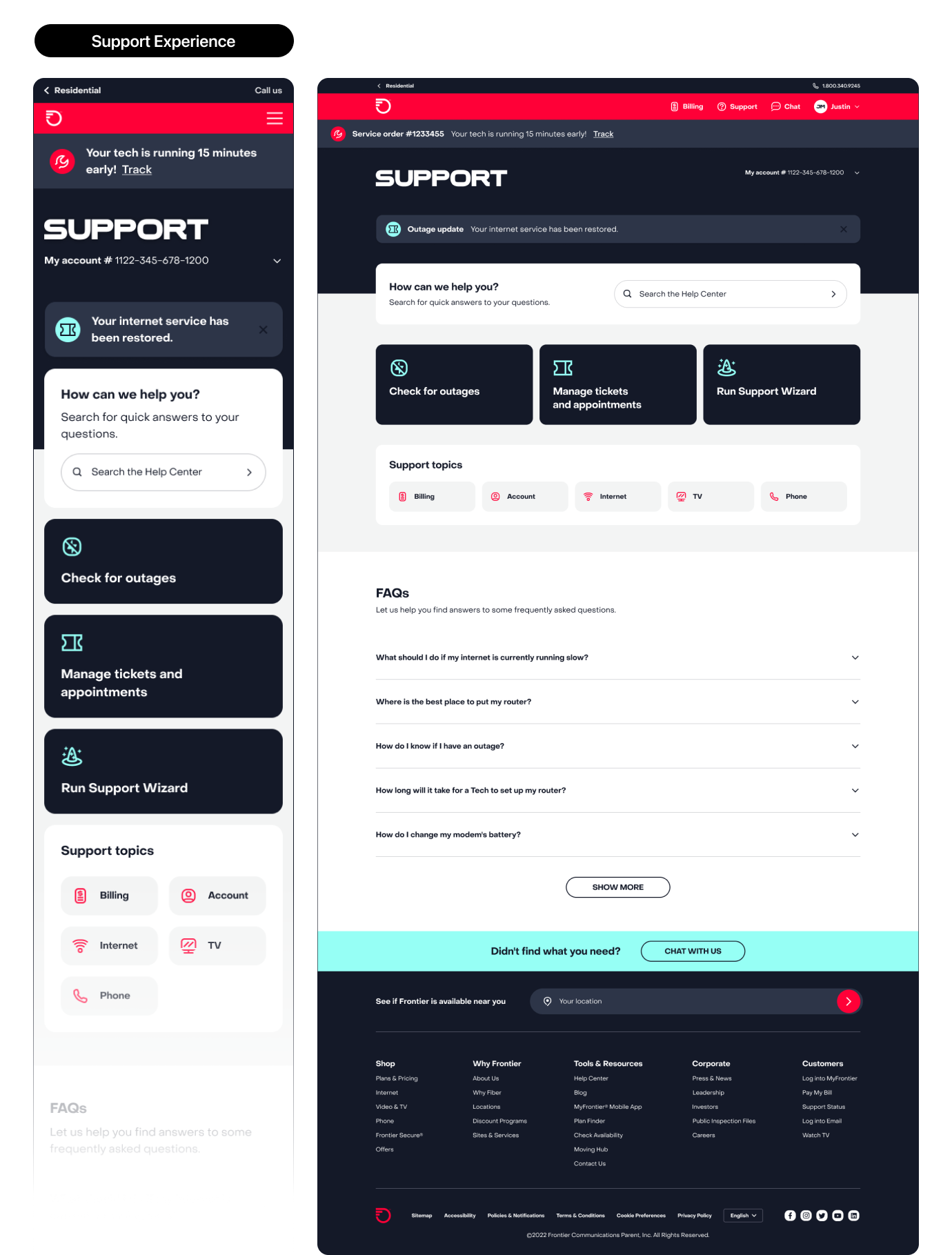
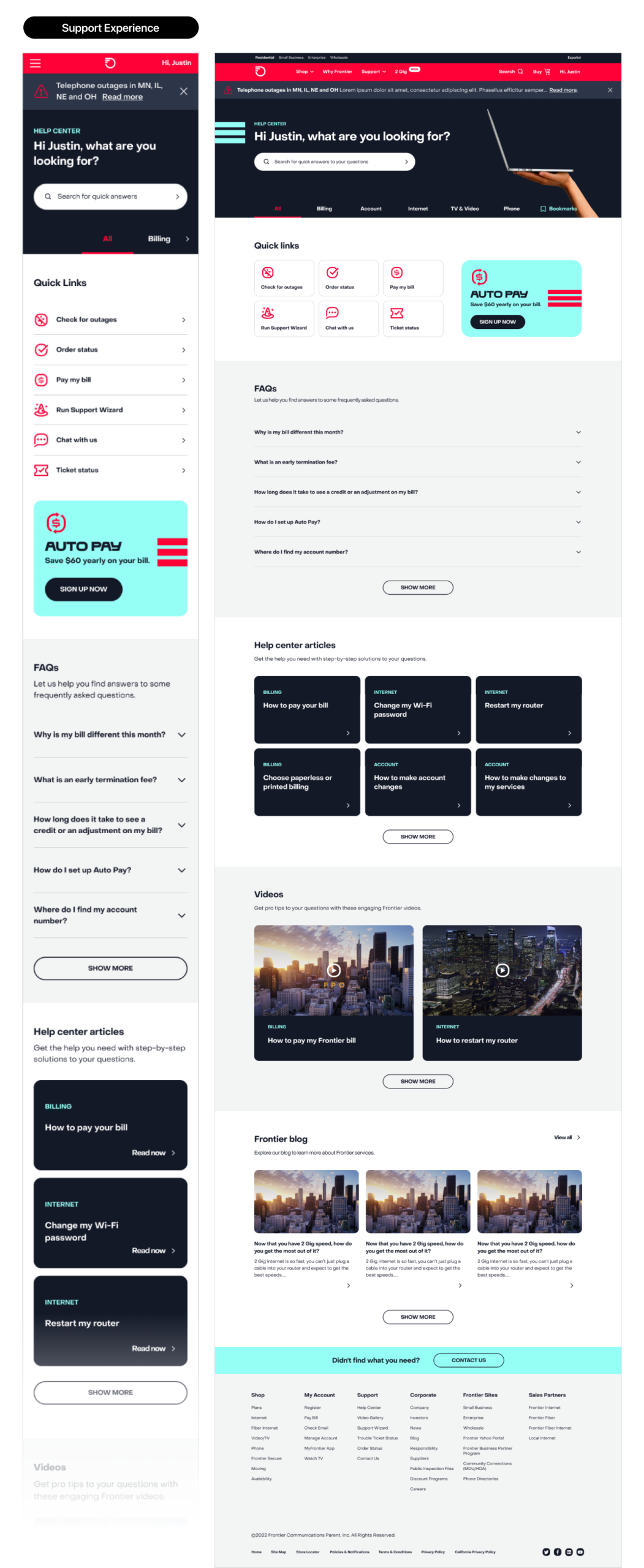
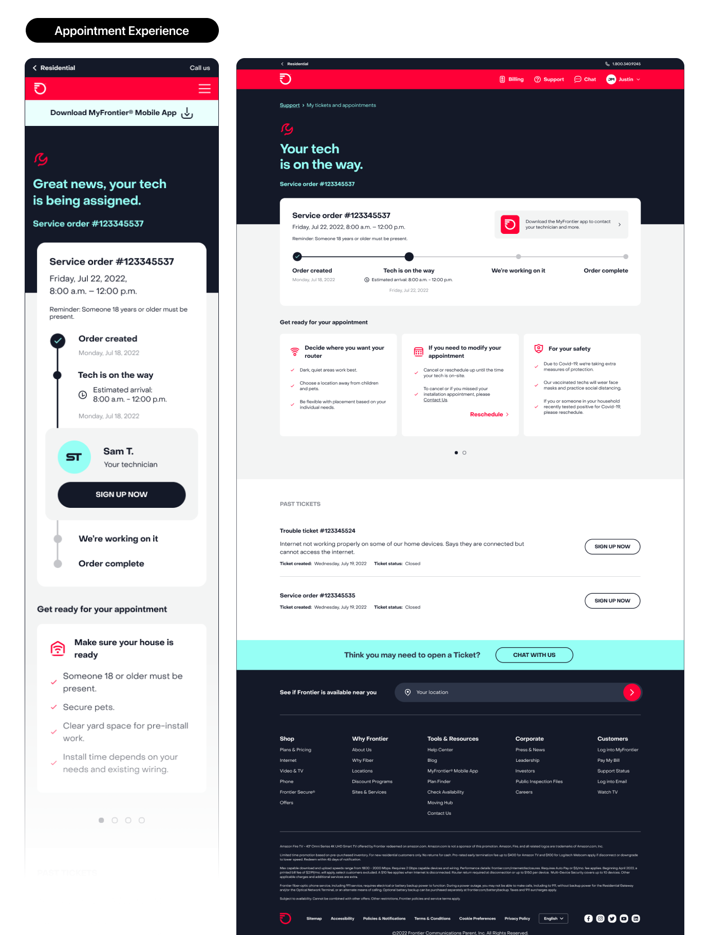
The MyFrontier app, rebuilt. The app is where the fiber promise gets audited. We designed it around self-service under stress: real network status instead of a spinner, guided troubleshooting that resolves the common cases before a call is ever placed, install-day tracking, and a bill view that matches the web view component for component — because a customer who gets two different answers on two devices trusts neither.
Speed as a design property. A company selling gigabit cannot ship a slow interface. We set perceived-performance budgets alongside visual specs and treated loading, skeleton, and transition states as brand expression rather than engineering leftovers. The staggered line work in the identity is a motion idea. We used it as one.