DiningOut Magazine


Category
Print, VideoAbout This Project
Setup
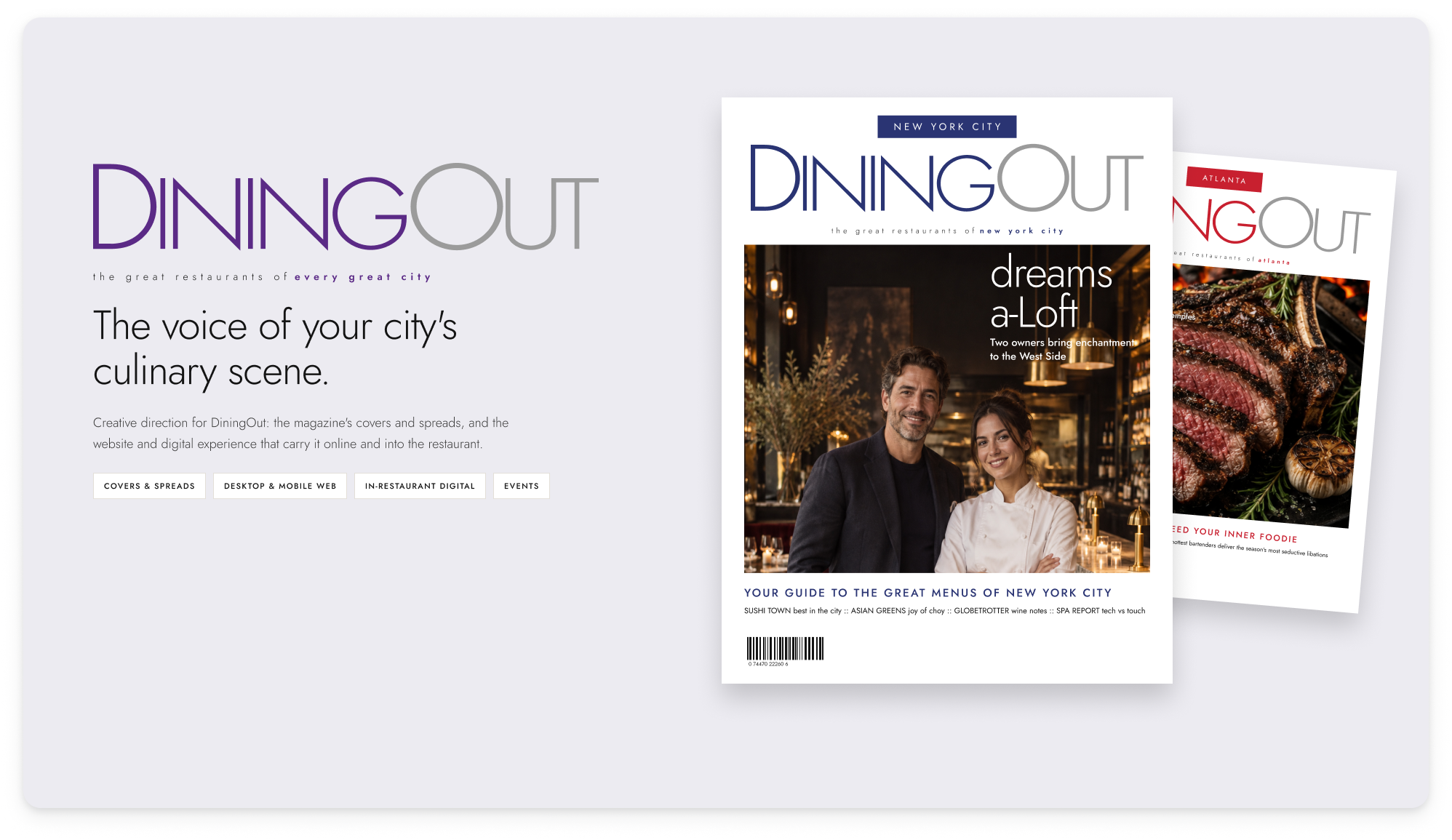
DiningOut is a city-by-city magazine about restaurants. Each market had its own issue, and the covers, spreads and website didn’t feel like they came from the same publication. Readers loved the print edition, but that relationship ended when they put the magazine down. Online, a restaurant profile was a listing rather than a story. At the restaurant itself, the magazine had nothing to say.
What I Led
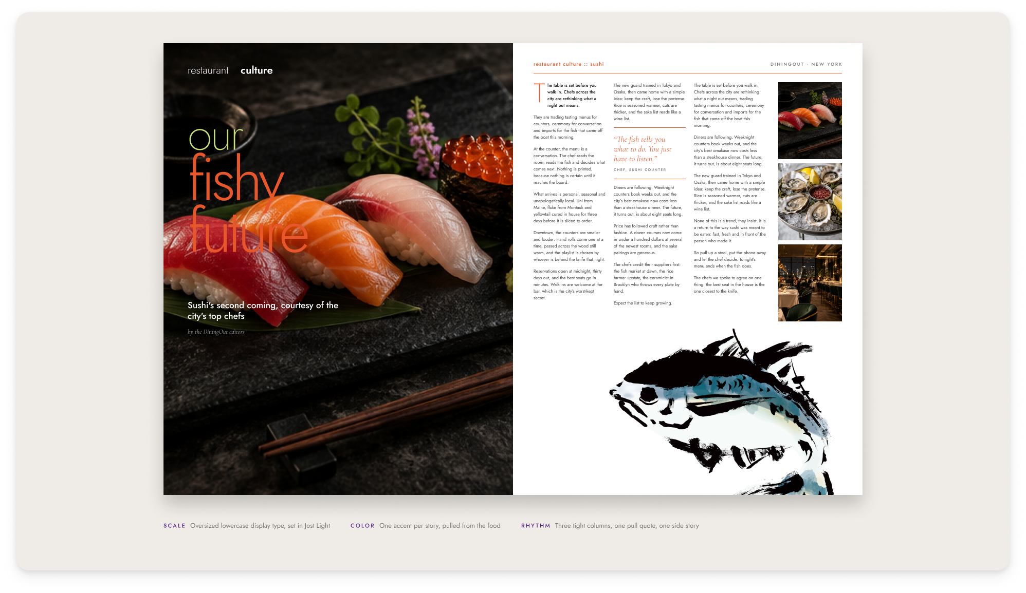
I led creative direction for the magazine’s covers and feature spreads, then carried that direction into DiningOut’s website and digital experience.
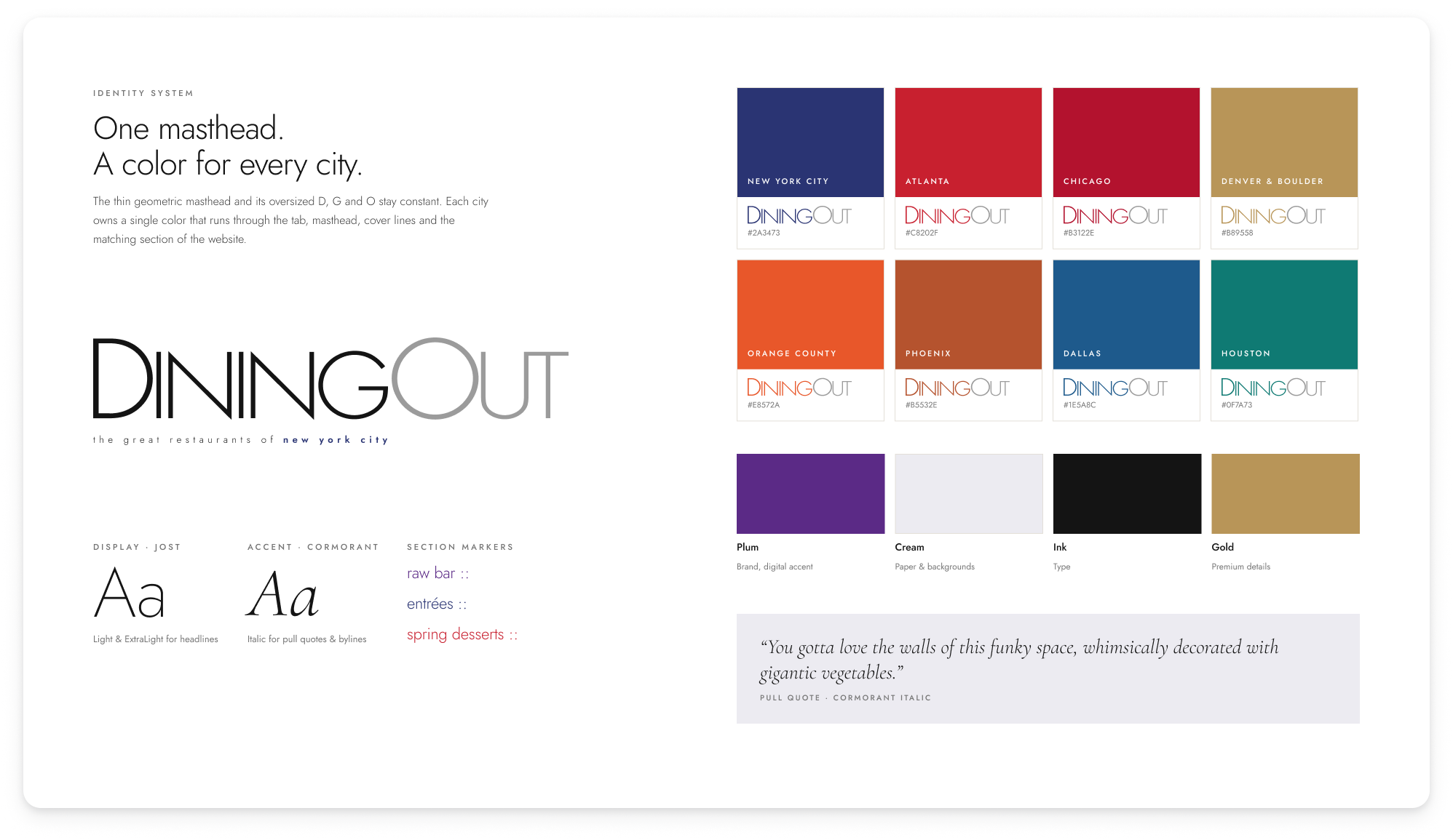
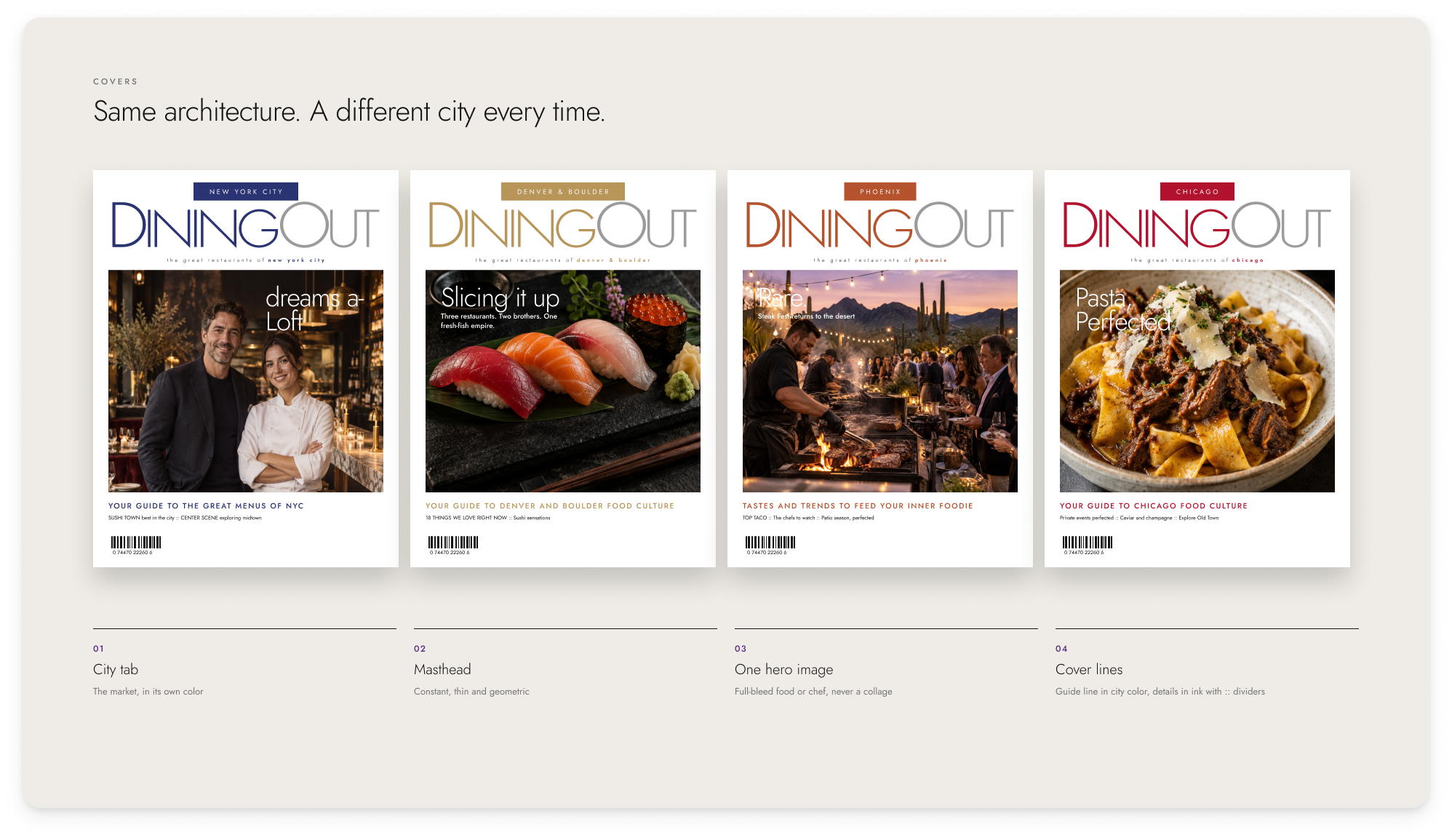
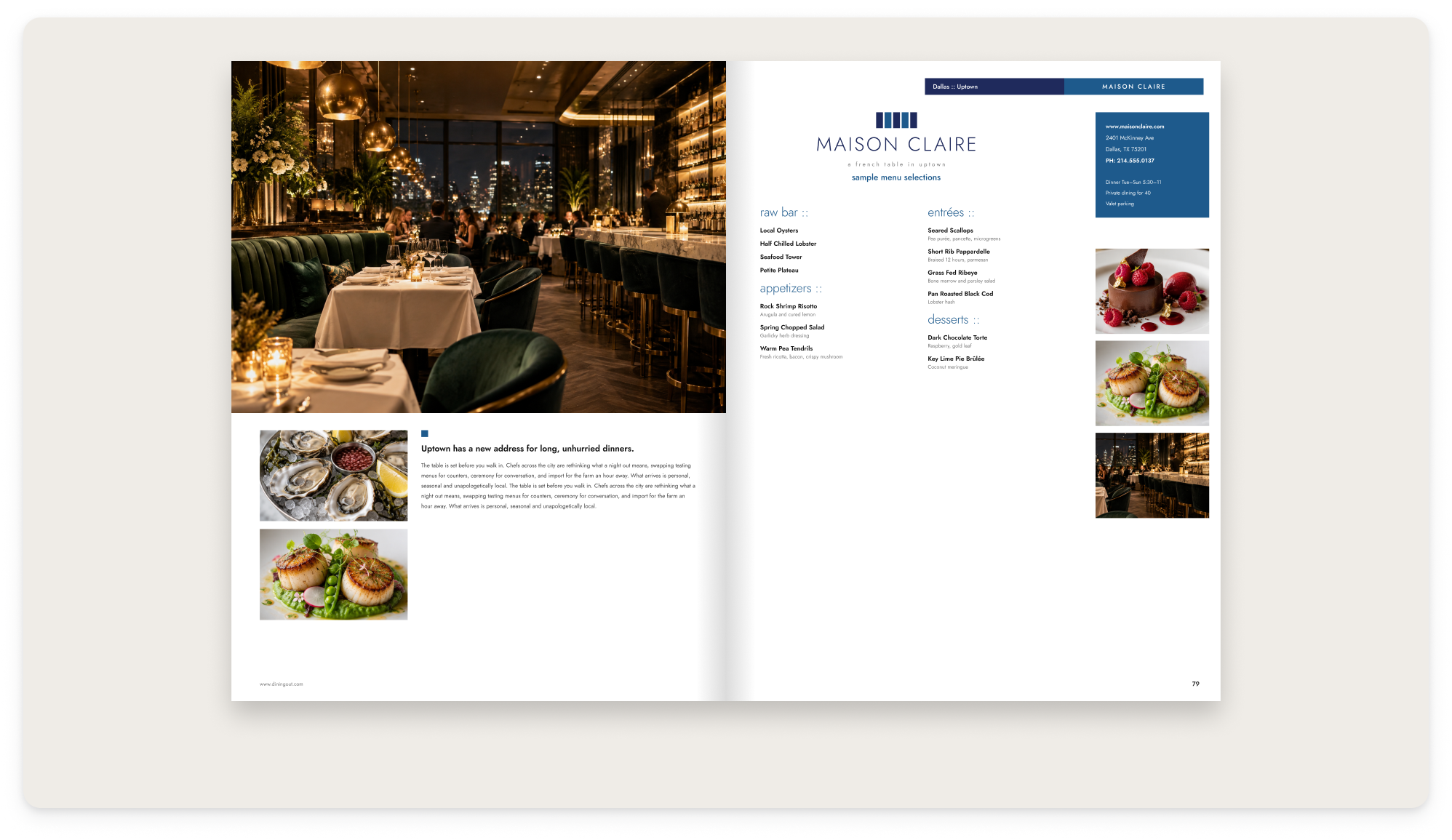
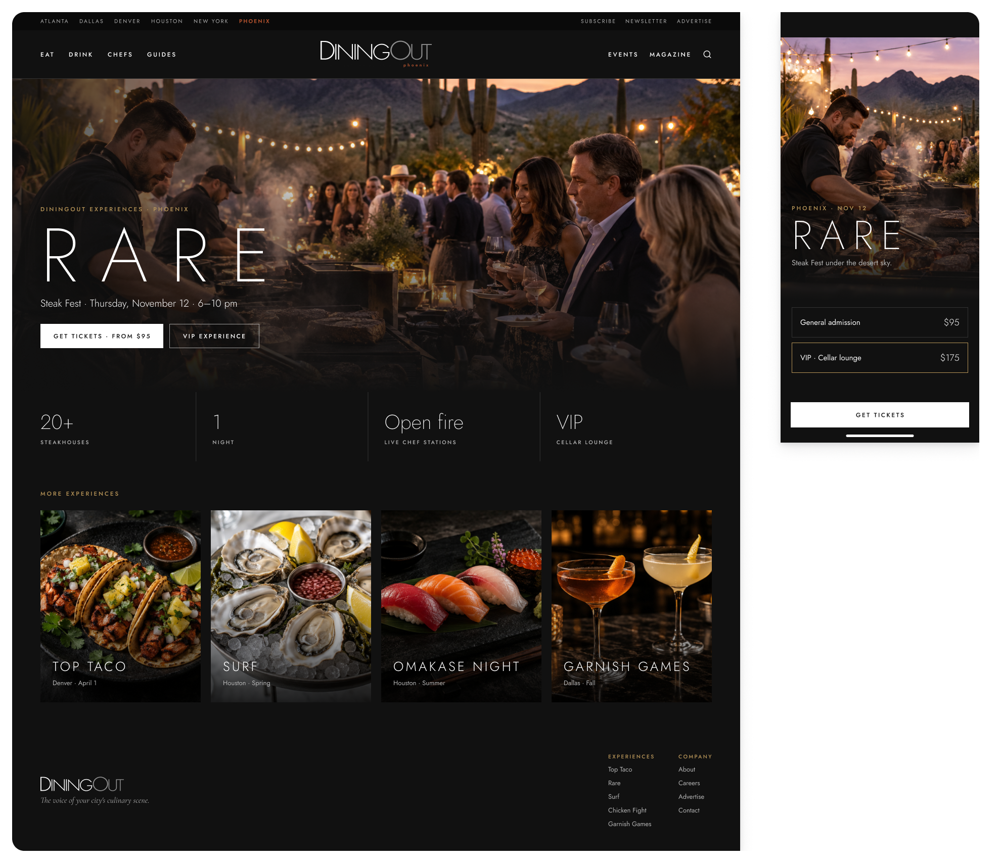
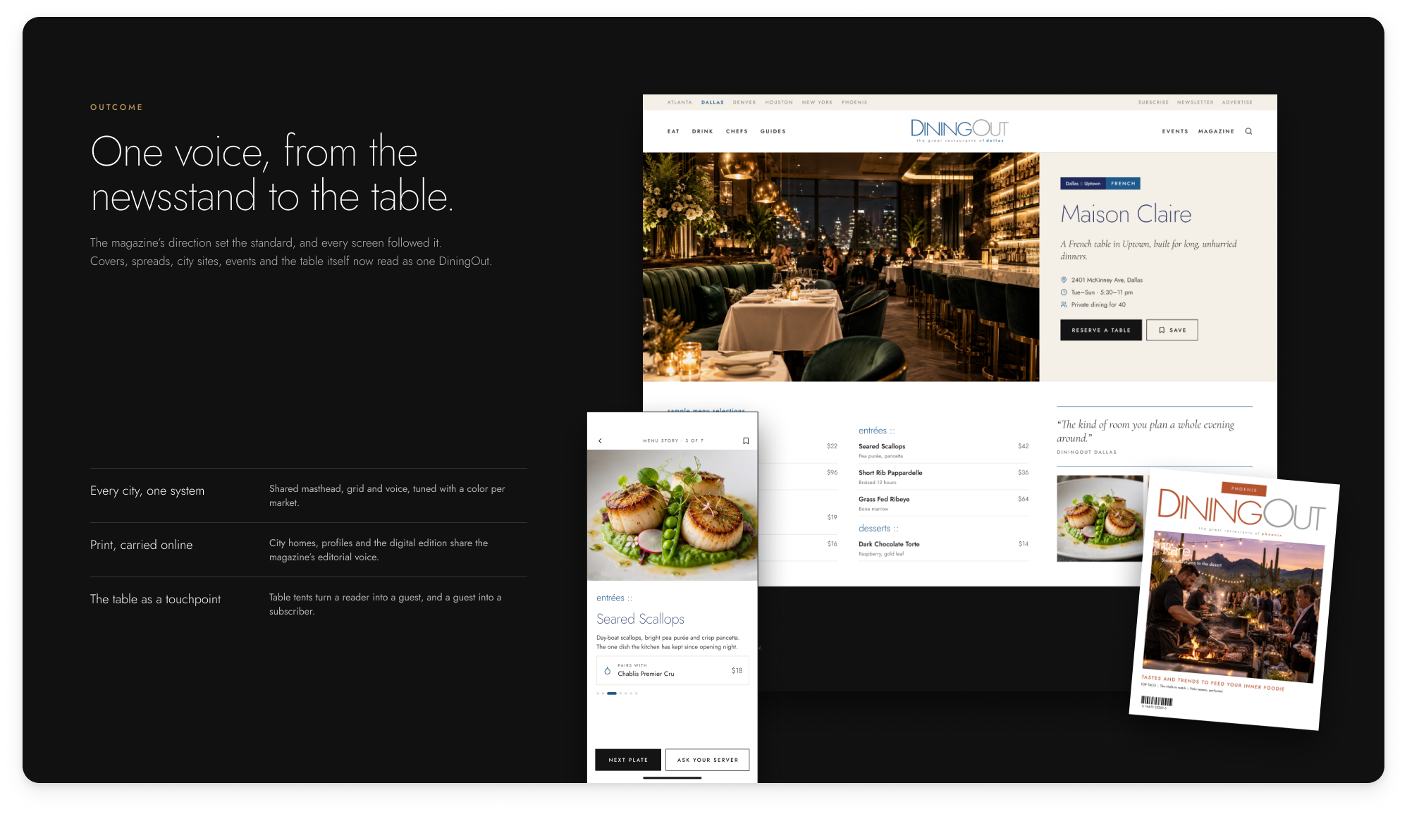
The starting point was the identity: one thin geometric masthead, a cover structure that stays the same, and a single color for each city. That color runs through the cover lines, the section markers and the matching city section of the site, so New York, Atlanta, Chicago, Denver, Phoenix, Dallas and Houston each feel like their own while still clearly being DiningOut. Inside, the feature spreads and restaurant profiles gave chefs and rooms the editorial treatment they deserved, down to how each menu was presented.
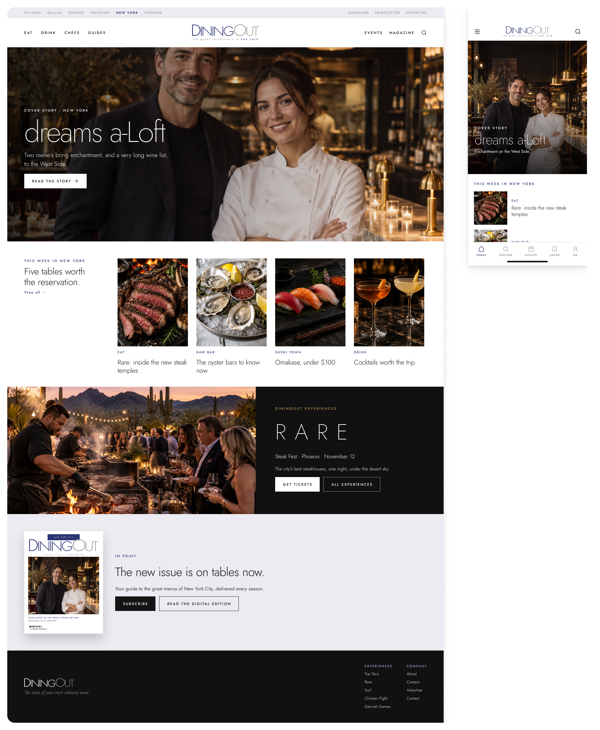
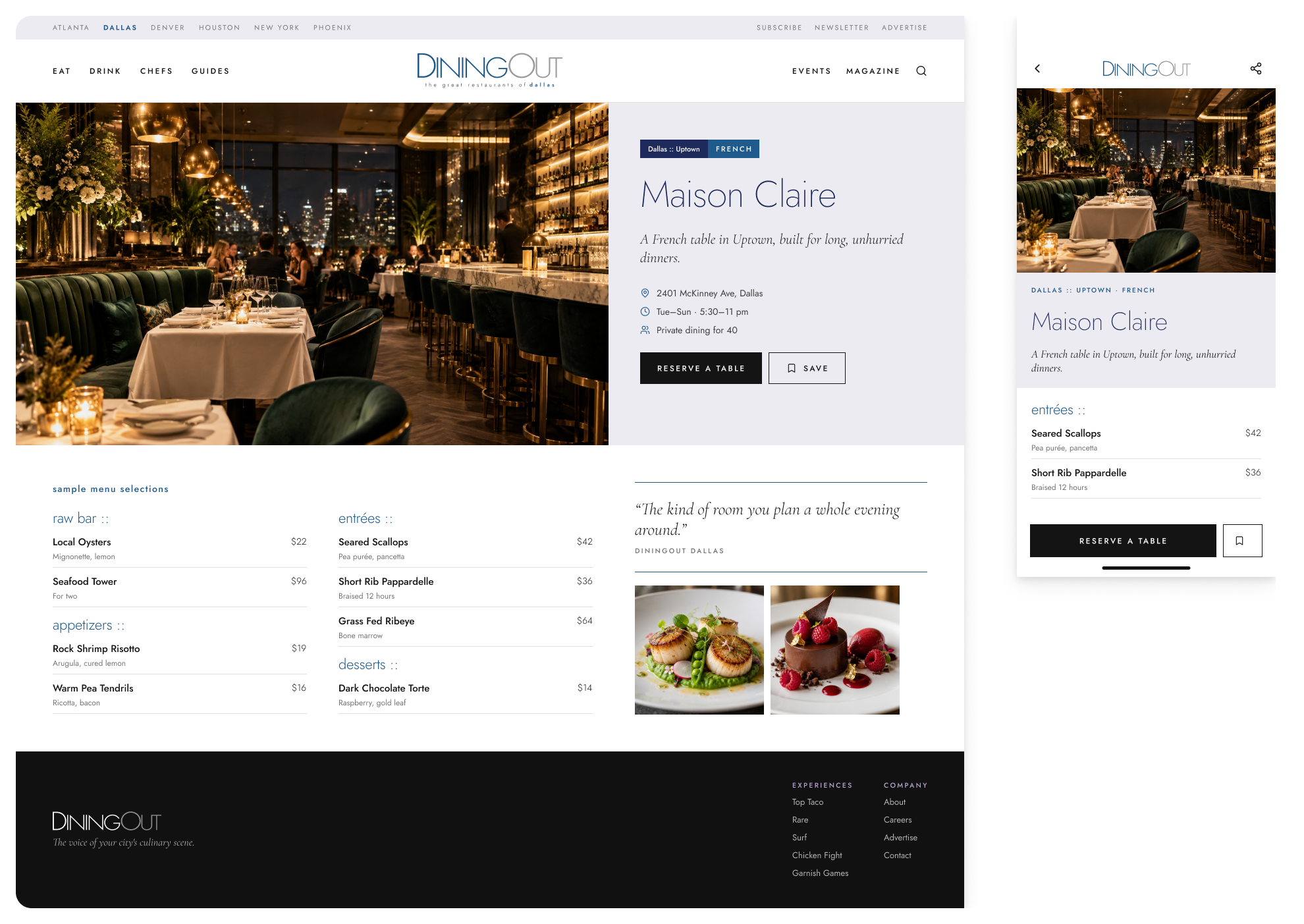
From there, we built the digital layer to read like the magazine rather than a directory:
- City homes: each city gets a home page that leads with the cover story.
- Restaurant profiles: each profile carries the spread’s voice through to a reservation.
- Events: DiningOut Experiences pages for events like Steak Fest and Top Taco.
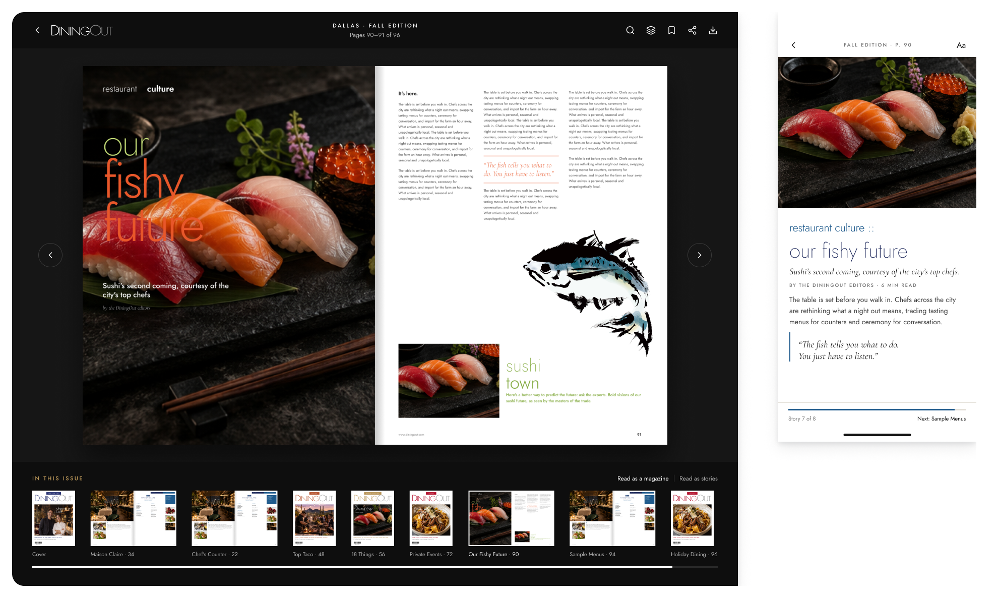
- Digital edition: read the issue as a magazine or as individual stories.
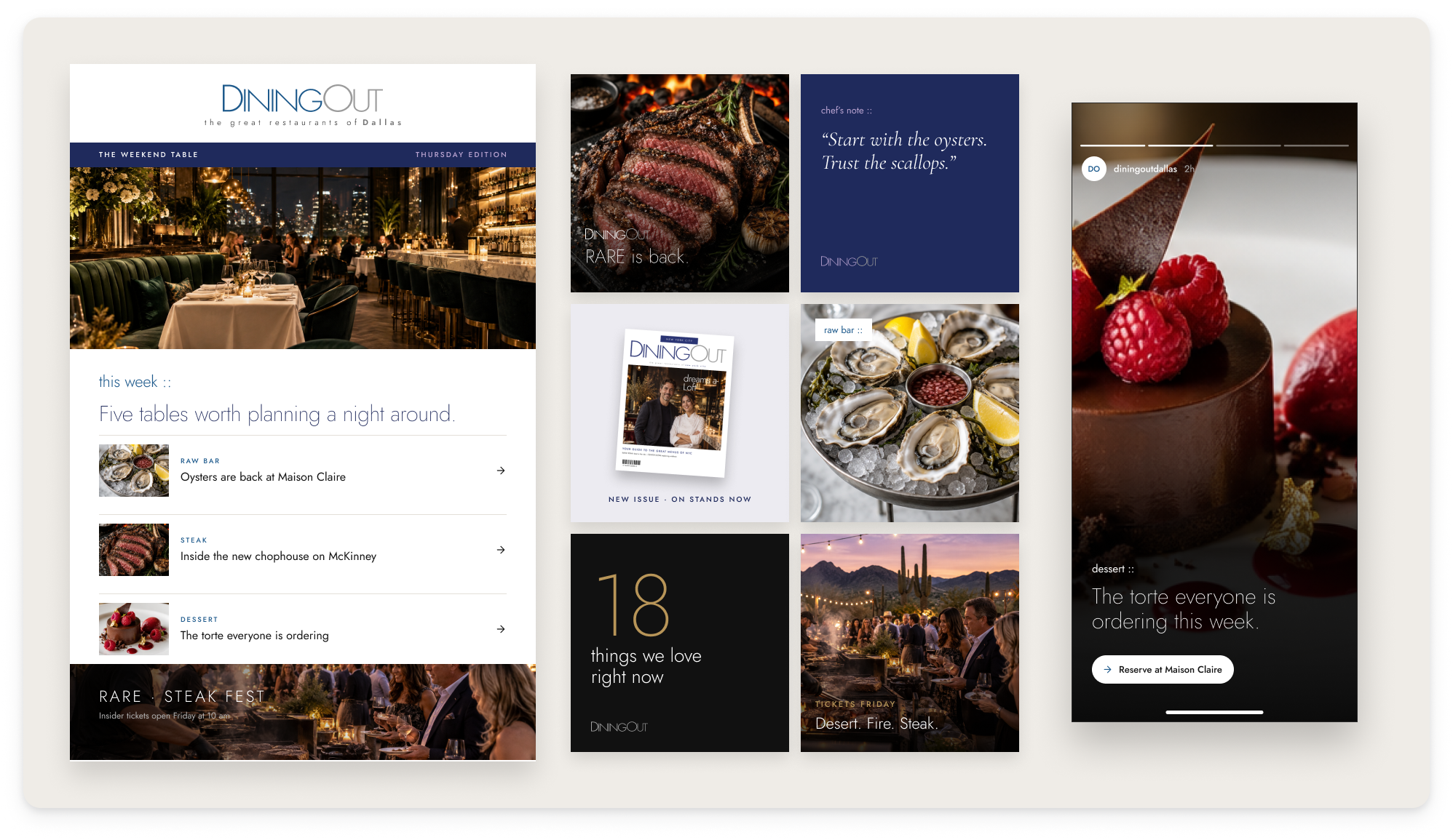
- Weekly newsletter and social: these kept each city’s voice going between issues.
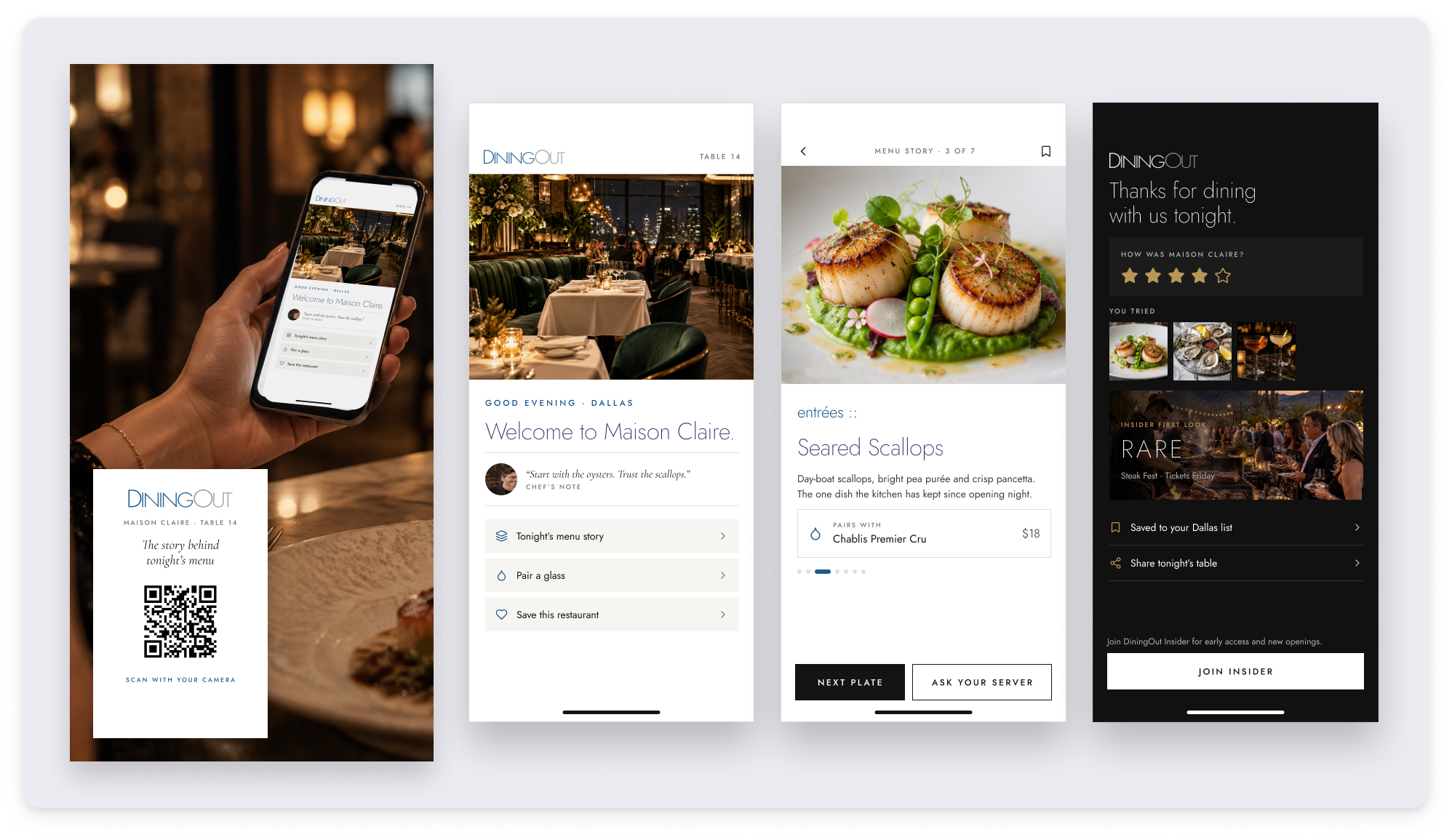
We also brought the magazine into the restaurant. A table tent invites guests to scan for the story behind tonight’s menu, the chef’s notes and wine pairings, then save the restaurant and join DiningOut Insider.
What We Delivered
One voice from the newsstand to the table. Covers, spreads, city sites, events and the dining room now read as one DiningOut. Every city has its own color and character, and every touchpoint follows the standard the magazine set.